
The Stylish Pivot Chart with Slicer in Excel is a dynamic tool designed to make data analysis more interactive and visually appealing. By combining the powerful capabilities of Pivot Charts and Slicers, this tool allows you to filter, segment, and visualize your data with ease. The stylish design of the chart ensures that your data is not only accessible but also presented in a way that is both clear and engaging.
Pivot Charts allow you to summarize large data sets efficiently, while the addition of slicers gives you an intuitive way to filter the data by various categories, time periods, or other criteria. This combination provides real-time interactivity and makes it easier to uncover trends, perform comparisons, and gain insights from your data. The Stylish Pivot Chart with Slicer is ideal for business dashboards, financial reports, and any other situation where you need to work with large sets of data and present them in an understandable format.

Key Features of the Stylish Pivot Chart with Slicer in Excel
📌 Interactive Data Filtering with Slicers
The Slicer feature allows you to filter and segment your data quickly and easily. By clicking on different segments of the slicer, you can instantly update your chart to show relevant data, making it ideal for exploring multiple aspects of your data without the need to manipulate raw data manually.
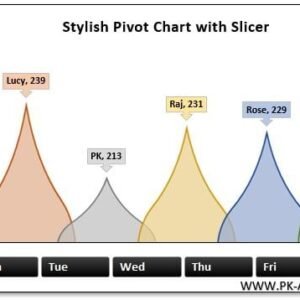
🛠 Pivot Chart Visualization
Pivot Charts provide a powerful way to visualize your data. They can summarize data points, show trends, and highlight key metrics, all while maintaining a sleek and stylish design. The combination of Pivot Charts and Slicers creates an intuitive, interactive dashboard.
💡 Real-Time Data Updates
With the integration of slicers, your Pivot Chart updates in real time. As you adjust the slicers, the chart dynamically reflects the new data set, giving you up-to-date insights instantly. This feature is ideal for tracking performance or analyzing data trends over time.
🔢 Customizable Design and Appearance
You can fully customize the appearance of the Pivot Chart, from color schemes to labels and axis formatting. This flexibility ensures that the chart not only matches your data but also fits seamlessly into your report, presentation, or dashboard.
🚀 Multiple Data Views
The Stylish Pivot Chart with Slicer allows you to view your data from different angles. Whether you’re analyzing sales by product, region, or time period, the slicers give you the ability to adjust the chart’s view with just a few clicks.
📊 Easy to Use and Set Up
Setting up the Pivot Chart with Slicer is quick and simple. With clear instructions and a user-friendly interface, even beginners can create interactive and visually appealing data charts. You don’t need advanced Excel skills to get started with this tool.
⚙ Enhanced Data Insights
The slicer functionality enables you to focus on specific subsets of data, which helps you uncover insights that might otherwise be hidden in large data sets. This feature allows you to compare different segments of your data side by side and identify key patterns.
🚀 Why You’ll Love the Stylish Pivot Chart with Slicer in Excel
✅ Interactive Filtering – Use slicers to filter and segment data for real-time insights. ✅ Pivot Chart Visualization – Summarize and visualize data trends efficiently. ✅ Real-Time Updates – Instantly update the chart as slicer selections are made. ✅ Customizable Design – Adjust the appearance to fit your needs or branding. ✅ Easy Setup and Use – Simple instructions for creating dynamic, stylish charts.
📂 What’s Inside the Stylish Pivot Chart with Slicer in Excel?
- Pivot Chart Visualization: A dynamic chart that summarizes and visualizes your data.
- Slicer for Data Filtering: Filter data quickly and easily with slicers.
- Customizable Chart Appearance: Change colors, labels, and design elements.
- Clear Setup Instructions: A simple, step-by-step guide to getting started.
🔍 How to Use the Stylish Pivot Chart with Slicer in Excel
1️⃣ Download the Template – Instant access to the Excel file upon purchase. 2️⃣ Input Your Data – Enter your data into the Pivot Table. 3️⃣ Add Slicer – Use the slicer to filter data by categories, regions, or time periods. 4️⃣ Customize the Chart – Adjust the appearance to match your needs. 5️⃣ Track and Present – Use the chart to monitor performance, trends, or metrics in real time.
🎯 Who Can Benefit from the Stylish Pivot Chart with Slicer in Excel? 🔹 Business Analysts
🔹 Financial Analysts
🔹 Sales and Marketing Teams
🔹 Project Managers
🔹 Anyone presenting or analyzing data
🔹 Professionals who need to make data-driven decisions and create interactive dashboards
Transform the way you analyze and present your data with the Stylish Pivot Chart with Slicer in Excel. This tool simplifies data exploration and helps you gain deeper insights with just a few clicks.
Click here to read the Detailed blog post
https://www.pk-anexcelexpert.com/stylish-pivot-chart-with-slicer-in-excel/
Visit our YouTube channel to learn step-by-step video tutorials
Watch the step-by-step video tutorial:


Reviews
There are no reviews yet.