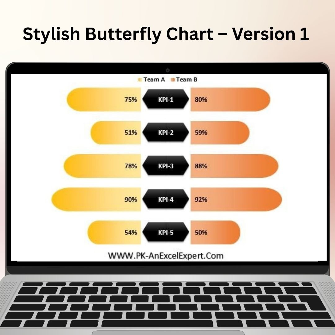
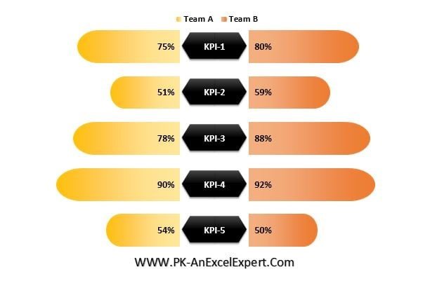
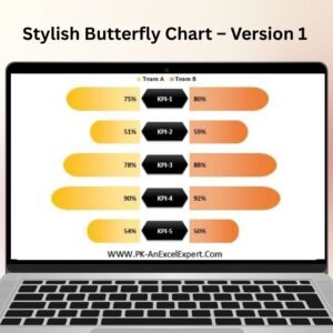
The Stylish Butterfly Chart Version 1 in Excel is a visually striking tool designed to display comparative data in a clear and engaging way. This chart is perfect for showcasing data comparisons, especially when you need to visualize two sets of data side-by-side. Whether you’re comparing sales performance, project metrics, or any other type of data, the Stylish Butterfly Chart will make your information stand out.
With its unique butterfly design, this chart is not only functional but also adds a touch of style to your reports and presentations. The chart’s dynamic nature allows for easy customization, so you can adjust the design, colors, and data to fit your needs. Ideal for business analysts, project managers, and anyone looking to present data in a more visually appealing way, the Stylish Butterfly Chart Version 1 will elevate your data presentations.
Key Features of the Stylish Butterfly Chart Version 1
📌 Unique and Stylish Design
The Stylish Butterfly Chart uses a mirrored design to compare two sets of data side by side. This makes it perfect for showing comparisons, trends, and deviations clearly. The chart’s butterfly shape is visually striking, ensuring your data grabs attention.
🛠 Customizable Data Sets
Easily adjust the data inputs for two different categories to display comparative information. Whether you’re comparing performance metrics, sales figures, or project outcomes, you can tailor the chart to suit your specific needs.
💡 Clear Visual Comparison
This chart makes it easy to compare data points across two categories. With the mirrored design, it’s simple to see how the two sets of data align or differ, allowing for immediate insights and decisions.
🔢 Interactive and Dynamic
The chart is dynamic and allows for real-time updates. As you change the data, the chart automatically updates to reflect the new information. This ensures that your visual comparison is always current.
🚀 Customizable Colors and Labels
The Stylish Butterfly Chart comes with customizable color options, so you can highlight key data points and match the chart’s design with your brand or presentation style. You can also adjust the labels for easy interpretation.
📊 Perfect for Dashboards and Presentations
This chart is ideal for use in Excel dashboards, reports, and presentations. Its striking design and clear comparisons make it a great tool for presenting data to stakeholders or decision-makers.
⚙ User-Friendly Setup
The Stylish Butterfly Chart Version 1 is designed to be easy to use, even for beginners. It comes with clear setup instructions, so you can get started right away without needing advanced Excel skills.
🚀 Why You’ll Love the Stylish Butterfly Chart Version 1
✅ Visually Engaging – A unique design that draws attention to the data. ✅ Easy Data Comparison – Compare two sets of data side by side. ✅ Customizable Design – Adjust colors, labels, and data to suit your needs. ✅ Real-Time Updates – The chart automatically adjusts as your data changes. ✅ Perfect for Presentations – Enhance reports and presentations with stylish data visuals.
📂 What’s Inside the Stylish Butterfly Chart Version 1?
- Mirror Design: A side-by-side comparison of two data sets.
- Customizable Data Inputs: Easily input and adjust data for comparison.
- Dynamic Updates: Automatically updates when data is changed.
- Step-by-Step Setup Guide: Clear instructions to help you set up and use the chart.
🔍 How to Use the Stylish Butterfly Chart Version 1
1️⃣ Download the Template – Instant access to the Excel file upon purchase. 2️⃣ Input Your Data – Enter your data into the chart’s input sections. 3️⃣ Customize the Chart – Adjust colors, labels, and data to suit your needs. 4️⃣ Track Performance – Use the chart to compare two data sets and visualize trends. 5️⃣ Present and Share – Use the chart in reports and presentations to engage your audience.
🎯 Who Can Benefit from the Stylish Butterfly Chart Version 1? 🔹 Business Analysts
🔹 Sales Teams
🔹 Project Managers
🔹 Marketing Teams
🔹 Financial Analysts
🔹 Anyone needing to compare data side by side in a visually engaging way
The Stylish Butterfly Chart Version 1 makes data comparison simple, visually engaging, and easy to interpret. Whether you’re comparing sales, project milestones, or performance metrics, this tool will help you present data more effectively.
Click here to read the Detailed blog post
https://www.pk-anexcelexpert.com/stylish-butterfly-chart-version-1/


Reviews
There are no reviews yet.