
The Stylish and Dynamic Comparison Chart in Excel is a powerful and visually appealing tool designed to help you compare multiple data sets with ease. This chart enables you to track, analyze, and present comparisons between different categories, products, or performance metrics in a dynamic, clear, and stylish format. Whether you’re comparing sales figures, project progress, or other key metrics, this comparison chart helps you communicate your data insights effectively.
With its modern design and smooth transitions, this comparison chart offers an interactive experience. You can adjust the data as needed, and the chart will automatically update to reflect changes, giving you real-time insights into the comparisons that matter most.
Key Features of the Stylish and Dynamic Comparison Chart
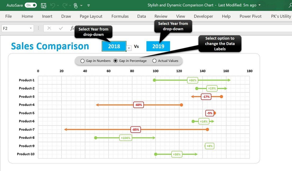
📌 Dynamic Data Visualization
The comparison chart dynamically adjusts as new data is entered, ensuring you always have the most up-to-date visual representation. Whether you’re comparing sales, performance, or product metrics, the chart will automatically adjust to provide accurate insights.
🛠 Multiple Data Sets Comparison
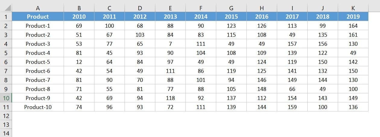
Easily compare different data sets side by side in a clear, easy-to-understand format. This feature makes it easy to track performance, identify trends, and visualize differences across various metrics or categories.
💡 Stylish and Modern Design
The chart features a sleek, modern design with customizable elements. Adjust colors, labels, and chart types to match your brand or presentation style, making it perfect for professional reports, presentations, or dashboards.
🔢 Real-Time Data Updates
As you modify the data, the chart updates instantly to reflect the changes. This real-time functionality ensures that your comparison chart always shows the latest information without the need for manual adjustments.
🚀 Customizable Chart Elements
Customize various aspects of the chart, including colors, labels, and legends. Tailor the chart to meet your specific data analysis needs, ensuring it fits seamlessly into your reporting or presentation style.
📊 Visual Comparison of Metrics
The stylish chart makes it easy to spot trends, outliers, and comparisons between different metrics. It visually represents data to help you quickly draw conclusions and make informed decisions.
⚙ Easy Setup and Customization
Setting up the Stylish and Dynamic Comparison Chart is quick and easy. The template is user-friendly, and the customization options make it adaptable to any data set or project.
🚀 Why You’ll Love the Stylish and Dynamic Comparison Chart
✅ Dynamic and Interactive – The chart automatically updates as new data is entered, providing real-time insights. ✅ Customizable Design – Modify colors, labels, and other elements to match your needs. ✅ Multiple Data Sets – Compare various data sets side by side for a clear visual comparison. ✅ Visually Engaging – Present your data in a sleek, modern format that enhances readability. ✅ Simple Setup – Easy to set up with minimal effort required, even for beginners.
📂 What’s Inside the Stylish and Dynamic Comparison Chart?
- Dynamic Comparison Chart: A visually striking chart that automatically updates as new data is entered.
- Multiple Data Sets Comparison: Compare data side by side for a comprehensive analysis.
- Customizable Chart Elements: Adjust colors, labels, and chart styles to suit your needs.
- Real-Time Data Updates: Watch the chart change as new information is added or adjusted.
- Simple Setup Instructions: Quick steps to get started and customize the chart for your specific needs.
🔍 How to Use the Stylish and Dynamic Comparison Chart
1️⃣ Download the Template – Instantly access the Excel file upon purchase. 2️⃣ Enter Your Data – Input the data you want to compare, and the chart will automatically populate. 3️⃣ Customize the Chart – Adjust labels, colors, and styles to match your brand or presentation style. 4️⃣ Track and Compare – Use the chart to monitor and analyze trends across different data sets. 5️⃣ Present and Share – Use the chart in presentations, reports, or dashboards to showcase your comparisons.
🎯 Who Can Benefit from the Stylish and Dynamic Comparison Chart? 🔹 Business Analysts
🔹 Sales Managers
🔹 Project Managers
🔹 Marketing Teams
🔹 Financial Analysts
🔹 Anyone needing to compare and analyze multiple data sets
Make data comparison easier and more visually appealing with the Stylish and Dynamic Comparison Chart in Excel. With real-time updates and easy customization, this chart is the perfect tool to track performance, analyze trends, and present data insights.
Click here to read the Detailed blog post
https://www.pk-anexcelexpert.com/stylish-and-dynamic-comparison-chart/


Reviews
There are no reviews yet.