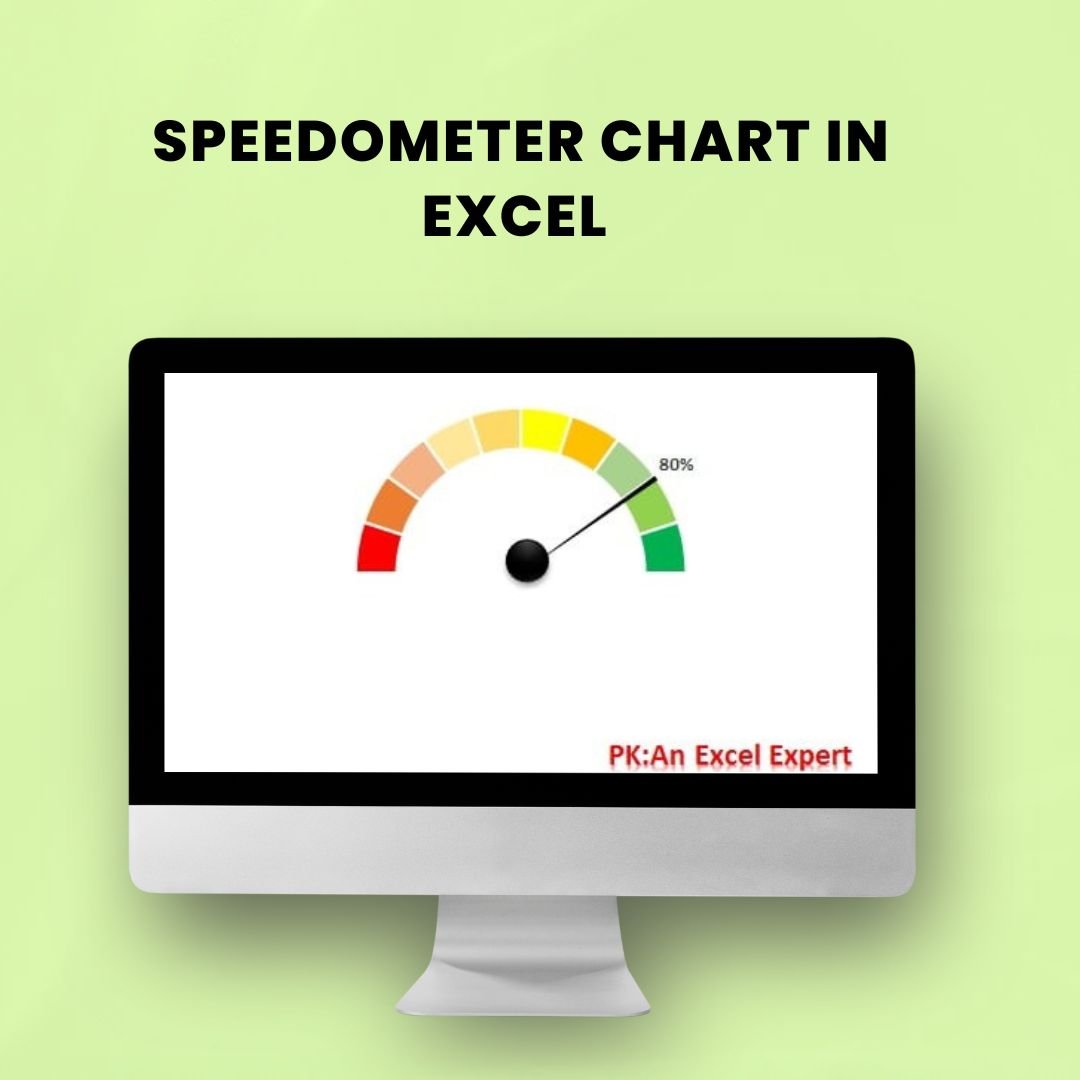
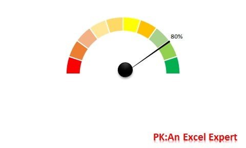
The Speedometer Chart is a visually striking and effective data visualization tool designed to represent a single data point in relation to a specific target range. Perfect for displaying KPIs (Key Performance Indicators), performance metrics, and goals, this chart is ideal for professionals in various industries including business, project management, and data analysis.
Unlike traditional bar or line charts, the speedometer chart offers an intuitive visual that highlights progress towards a target, allowing viewers to quickly assess whether they are on track, ahead, or behind. It’s a highly engaging way to present complex data in a simplified manner.
This Speedometer Chart in Excel makes it easy to visualize a single data point relative to a maximum value, and it’s highly customizable to suit your reporting needs. Whether you’re tracking sales progress, customer satisfaction, or project milestones, the speedometer chart ensures your data speaks clearly and immediately.
Key Features of the Speedometer Chart in Excel
📊 Intuitive Data Representation
This chart visually represents your data against a goal, giving you an immediate understanding of performance, such as whether you’re meeting, exceeding, or falling short of expectations.
🔧 Customizable Ranges & Targets
You can easily adjust the maximum, minimum, and target values to fit your dataset. This flexibility allows you to tailor the chart to any KPI or goal you’re tracking.
🎨 Dynamic & Engaging Visuals
With vibrant colors and a sleek design, the speedometer chart is eye-catching and makes your data stand out. It’s perfect for reports and presentations where clarity and impact are essential.
⚙️ Simple to Use & Implement
This chart is easy to create using Excel, and it comes with clear instructions that guide you through the process, making it simple to implement in your projects.
📈 Track Single or Multiple Metrics
You can use the speedometer chart to track a single KPI or performance metric, or even multiple metrics across various sectors, offering a comprehensive view of progress.
Why You’ll Love the Speedometer Chart in Excel
✅ Visually Engaging & Informative
The speedometer chart provides an intuitive way to monitor progress, making it easy for you and your team to understand performance at a glance.
✅ Perfect for KPI Tracking
Track critical KPIs such as sales targets, project completion, or customer satisfaction in a clear and visually engaging way.
✅ Improve Data Interpretation
With its easy-to-read design, the speedometer chart simplifies complex data, allowing decision-makers to act swiftly and accurately.
✅ Customizable Design
You have full control over the chart’s appearance, from color schemes to the layout, allowing you to align it with your brand’s visual identity or specific presentation style.
✅ Easy to Implement
Create and implement the speedometer chart in minutes. With clear step-by-step instructions, it’s user-friendly even for those with limited charting experience.
What’s Inside the Speedometer Chart in Excel?
-
Clear Data Representation: Easily track and visualize performance against set goals.
-
Customizable Ranges: Adjust the maximum and minimum values as per your data.
-
Dynamic Visual Design: Use colors to represent different performance levels, such as green for on target, yellow for under-performing, and red for above target.
-
Multiple Metrics Support: Track one or more KPIs to monitor overall performance.
-
Easy-to-Follow Instructions: Quick setup process with step-by-step guidelines.
How to Use the Speedometer Chart in Excel
1️⃣ Download the Template: Get instant access to the Speedometer Chart in Excel.
2️⃣ Set the Data Range: Define your maximum, minimum, and target values.
3️⃣ Customize the Appearance: Adjust the chart’s colors and design elements to fit your brand or reporting style.
4️⃣ Insert Your Data: Input your performance metric or KPI to visualize progress.
5️⃣ Track & Analyze: Use the chart to track progress, identify trends, and make data-driven decisions.
Who Can Benefit from the Speedometer Chart in Excel?
🔹 Business Professionals & Managers
🔹 Data Analysts & Project Managers
🔹 Marketing Teams & Sales Departments
🔹 Executives & C-Level Decision Makers
🔹 Consultants & Coaches
🔹 Any Organization Using KPIs & Metrics
Add impact and clarity to your reports with the Speedometer Chart in Excel. Track your KPIs, goals, and performance metrics with a visually engaging and easy-to-understand chart that gets results.
Click here to read the Detailed blog post
Visit our YouTube channel to learn step-by-step video tutorials
Youtube.com/@PKAnExcelExpert


Reviews
There are no reviews yet.