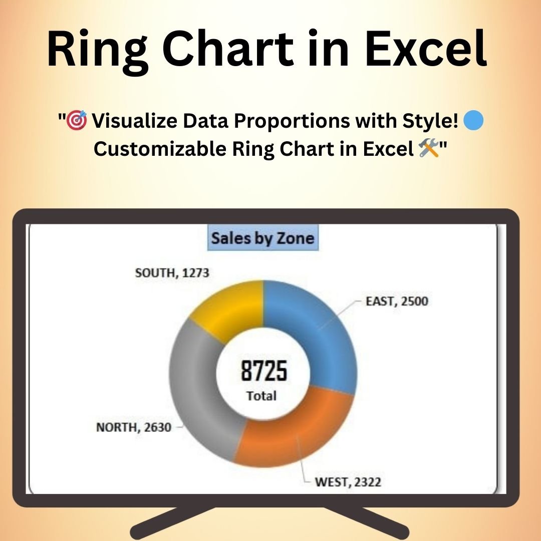
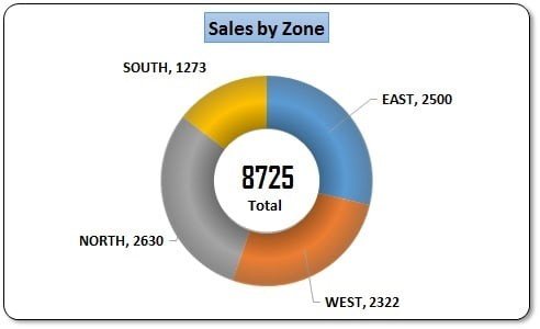
The Ring Chart in Excel is a visually striking and dynamic way to represent proportional data, offering an alternative to traditional pie charts. This chart provides a circular, segmented format that is perfect for showcasing parts of a whole, such as percentages, distribution, or comparisons between categories. The Ring Chart in Excel is fully customizable, enabling you to adjust colors, labels, and segments to create a chart that aligns with your brand or presentation style.
Whether you’re working with market share data, sales figures, or any other data set that requires a clear and impactful visualization, the Ring Chart in Excel ensures that your data is not only understood but also visually appealing. It’s the perfect tool for business reports, presentations, or dashboards, providing a fresh and professional look for your data.
Key Features of the Ring Chart in Excel
📌 Customizable Design
The Ring Chart is highly customizable, allowing you to change the colors, segment sizes, and labels. Whether you’re presenting financial data, product distribution, or survey results, you can tailor the design to match your needs.
🛠 Alternative to Pie Charts
The Ring Chart offers a more modern and stylish alternative to traditional pie charts. It provides the same data insights but with a sleek, ring-shaped design that stands out in reports, presentations, and dashboards.
💡 Proportional Data Representation
This chart is ideal for displaying proportional data. Each segment of the ring represents a part of the whole, making it easy to visualize data breakdowns such as sales by region, market share by company, or revenue by product.
🔢 Clear Labeling and Segmentation
Each segment of the Ring Chart can be labeled with its respective value or percentage, ensuring that your audience can quickly grasp the significance of each part. Labels and numbers are easy to read and can be positioned to enhance chart clarity.
🚀 Real-Time Data Updates
The Ring Chart is linked to your data in Excel, meaning it automatically updates whenever your data changes. This feature is especially useful for ongoing reports or dashboards where the data is constantly evolving.
📊 Interactive and Engaging
This chart is not only visually appealing but also interactive. You can modify the chart’s size, color, and segment positioning to get the exact visual presentation you need. The Ring Chart makes data analysis more engaging and less static than traditional charts.
⚙ Easy Setup and Customization
Creating a Ring Chart in Excel is simple. With just a few clicks, you can insert the chart, customize the design, and start visualizing your data. Even users with basic Excel skills can easily create and modify the chart.
🚀 Why You’ll Love the Ring Chart in Excel
✅ Stylish and Modern Design – A fresh, circular design that is visually appealing and engaging. ✅ Customizable Appearance – Adjust colors, labels, and segments to fit your needs. ✅ Proportional Data Visualization – Clearly display parts of a whole, such as percentages or market share. ✅ Real-Time Updates – Automatically adjust as your data changes in Excel. ✅ Easy to Set Up and Use – Simple steps for creating and customizing your chart.
📂 What’s Inside the Ring Chart in Excel?
- Customizable Ring Chart: A modern, visually appealing circular chart.
- Color and Label Adjustments: Easily change the colors and labels of each segment.
- Real-Time Data Updates: Chart updates automatically when your data changes.
- Clear Setup Instructions: Easy-to-follow guide to creating and customizing the chart.
🔍 How to Use the Ring Chart in Excel
1️⃣ Download the Template – Instant access to the Excel file upon purchase. 2️⃣ Input Your Data – Enter your proportional data into the provided Excel sheet. 3️⃣ Create the Ring Chart – Insert the chart and adjust the design to your preferences. 4️⃣ Customize the Appearance – Modify colors, labels, and segment sizes as needed. 5️⃣ Track and Visualize – Use the chart to monitor data trends or present information clearly.
🎯 Who Can Benefit from the Ring Chart in Excel? 🔹 Business Analysts
🔹 Marketing Teams
🔹 Financial Analysts
🔹 Project Managers
🔹 Sales Teams
🔹 Anyone looking to represent data proportions in a visually striking way
Enhance your data presentations with the Ring Chart in Excel. This dynamic and customizable chart provides a fresh, engaging way to represent data proportions and trends, making your reports and presentations stand out.
Click here to read the Detailed blog post
https://www.pk-anexcelexpert.com/ring-chart-in-excel/


Reviews
There are no reviews yet.