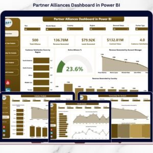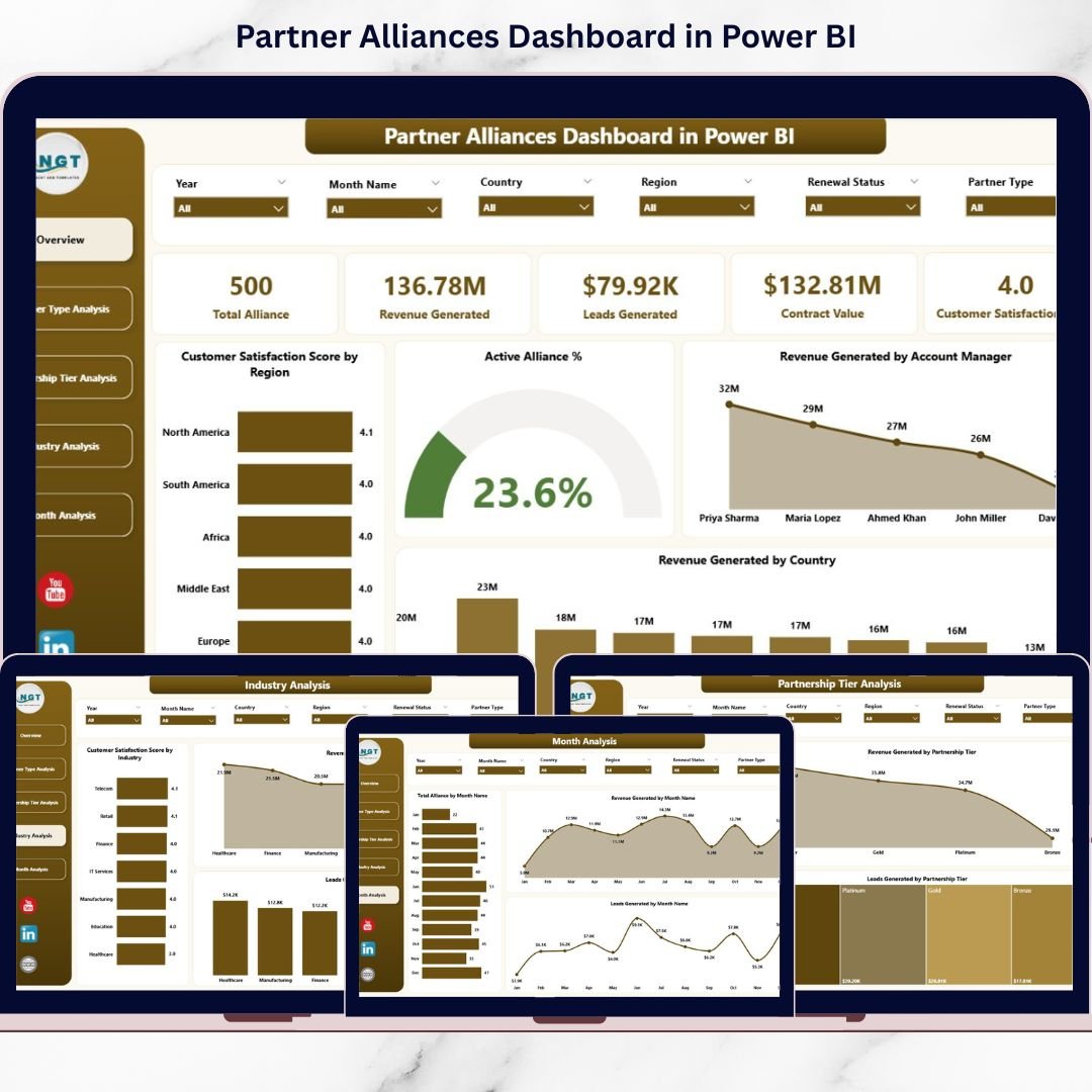
The Partner Alliances Dashboard in Power BI centralizes everything into one powerful, interactive analytics solution. It tracks revenue, leads, tiers, industries, satisfaction scores, and monthly growth — all in real time.
This isn’t just reporting.
This is alliance intelligence. 🚀📊
🚀 Key Feature of Partner Alliances Dashboard in Power BI
📊 5 Interactive Analytical Pages
Analyze alliance performance from multiple perspectives.
🎯 KPI Cards for Instant Insights
Track Active Alliance %, Revenue, Satisfaction, and Manager Performance instantly.
📈 Revenue & Lead Tracking
Monitor financial contribution and pipeline impact clearly.
🏢 Partner Type & Tier Comparison
Evaluate Platinum, Gold, Silver, and Bronze tiers side by side.
🌍 Industry & Country Performance Analysis
Identify profitable markets quickly.
📅 Monthly Trend Monitoring
Track alliance growth and seasonal patterns.
🎛 Dynamic Slicers for Filtering
Filter by Region, Partner Type, Industry, Tier, or Month instantly.
🔎 Real-Time Power BI Visuals
Refresh data and view updated insights immediately.
⚙ Scalable & Customizable Structure
Add new KPIs, dimensions, or measures easily.
📦 What’s Inside the Partner Alliances Dashboard in Power BI
This ready-to-use Power BI solution includes 5 powerful pages:
1️⃣ Overview Page – The Command Center
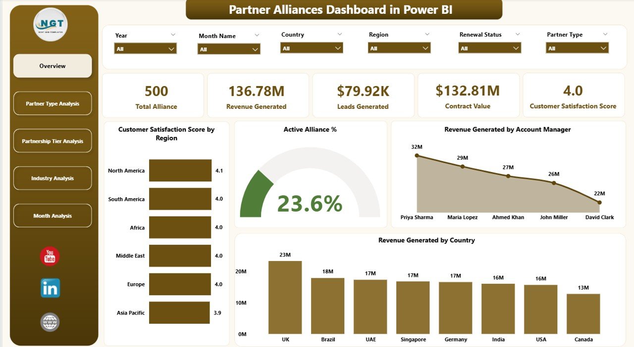
✔ Slicers for filtering
✔ 5 KPI Cards
✔ Region & Manager breakdown
Key Insights:
-
Customer Satisfaction Score by Region
-
Active Alliance %
-
Revenue by Account Manager
-
Revenue by Country
-
Overall Performance Snapshot
This page gives executives immediate visibility into alliance health.
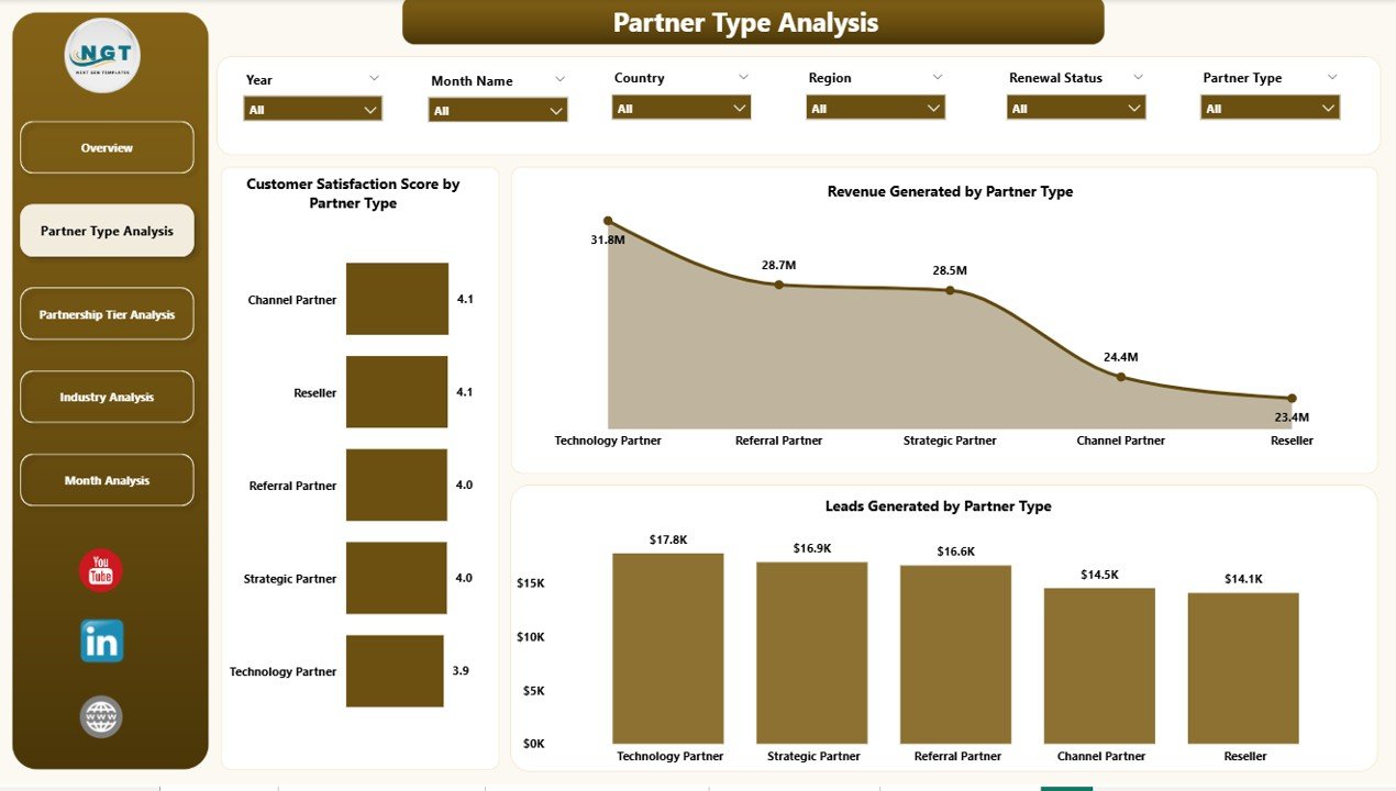
2️⃣ Partner Type Analysis
✔ Satisfaction by Partner Type
✔ Revenue by Partner Type
✔ Leads by Partner Type
Compare Referral, Technology, Distribution, and Strategic partners clearly.
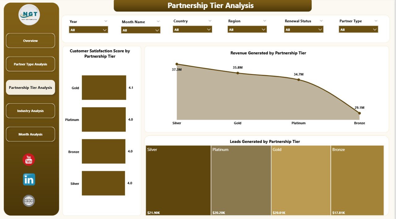
3️⃣ Partnership Tier Analysis
✔ Revenue by Tier
✔ Satisfaction by Tier
✔ Leads by Tier
Analyze Platinum, Gold, Silver, and Bronze tiers to refine incentive models.
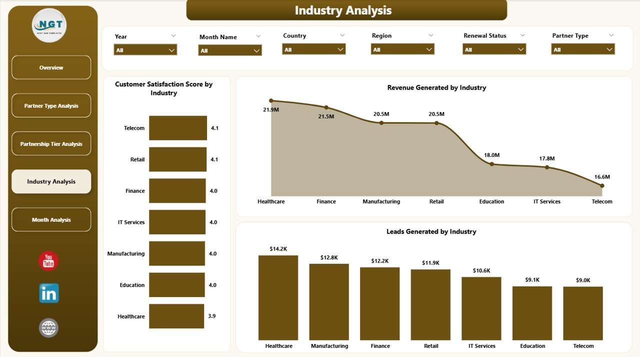
4️⃣ Industry Analysis
✔ Revenue by Industry
✔ Satisfaction by Industry
✔ Leads by Industry
Identify high-growth sectors and expand strategically.
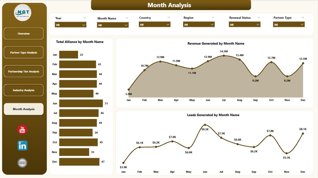
5️⃣ Month Analysis
✔ Total Alliances by Month
✔ Revenue by Month
✔ Leads by Month
Track trends, revenue spikes, and slow periods effectively.
🛠 How to Use the Partner Alliances Dashboard in Power BI
Getting started is simple:
1️⃣ Prepare structured alliance data in Excel
2️⃣ Import into Power BI
3️⃣ Refresh dataset regularly
4️⃣ Use slicers to filter performance
5️⃣ Start with Overview page
6️⃣ Drill into Type, Tier, Industry, or Month analysis
7️⃣ Take strategic action based on insights
No complicated setup — just structured alliance intelligence.
👥 Who Can Benefit from This Partner Alliances Dashboard in Power BI
This dashboard is ideal for:
🤝 Alliance Managers
📊 Sales Directors
📈 Business Development Teams
🌍 Channel Managers
📣 Marketing Leaders
👔 Executive Leadership
Any organization managing distributors, referral partners, resellers, or strategic collaborators can benefit.
Why This Dashboard Strengthens Alliance Strategy
When you track:
-
Customer Satisfaction (CSAT)
-
Active Alliance %
-
Revenue Contribution
-
Leads Generated
-
Tier Performance
-
Industry Contribution
-
Monthly Growth Trends
You gain:
✔ Clear visibility into partner contribution
✔ Faster decision-making
✔ Improved incentive planning
✔ Better forecasting accuracy
✔ Stronger accountability
✔ Higher ROI
Partnerships stop being assumptions. They become measurable assets.
How It Drives Growth
This dashboard helps you:
-
Identify top-performing partners
-
Detect weak-performing tiers
-
Expand into high-revenue industries
-
Monitor country-level performance
-
Align incentives with measurable results
-
Improve partner engagement
Data drives partnerships. Insight drives growth. Power BI drives both.
Click here to read the Detailed blog post
Visit our YouTube channel to learn step-by-step video tutorials
YouTube Channel