
Managing operations without real-time visibility often leads to rising costs, hidden delays, and missed performance targets. Many organizations still depend on static spreadsheets that fail to show the complete operational picture. The Operations Dashboard in Excel solves this problem by converting raw operational data into clear, actionable insights—inside a tool your team already knows and trusts.
This ready-to-use Excel dashboard is designed to help operations leaders, managers, and teams track cost, efficiency, completion rates, delays, and trends across departments, regions, and operation types. Instead of reacting late, you gain the ability to act early, control performance, and improve operational outcomes.
Built entirely in Excel, this dashboard combines simplicity with analytical power—without any dependency on complex BI tools or coding knowledge.
🚀 Key Features of Operations Dashboard in Excel
✅ Centralized Operational Monitoring – View all critical operational KPIs in one structured and visual dashboard.
✅ Planned vs Actual Cost Tracking – Instantly compare budgets with real spending and identify variances.
✅ Department Performance Analysis – Measure efficiency, delays, and cost consumption department-wise.
✅ Regional Performance Insights – Analyze operations across regions to optimize resources and logistics.
✅ Operation Type Evaluation – Compare execution and planning accuracy across different operation categories.
✅ Monthly Trend Analysis – Monitor performance movement over time instead of static reports.
✅ Excel-Based & Fully Editable – Modify KPIs, charts, and logic easily based on your business needs.
📦 What’s Inside the Operations Dashboard in Excel
This product comes with a professionally structured, multi-sheet Excel dashboard, including:
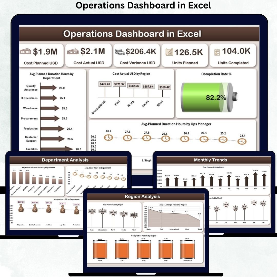
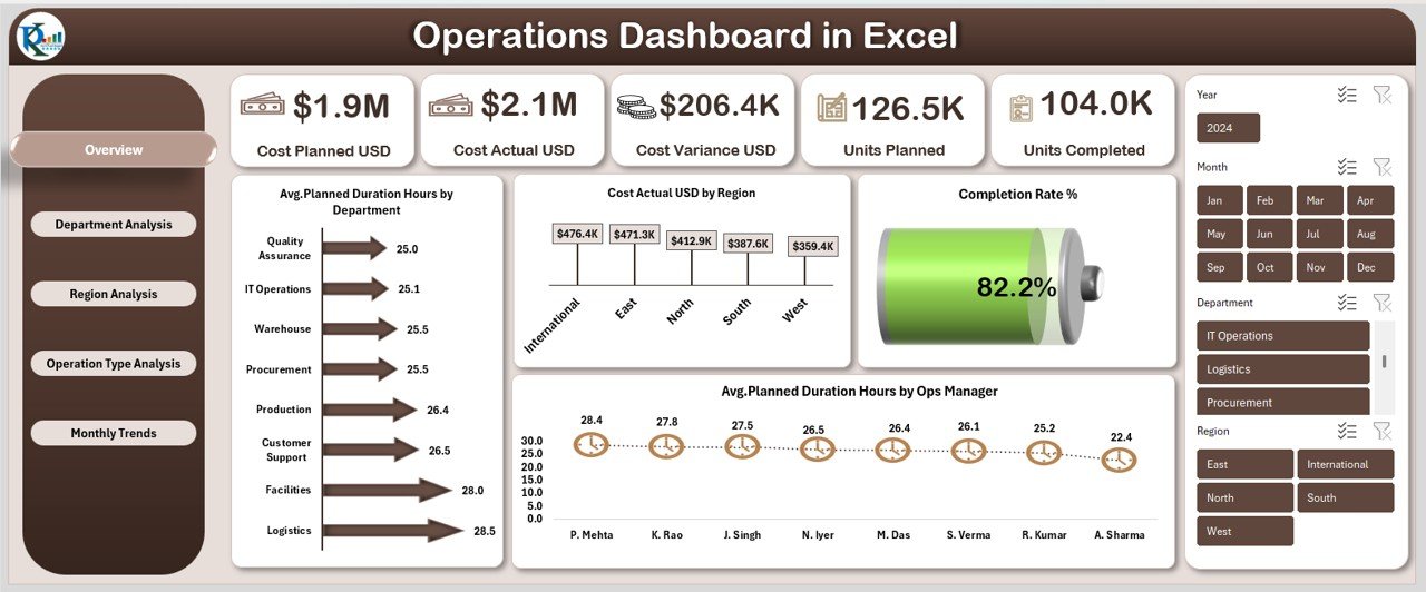
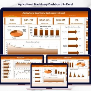
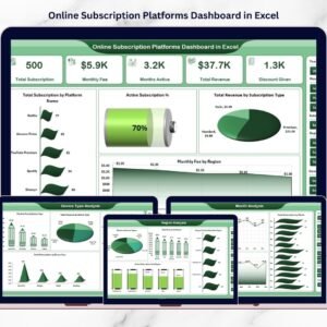
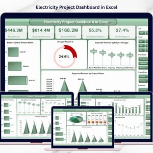
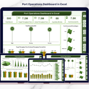
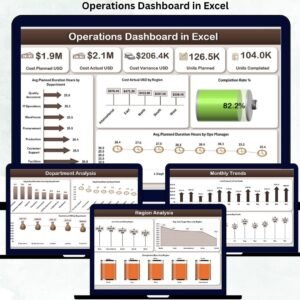
📊 Overview Sheet
Offers a high-level snapshot with key KPIs such as Cost Planned USD, Cost Actual USD, Cost Variance USD, Units Planned, Units Completed, and Completion Rate %. Visuals provide instant clarity for leadership reviews.
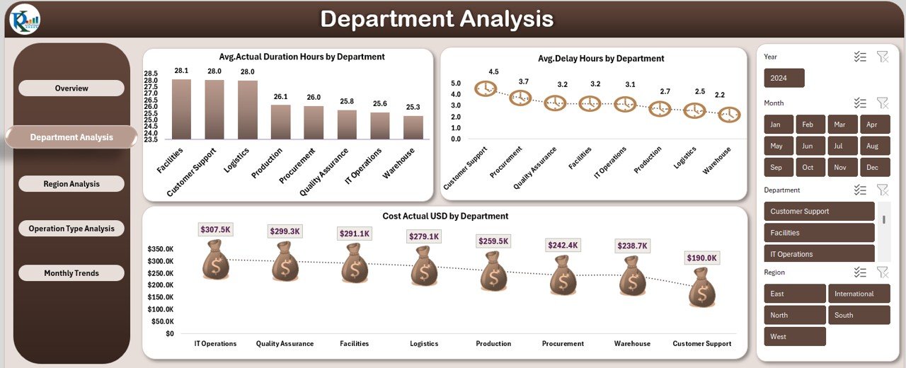
📊 Department Analysis Sheet
Displays Avg. Actual Duration Hours, Avg. Delay Hours, and Cost Actual USD by department—perfect for identifying bottlenecks and accountability gaps.
📊 Region Analysis Sheet
Tracks Cost Planned USD, Completion Rate %, and Avg. SLA Target Hours by region to support geographically distributed operations.
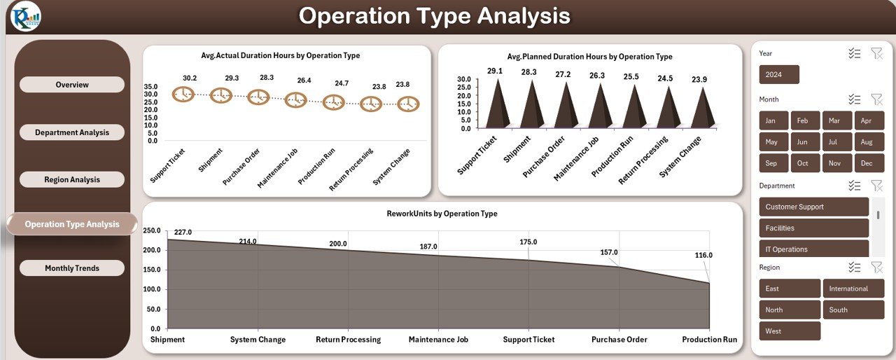
📊 Operation Type Analysis Sheet
Compares planned vs actual duration and rework units by operation type, helping standardize processes and improve quality.
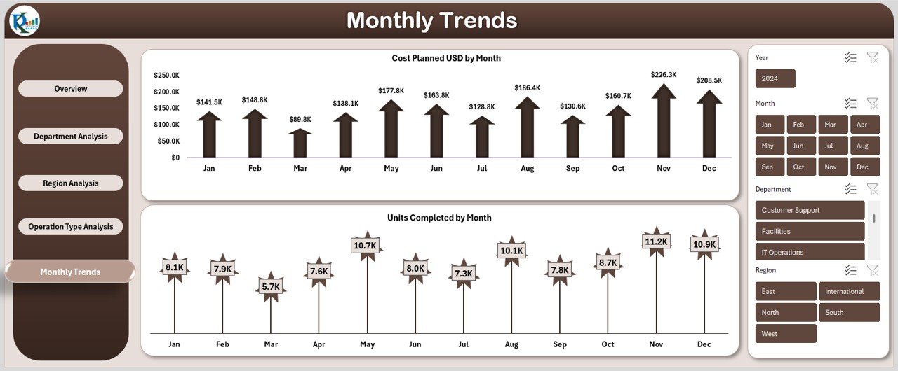
📊 Monthly Trends Sheet
Shows Cost Planned USD and Units Completed by month, enabling forecasting and proactive planning.
Each sheet is structured for clarity, speed, and decision-making efficiency.
🛠️ How to Use the Operations Dashboard in Excel
Using this dashboard is simple and practical:
1️⃣ Enter or update your operational data in the structured input tables
2️⃣ Refresh pivot tables (if required)
3️⃣ Use slicers and filters to analyze departments, regions, or timeframes
4️⃣ Review KPIs, charts, and trends instantly
5️⃣ Take corrective actions using variance and delay indicators
No coding. No complex setup. Just update data and analyze.
🎯 Who Can Benefit from This Operations Dashboard in Excel
This dashboard is ideal for:
📌 Operations Managers and Heads
📌 Project Managers
📌 Department Leaders
📌 Regional Operations Teams
📌 Process Improvement Professionals
📌 Small and Medium Businesses
📌 Excel-driven Enterprises
If your organization manages multiple operations and values performance clarity, this dashboard fits perfectly.
Click here to read the detailed blog post
Watch the step-by-step video tutorial:


Reviews
There are no reviews yet.