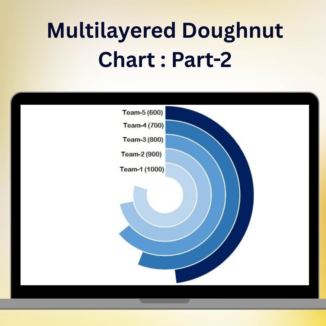
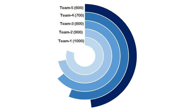
The Multilayered Doughnut Chart Part 2 is an advanced Excel charting solution designed to help you present complex data in a visually appealing and easy-to-understand format. This chart takes your data visualization to the next level by adding multiple layers to a doughnut chart, enabling you to represent several datasets or categories within a single, unified graphic. Perfect for showcasing comparative data, part-to-whole relationships, and trends, this chart can be used in dashboards, reports, and presentations to convey insights clearly and effectively.
In Part 2 of this series, we dive deeper into how to create and customize multilayered doughnut charts, providing you with the tools to enhance your Excel dashboards with detailed visual storytelling. Whether you’re tracking sales data, financial metrics, or project progress, the multilayered doughnut chart offers a sophisticated way to represent data across multiple levels.
Key Features of the Multilayered Doughnut Chart Part 2 in Excel
📊 Multiple Data Layers
Display several datasets in one chart by stacking multiple doughnut layers. Each layer represents a different category, providing a comprehensive view of your data at a glance.
🔄 Customizable Data Visualization
Customize each layer’s color, width, and design to match your preferences and branding. This flexibility allows you to create visually appealing and easy-to-read charts that enhance data understanding.
📈 Compare Categories Efficiently
Easily compare data from different categories by viewing them in separate doughnut layers. This allows for clear differentiation between related datasets, making comparisons quick and intuitive.
📉 Track Performance & Trends
Track key performance metrics and visualize trends over time with layered data representation. This chart is ideal for monitoring progress, identifying growth areas, and pinpointing potential issues.
🖥️ Easy Setup & Implementation
With straightforward instructions and step-by-step guidance, creating a multilayered doughnut chart in Excel is simple. Whether you’re a beginner or an advanced Excel user, you’ll be able to set up the chart quickly and efficiently.
Why You’ll Love the Multilayered Doughnut Chart Part 2 in Excel
✅ Enhance Data Visualization
Elevate your data presentation with multilayered doughnut charts that provide clear, at-a-glance insights into multiple datasets.
✅ Perfect for Multi-Dimensional Data
Ideal for representing multiple KPIs, product categories, financial metrics, or project timelines, the multilayered doughnut chart helps you make sense of complex data relationships.
✅ Visually Appealing & Customizable
Easily customize the chart’s appearance to match your style, from color schemes to layer widths, making it both functional and attractive for any presentation.
✅ Compare Data More Effectively
Multiple layers allow you to compare several data points at once, making it easier to understand relationships and performance metrics.
✅ Save Time with Pre-Built Templates
Speed up your reporting process with pre-built templates that you can use to create multilayered doughnut charts instantly.
What’s Inside the Multilayered Doughnut Chart Part 2 Template in Excel?
- Multiple Layers of Data: Represent multiple categories or datasets within a single chart.
- Color Customization: Change colors for each layer to improve clarity and visualization.
- Data Segmentation: View data in distinct segments for better comparison.
- Flexible Design: Adjust chart elements such as width, color, and labels to suit your needs.
- Performance Tracking: Easily track progress, trends, and performance metrics across different layers.
- Step-by-Step Guidance: Detailed instructions to help you set up the chart and customize it to your exact specifications.
How to Use the Multilayered Doughnut Chart Part 2 in Excel
1️⃣ Download the Template: Get instant access to the Multilayered Doughnut Chart template in Excel.
2️⃣ Input Your Data: Enter your data into the designated sections of the chart template.
3️⃣ Customize the Layers: Customize the color, width, and appearance of each doughnut layer.
4️⃣ Track & Compare Data: Use the multilayered chart to track performance metrics and compare multiple data points.
5️⃣ Update as Needed: Modify the chart as new data comes in, keeping your reports and dashboards up-to-date.
Who Can Benefit from the Multilayered Doughnut Chart Part 2 in Excel?
🔹 Business Analysts & Data Analysts
🔹 Sales & Marketing Teams
🔹 Financial & Operations Managers
🔹 Project Managers & Team Leaders
🔹 Anyone Who Needs to Visualize Multiple Data Sets Simultaneously
🔹 Excel Enthusiasts & Dashboard Designers
Bring clarity and sophistication to your data presentations with the Multilayered Doughnut Chart Part 2 in Excel. Track multiple datasets, visualize performance trends, and present insights in a dynamic and customizable format.
Click here to read the Detailed blog post
Visit our YouTube channel to learn step-by-step video tutorials
Youtube.com/@PKAnExcelExpert


Reviews
There are no reviews yet.