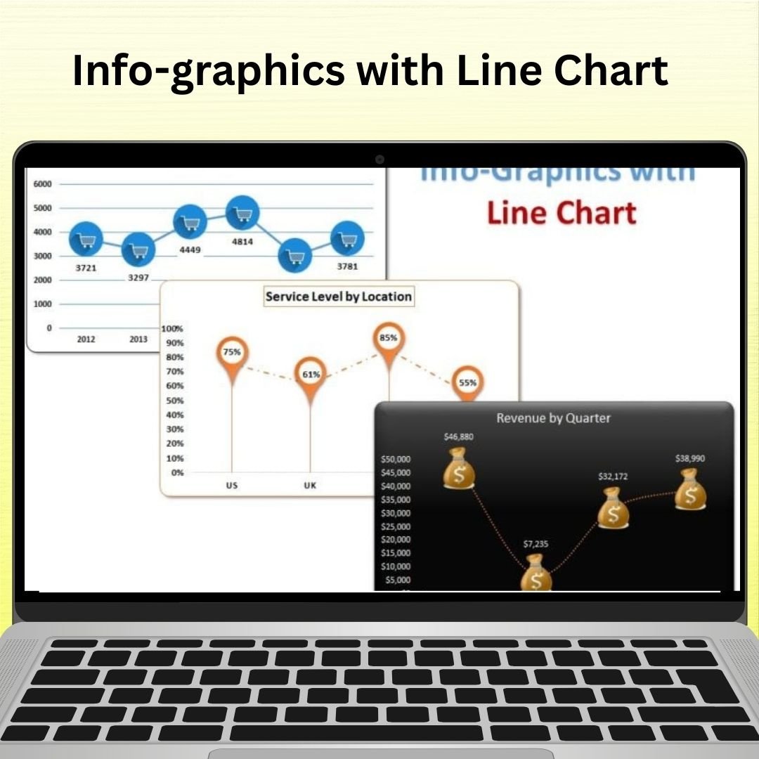
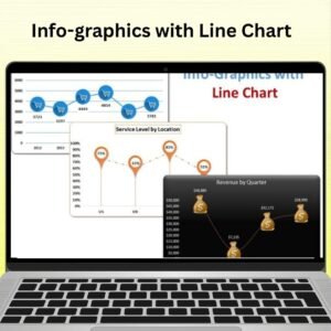
The Info-graphics with Line Chart is an innovative tool designed to transform your data into visually engaging infographics combined with dynamic line charts. This powerful tool allows you to display key performance metrics and trends over time in a sleek, easy-to-understand format. Whether you’re tracking sales, progress on projects, or any other time-based data, this chart will make your presentations and reports more engaging and insightful.
This template combines the clarity of line charts with creative infographic elements to give your data visual appeal and context. It’s perfect for business analysts, marketers, project managers, or anyone looking to present complex data in a clear and visually compelling way. With customizable design options, the Infographics with Line Chart in Excel is ideal for reports, presentations, and dashboards that require both detailed data and eye-catching visuals.
Key Features of the Info-graphics with Line Chart
📌 Engaging Infographic Design
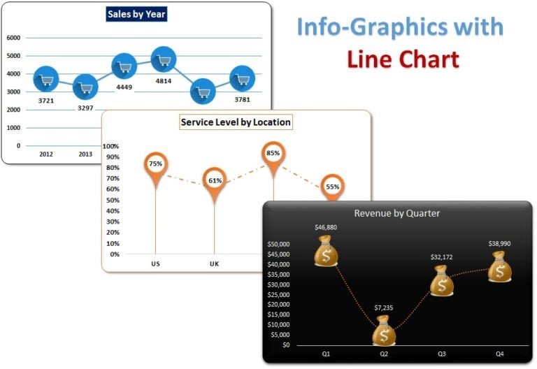
This chart combines line charts with visually appealing infographic elements, making your data more attractive and easy to interpret. With creative visuals, you can better illustrate trends, milestones, and performance metrics over time.
🛠 Customizable Line Charts
Adjust the line chart to suit your specific data needs. Whether you’re tracking sales, revenue growth, or project milestones, you can customize the chart’s data points, colors, and lines to fit your requirements.
💡 Clear Trend Analysis
The line chart provides a clear visual of trends over time, making it easier to spot increases, decreases, and fluctuations. Whether you’re presenting data monthly, quarterly, or yearly, this tool highlights important trends and helps communicate insights quickly.
🔢 Interactive and Dynamic Data
As you update your data, the chart automatically adjusts in real-time, ensuring that the visuals are always up to date. This dynamic feature allows for easy modifications and quick updates as data changes.
🚀 Customizable Design Elements
Customize the infographic’s design, such as icons, colors, and labels, to suit your branding or presentation needs. This chart offers flexibility, allowing you to make it align with your company’s style or personal preferences.
📊 Ideal for Dashboards and Reports
This infographic combined with a line chart is perfect for use in business dashboards, performance reviews, or reports. It makes your presentations more impactful, allowing stakeholders to quickly grasp key metrics.
⚙ User-Friendly Setup
Despite its advanced capabilities, the Infographics with Line Chart in Excel is easy to set up and use. You don’t need advanced Excel skills to start creating beautiful data presentations – simply input your data and watch the magic happen.
🚀 Why You’ll Love the Infographics with Line Chart in Excel
✅ Visually Engaging – Combine the power of infographics and line charts for stunning presentations. ✅ Customizable Design – Adjust the design, colors, and data to suit your needs. ✅ Clear Trend Visualization – Easily spot data trends and fluctuations. ✅ Real-Time Updates – The chart dynamically adjusts as you input new data. ✅ Perfect for Dashboards – Enhance reports, presentations, and dashboards with this tool. ✅ Simple and User-Friendly – Easy to customize and use without advanced Excel skills.
📂 What’s Inside the Infographics with Line Chart in Excel?
- Line Chart Integration: Track trends and performance metrics with a dynamic line chart.
- Infographic Elements: Add creative, visual elements to enhance data understanding.
- Customizable Design: Personalize the chart to fit your branding or reporting style.
- Step-by-Step Setup Instructions: Clear, concise instructions for setting up the chart.
🔍 How to Use the Infographics with Line Chart in Excel
1️⃣ Download the Template – Instant access to the Excel file upon purchase. 2️⃣ Enter Your Data – Add your time-based data, such as sales figures, project milestones, or any other metrics. 3️⃣ Customize the Chart – Adjust the design, colors, and infographic elements. 4️⃣ Track and Visualize Trends – Monitor performance over time and spot trends. 5️⃣ Present and Share – Use the chart in reports or presentations for visual impact.
🎯 Who Can Benefit from the Infographics with Line Chart in Excel? 🔹 Business Analysts
🔹 Marketing Teams
🔹 Project Managers
🔹 Sales Teams
🔹 Financial Analysts
🔹 Anyone needing to present time-based data in a visually compelling way
Turn your data into visually engaging presentations with the Infographics with Line Chart in Excel. With its easy-to-use design and powerful data visualization capabilities, this tool will enhance your reports and presentations.
Click here to read the Detailed blog post
https://www.pk-anexcelexpert.com/info-graphics-with-line-chart/


Reviews
There are no reviews yet.