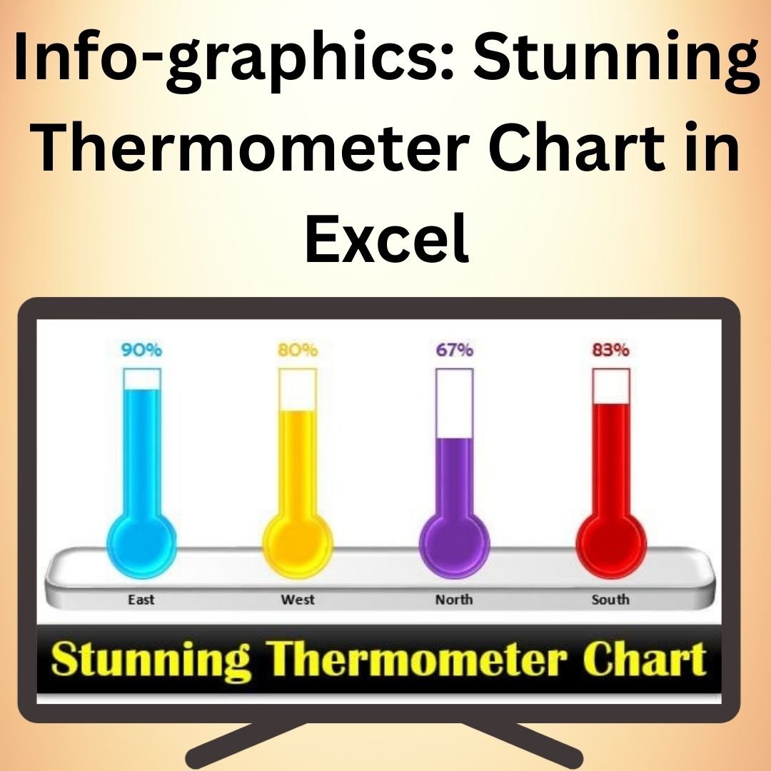
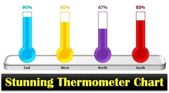
The Stunning Thermometer Chart in Excel is a visually impactful way to represent progress, goals, and performance metrics. This chart is ideal for showcasing how much progress has been made towards a specific target, such as sales goals, fundraising objectives, or project milestones. With its vibrant and eye-catching design, the Thermometer Chart helps make your data more engaging and easier to understand, allowing stakeholders to quickly assess progress at a glance.
The Stunning Thermometer Chart is fully customizable, letting you adjust colors, labels, and data ranges to perfectly fit your needs. Whether you’re tracking goals for business targets, budget management, or performance reviews, this chart offers a dynamic way to visually represent your progress. It’s perfect for use in reports, presentations, and dashboards, offering a clean and professional look.
Key Features of the Stunning Thermometer Chart in Excel
📌 Vibrant and Engaging Design
The Thermometer Chart uses a vibrant color gradient to display progress, with a clear visual indication of how much has been completed versus the goal. This chart is designed to attract attention and clearly communicate progress in a way that is easy to interpret.
🛠 Customizable Colors and Labels
Easily customize the chart’s colors to match your company’s branding or presentation style. You can also adjust the labels and axis to make sure the chart fits your specific use case, whether you’re tracking sales, fundraising, or other goals.
💡 Clear and Precise Goal Tracking
The Thermometer Chart helps track goals by showing both the target and current progress. This is perfect for projects or campaigns where it’s important to highlight milestones and motivate teams to reach their objectives.
🔢 Dynamic Data Representation
As your data changes, the thermometer chart automatically updates to reflect the new values. This dynamic feature ensures that your chart always displays the most accurate and up-to-date information, which is especially useful in fast-moving environments.
🚀 Easy to Set Up
Setting up the Thermometer Chart in Excel is simple, even for beginners. The process is straightforward, with clear instructions provided. This means that you can start visualizing your data right away without needing advanced Excel skills.
📊 Perfect for Presentations and Reports
The Thermometer Chart is ideal for presentations, reports, and dashboards. Its visually engaging design makes it easy to highlight key metrics and showcase progress in a professional and dynamic way.
⚙ User-Friendly Interface
With its clean layout and clear visuals, the Thermometer Chart is easy to understand and use. It’s a great tool for any business, nonprofit, or project team looking to display data in a way that’s both informative and visually appealing.
🚀 Why You’ll Love the Stunning Thermometer Chart in Excel
✅ Visual Impact – The vibrant design draws attention to your data and makes progress easy to track. ✅ Customizable Appearance – Adjust colors, labels, and ranges to suit your needs. ✅ Dynamic Data Updates – The chart automatically adjusts as your data changes. ✅ Professional and Engaging – Perfect for reports, presentations, and dashboards. ✅ Simple Setup – Set up your chart quickly and easily with clear instructions.
📂 What’s Inside the Stunning Thermometer Chart in Excel?
- Vibrant Thermometer Chart: A dynamic and visually engaging chart for tracking progress.
- Customizable Design: Adjust colors, labels, and data ranges to fit your needs.
- Dynamic Data Updates: Automatically update as your data changes.
- Clear Setup Instructions: Simple, easy-to-follow steps for setting up your chart.
🔍 How to Use the Stunning Thermometer Chart in Excel
1️⃣ Download the Template – Instant access to the Excel file upon purchase. 2️⃣ Input Your Data – Enter the target value and current progress into the provided Excel sheet. 3️⃣ Customize the Design – Adjust the chart’s colors and labels to suit your branding or reporting style. 4️⃣ Track Progress – Watch the thermometer fill up as your data updates. 5️⃣ Share and Present – Use the chart in reports or presentations to highlight progress.
🎯 Who Can Benefit from the Stunning Thermometer Chart in Excel? 🔹 Business Analysts
🔹 Sales Teams
🔹 Marketing Teams
🔹 Project Managers
🔹 Fundraising Teams
🔹 Anyone needing to visually track and represent goals or progress
Track and visualize progress towards your goals with the Stunning Thermometer Chart in Excel. This dynamic tool helps you stay motivated and focused by providing a clear, visual representation of how far you’ve come and what still needs to be done.
Click here to read the Detailed blog post
https://www.pk-anexcelexpert.com/info-graphics-stunning-thermometer-chart-in-excel/


Reviews
There are no reviews yet.