
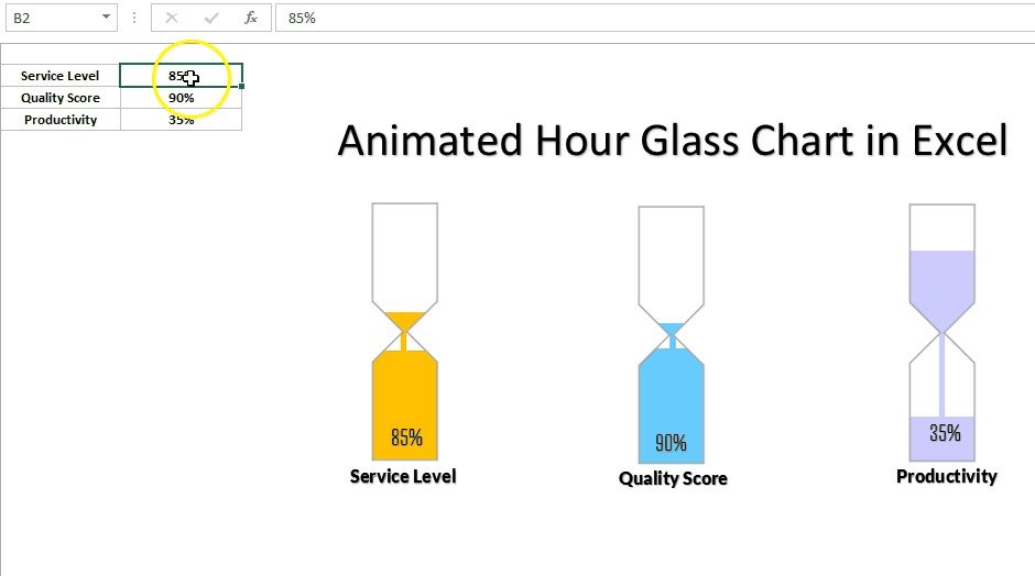
The Animated Hour Glass Chart in Excel is a unique and visually engaging tool designed to help you display data in a way that is both informative and eye-catching. This template enables you to create an animated hourglass chart that dynamically highlights key performance indicators (KPIs) or other important data points. The hourglass chart is perfect for comparing data, tracking progress, or visualizing trends over time in a way that captures the attention of your audience.
Using this animated hourglass chart, you can represent multiple data series in a visually appealing format. The animation feature allows for smooth transitions, making it easy to show changes in data over time or highlight specific data points during presentations. Whether you’re reporting sales performance, project progress, or other business metrics, the Animated Hourglass Chart in Excel will make your data come to life.
Key Features of the Animated Hourglass Chart in Excel
⏳ Dynamic Data Animation
The hourglass chart comes with an animated feature that smoothly updates and transitions as data changes, offering an engaging experience during presentations or reports.
📊 Multiple Data Series Display
Represent multiple data sets in the hourglass chart simultaneously. This allows you to compare and contrast different metrics, track progress, and display results in one consolidated visual.
📈 Perfect for KPI Tracking
Use the hourglass chart to track key performance indicators (KPIs), sales figures, project milestones, and more. The dynamic nature of the chart makes it ideal for showing progress over time.
🎨 Fully Customizable Design
Tailor the chart to your specific needs with customizable colors, labels, and design elements. Match it to your company’s branding or adjust it for specific presentations.
🖥️ Interactive & Easy to Use
The template is user-friendly and easy to implement. Just input your data, and the hourglass chart will automatically update with animated transitions. No advanced Excel skills are required.
Why You’ll Love the Animated Hourglass Chart in Excel
✅ Engage Your Audience
With the animated transition feature, your data is presented in a dynamic way that grabs your audience’s attention, making it easier for them to understand and retain the information.
✅ Track and Compare Multiple Data Points
Showcase multiple KPIs or datasets simultaneously in the hourglass chart. Use it to compare sales figures, track project milestones, or present other performance metrics.
✅ Visually Appealing and Professional
The hourglass chart provides a sleek and professional design for any presentation, making complex data simple and visually appealing for your audience.
✅ Easy to Customize & Use
Customizing the chart to fit your branding or presentation needs is simple. Input your data, and the chart will do the rest, providing an updated, animated view of your metrics.
✅ Perfect for Reports & Presentations
Use the animated hourglass chart in business reports, meetings, and presentations to effectively communicate your data in a visually impactful way.
What’s Inside the Animated Hourglass Chart in Excel Template?
- Animated Transitions: Smooth transitions and animations for a dynamic presentation of data.
- Multiple Data Series: Display and compare several datasets at once in the hourglass format.
- Customizable Design: Change colors, fonts, and labels to fit your branding or style.
- KPI & Metric Tracking: Ideal for tracking key performance indicators, project milestones, and business metrics.
- Interactive Elements: Easily update data with real-time animation and visual updates.
- User-Friendly Interface: Simple setup and easy-to-use template, perfect for all skill levels.
How to Use the Animated Hourglass Chart in Excel
1️⃣ Download the Template: Get instant access to the Animated Hourglass Chart in Excel.
2️⃣ Input Your Data: Enter your data for the KPIs or metrics you want to track in the chart.
3️⃣ Customize the Design: Adjust the colors, fonts, and labels to match your branding or presentation needs.
4️⃣ Track & Visualize: Watch your data come to life with animated transitions, showing updates and progress in real-time.
Who Can Benefit from the Animated Hourglass Chart in Excel?
🔹 Business Owners & Entrepreneurs
🔹 Project Managers & Team Leaders
🔹 Marketing & Sales Teams
🔹 Data Analysts & Business Intelligence Professionals
🔹 Anyone Looking to Present Data in a Visually Engaging Way
🔹 Anyone Reporting on KPIs, Performance, or Progress Metrics
Enhance your data presentations with the Animated Hourglass Chart in Excel. Use it to track KPIs, monitor project progress, or simply present data in a more interactive and engaging way.
Click here to read the Detailed blog post
Visit our YouTube channel to learn step-by-step video tutorials
Youtube.com/@PKAnExcelExpert


Reviews
There are no reviews yet.