

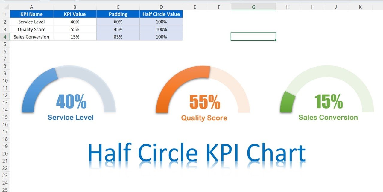
The Half Circle KPI Charts in Excel using Doughnut Charts template is a visually stunning and highly functional tool designed to track key performance indicators (KPIs) in an innovative and engaging way. Using doughnut charts to create dynamic half-circle visuals, this template allows you to track metrics such as sales progress, project completion, or any performance data in a clear and easy-to-understand format.
This template is fully customizable, allowing you to adjust the color, size, and data fields to suit your specific KPIs. The half-circle chart design not only makes your data visually appealing but also helps to highlight important trends and performance metrics at a glance. It’s the perfect solution for business analysts, project managers, and teams who want to present data in a more engaging and modern way.
Key Features of the Half Circle KPI Charts in Excel Using Doughnut Charts
📌 Visually Engaging Half-Circle Design
The half-circle doughnut chart offers a fresh take on traditional bar or pie charts, providing a visually engaging way to display KPIs. It’s perfect for presentations or reports where you want to grab attention and make an impact.
🛠 Customizable Data Fields
Easily adjust the data fields to track a variety of KPIs. Whether you’re tracking project completion, sales growth, or any other performance metric, you can modify the chart to fit your specific needs.
💡 Color-Coded Progress Representation
Use color to represent progress in the half-circle chart. The customizable color options allow you to visually differentiate between various levels of performance, making it easy to understand at a glance.
🔢 Real-Time Data Updates
As you input or modify data, the chart automatically updates in real-time. This ensures that your progress is always accurately represented, providing you with up-to-date insights into your metrics.
🚀 Multiple Use Cases
Whether you’re tracking individual goals, team KPIs, or overall project progress, this template is flexible enough to be used for a wide range of data tracking needs. From business performance to personal development, the half-circle KPI chart is ideal for any scenario.
📊 Simple Setup and Customization
No advanced Excel skills are required to use or customize the chart. The template comes with clear instructions and an easy setup process, allowing you to quickly integrate the chart into your own workbooks.
⚙ Professional Look
This template helps you present data in a professional and visually appealing way. Perfect for internal reports, team meetings, or presentations to stakeholders, the half-circle chart will make your data more impactful and memorable.
🚀 Why You’ll Love the Half Circle KPI Charts in Excel Using Doughnut Charts
✅ Fresh and Unique Design – Track KPIs with a half-circle chart that stands out from traditional bar or pie charts. ✅ Customizable and Flexible – Tailor the chart to track any metric or KPI you need. ✅ Real-Time Updates – Automatically update the chart as new data is entered. ✅ Easy to Set Up – Simple to use and modify, with no advanced Excel skills needed. ✅ Professional Presentation – Make your data more engaging and impactful with visually compelling charts.
📂 What’s Inside the Half Circle KPI Charts in Excel Using Doughnut Charts?
- Half-Circle Doughnut Chart: A modern and visually engaging chart format to track KPIs.
- Customizable Data: Easily modify data fields to track various performance metrics.
- Color-Coded Progress: Use color to represent different levels of performance.
- Real-Time Updates: The chart updates automatically as new data is entered.
- Easy Setup: Simple instructions to customize and implement the chart in your workbook.
🔍 How to Use the Half Circle KPI Charts in Excel Using Doughnut Charts
1️⃣ Download the Template – Get instant access to the Excel file upon purchase. 2️⃣ Customize Your Data – Adjust the chart to track the KPIs or performance metrics relevant to your goals. 3️⃣ Enter Data – Input your data and watch the half-circle chart update automatically. 4️⃣ Track Progress – Visualize your performance in real-time using the color-coded half-circle chart. 5️⃣ Present and Share – Use the chart in presentations, meetings, or reports to showcase your progress.
🎯 Who Can Benefit from the Half Circle KPI Charts in Excel Using Doughnut Charts? 🔹 Project Managers 🔹 Sales Teams 🔹 Business Analysts 🔹 HR Teams 🔹 Marketing Professionals 🔹 Anyone needing to track and present KPIs in an engaging and modern way
Track your KPIs and visualize progress with style using the Half Circle KPI Charts in Excel Using Doughnut Charts. This template makes your data more engaging, dynamic, and easy to understand.
Click here to read the Detailed blog post
https://www.pk-anexcelexpert.com/half-circle-kpi-charts-in-excel-using-doughnut-charts/


Reviews
There are no reviews yet.