The grocery delivery industry is evolving faster than ever. With rising customer expectations for quick delivery, fresh products, smooth payments, and excellent service, companies must stay ahead with accurate, real-time insights. Manual reports and scattered spreadsheets cannot support such fast-moving operations. The Grocery Delivery Services Dashboard in Power BI solves this challenge by offering a clean, powerful, and interactive way to track performance every day.
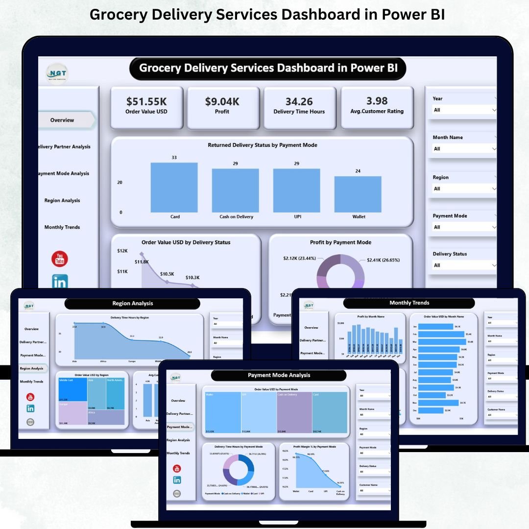
This ready-to-use Power BI dashboard brings together all essential grocery delivery KPIs—order value, profit, delivery time, regional insights, partner performance, payment behavior, and monthly trends—into one simple, structured view. Whether you manage operations, customer experience, delivery partners, or financial performance, this dashboard helps you make fast and confident decisions.
Because the dashboard runs in Power BI, visuals update instantly with slicers, filters, and connected charts. Teams no longer waste hours combining reports; instead, they get everything they need in seconds.
✨ Key Features of the Grocery Delivery Services Dashboard in Power BI
📦 Complete Visibility of Grocery Delivery KPIs
Track order value, profit, delivery time, satisfaction score, partner performance, and more, all in one place.
⏱ Instant Performance Insights
Slicers and visuals update instantly helping teams detect delays, issues, and improvements quickly.
💳 Payment Behavior Intelligence
Understand how different payment modes impact delivery success, profitability, and customer experience.
👥 Partner-Wise Delivery Insights
Analyze each delivery partner’s performance to strengthen SLAs and improve service reliability.
🌍 Regional Comparison at a Glance
Identify which regions deliver faster, drive higher revenue, or show higher satisfaction levels.
📅 Monthly Trend Analysis
Understand seasonal patterns and prepare for peak-demand periods.
🧭 Simple Navigation for Every User
Each page includes easy-to-use navigation, making the dashboard perfect for beginners and experts.
📦 What’s Inside the Grocery Delivery Services Dashboard in Power BI
This dashboard has five activity-focused pages, each designed to give clear operational and financial visibility.
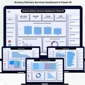
📌 1. Overview Page – Your Complete Business Snapshot
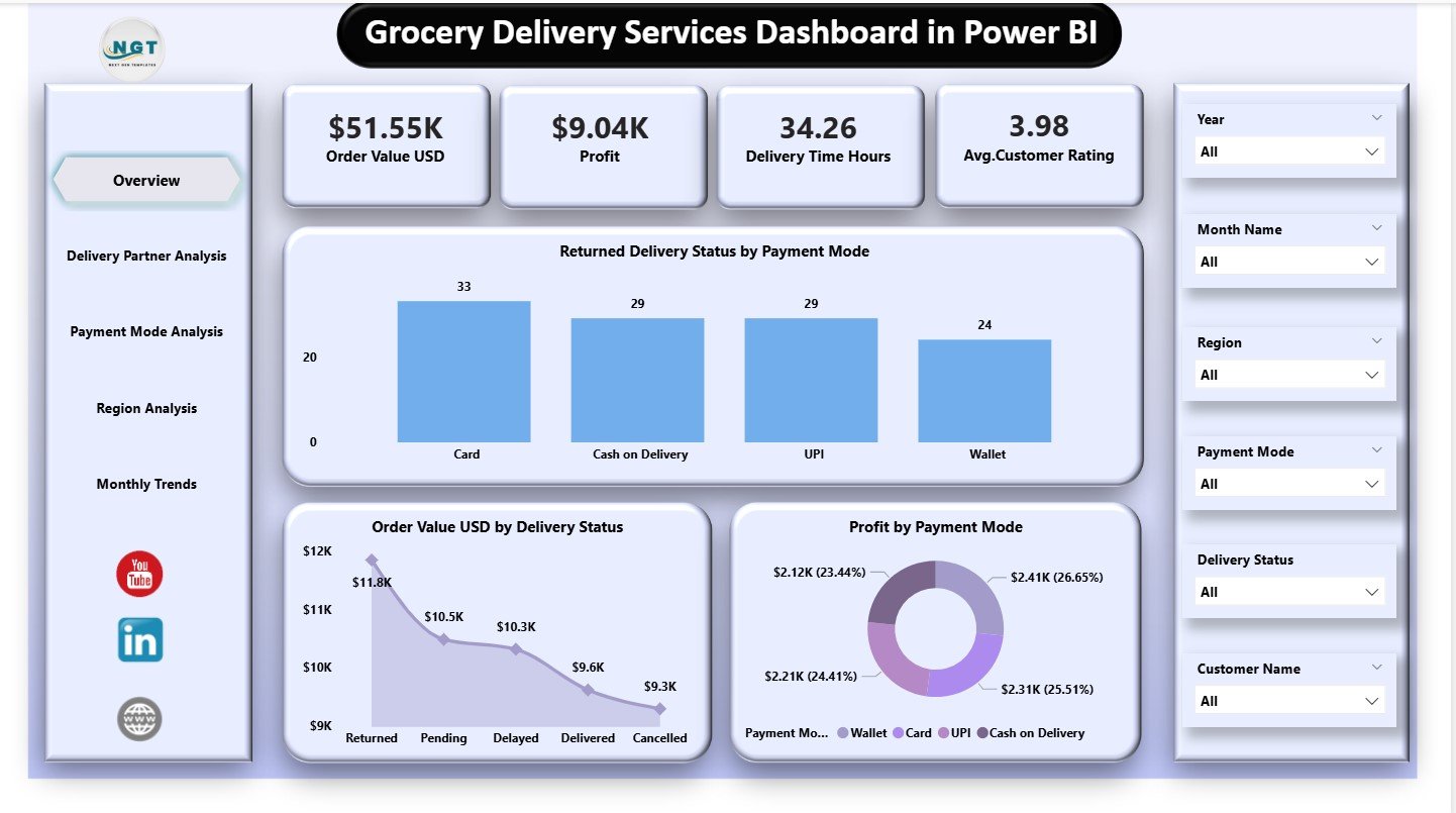
This is the main performance screen and displays four powerful KPI cards:
-
⭐ Order Value (USD)
-
⭐ Profit
-
⭐ Delivery Time (Hours)
-
⭐ Average Satisfaction Rating
Below the KPI cards, three critical charts highlight:
-
Returned Delivery Status by Payment Mode
-
Order Value by Delivery Status
-
Profit by Payment Mode
The Overview Page is perfect for leadership teams who want a quick and accurate summary of daily and monthly performance.
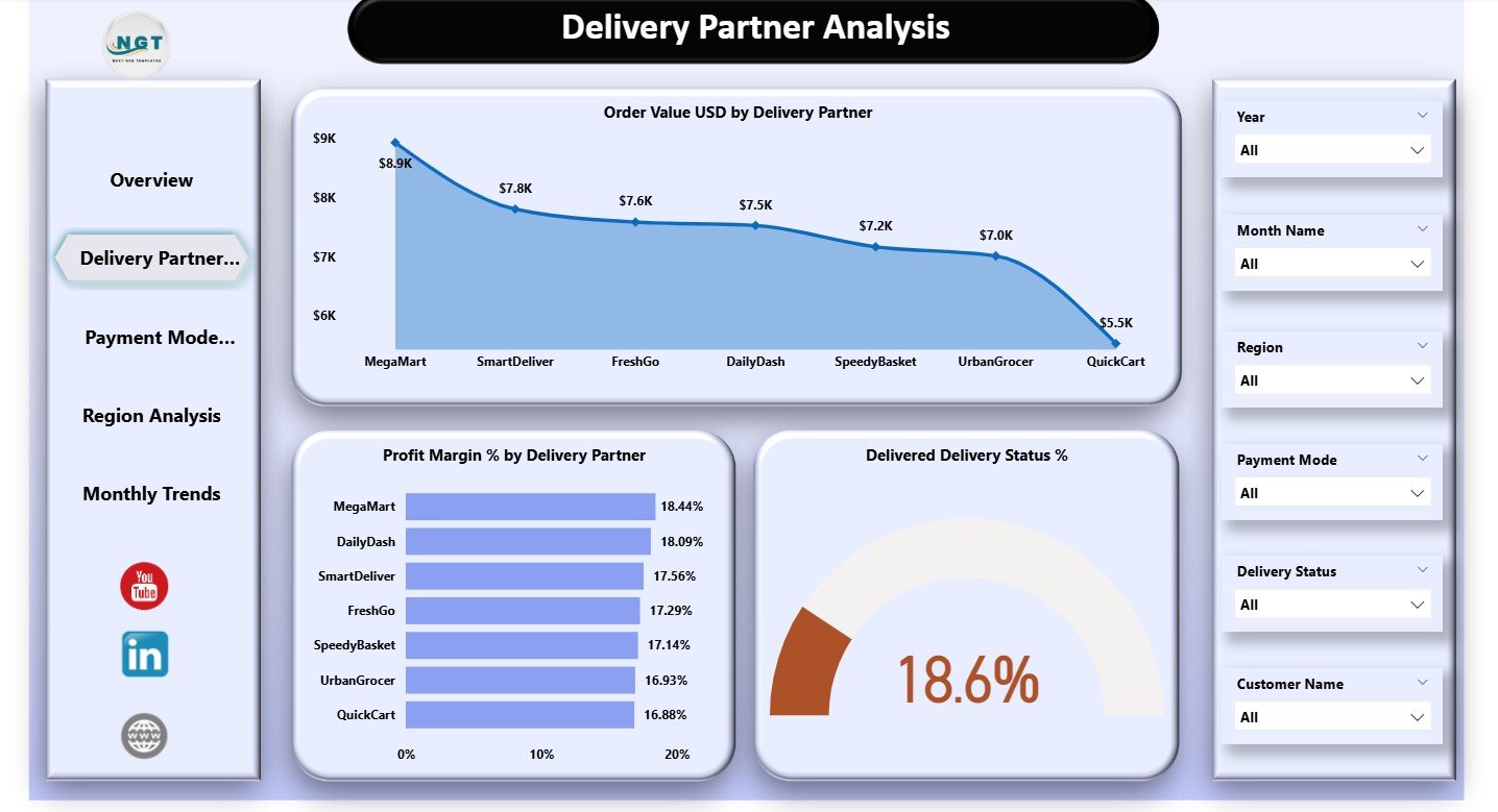
📌 2. Delivery Partner Analysis – Evaluate Partner Performance
Delivery partners greatly influence delivery time, customer satisfaction, and overall operational efficiency.
This page includes charts for:
-
Order Value (USD) by Delivery Partner
-
Profit Margin % by Delivery Partner
-
Delivered Delivery Status %
These insights help teams determine which partners perform better and which ones cause delays, low ratings, or increased costs.
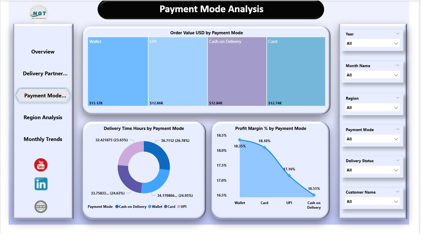
📌 3. Payment Mode Analysis – Understand Customer Payment Behavior
Customer payment choices can reveal major patterns in revenue and delays.
This page visualizes:
-
Order Value by Payment Mode
-
Delivery Time (Hours) by Payment Mode
-
Profit Margin % by Payment Mode
Companies use this section to identify high-risk payment modes, optimize pricing, and improve customer experience.
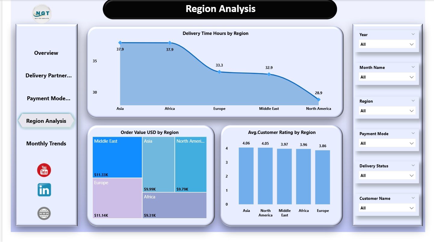
📌 4. Region Analysis – Discover Regional Differences
Every region behaves differently based on traffic, density, customer behavior, and distance.
This page includes:
-
Delivery Time Hours by Region
-
Order Value (USD) by region
-
Average Satisfaction Rating by Region
These insights guide better resource allocation, route planning, and regional strategy improvements.
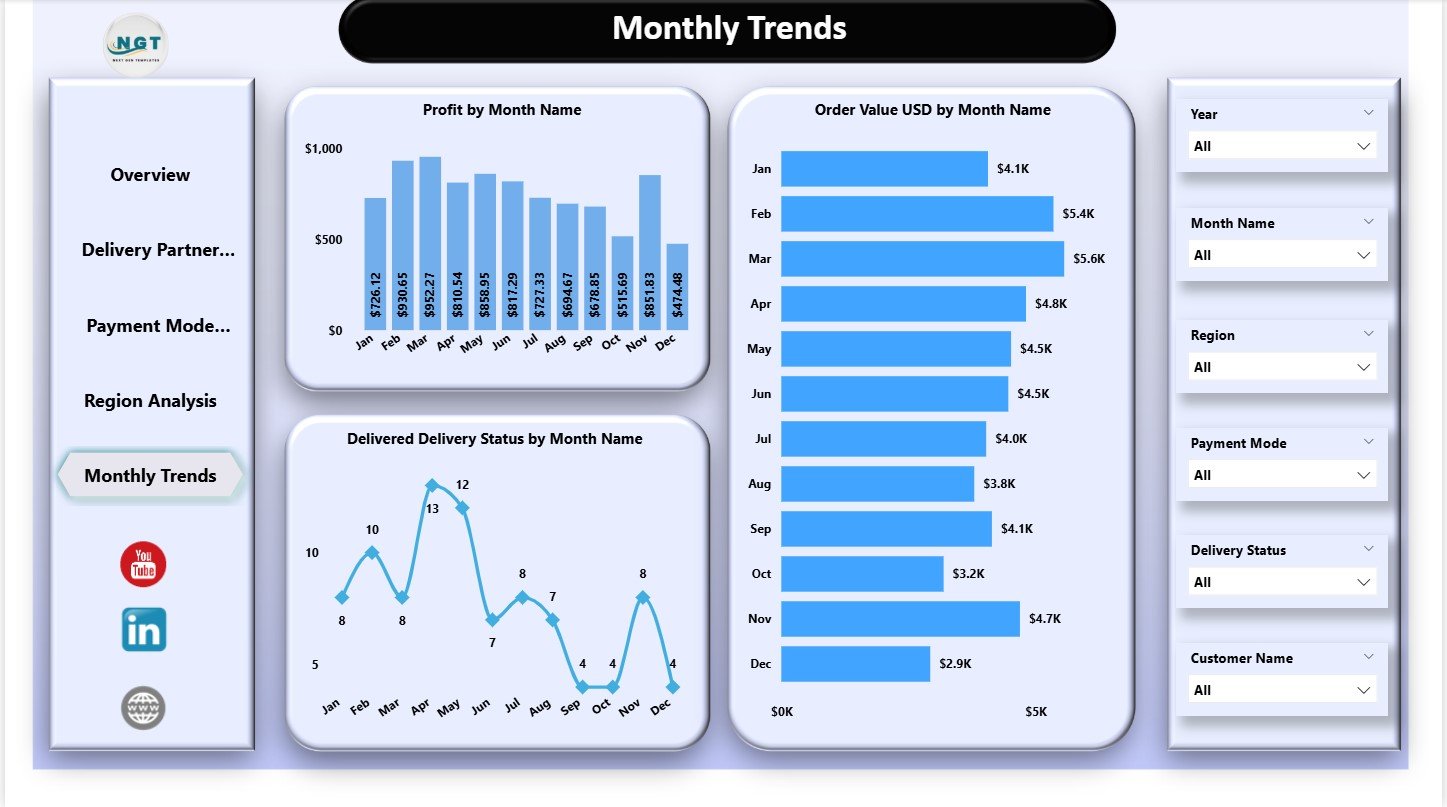
📌 5. Monthly Trends – Identify Seasonal Patterns
The Monthly Trends page reveals performance movement across months with three key charts:
-
Profit by Month
-
Order Value by Month
-
Delivered Delivery Status by Month
Teams use this to plan staffing, marketing campaigns, and logistics operations for high-demand seasons.
🛠 How to Use the Grocery Delivery Services Dashboard in Power BI
1️⃣ Load your updated data in Power BI
2️⃣ Refresh visuals to update KPIs instantly
3️⃣ Use slicers for partner-wise, region-wise, or month-wise analysis
4️⃣ Compare payment modes for profit and failure insights
5️⃣ Check monthly trends for forecasting and planning
6️⃣ Track satisfaction and delivery time regularly
With this simple workflow, teams gain complete control of their delivery ecosystem.
👥 Who Can Benefit from This Dashboard
This dashboard is ideal for:
🛒 Grocery delivery companies
🚴 Delivery partner networks
📦 Hyperlocal delivery startups
📍 Regional delivery managers
📊 Customer experience teams
🧾 Finance & operations teams
🏬 Multi-store retail chains
Anyone responsible for fast, accurate delivery operations will benefit greatly.


Reviews
There are no reviews yet.