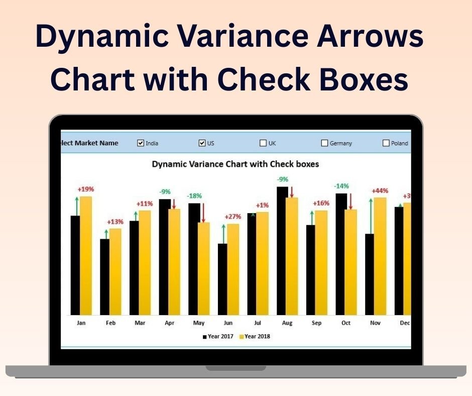
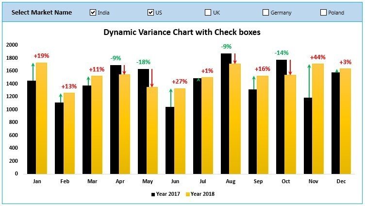
The Dynamic Variance Arrows Chart with Check Boxes is a unique and powerful Excel tool designed to track and visualize performance variances across various metrics with an interactive and user-friendly interface. This tool allows you to monitor performance trends, highlight key variances using dynamic arrows, and manage specific metrics with checkboxes for flexible data analysis. Ideal for financial analysts, project managers, and business owners, this chart enables you to track and communicate performance variances in a clear and actionable way.
With checkboxes, you can easily manage the visibility of specific data points or metrics, allowing for customized and interactive analysis. The dynamic arrows will automatically adjust based on your data, providing an instant view of whether performance is meeting, exceeding, or falling short of expectations.
Key Features of the Dynamic Variance Arrows Chart with Check Boxes:
📊 Dynamic Variance Arrows
Track performance variance with dynamic arrows that visually represent positive and negative variances. This feature provides immediate insights into areas of success and improvement.
✔️ Interactive Checkboxes
Use checkboxes to toggle the visibility of different data points or metrics. This makes it easier to filter the data and focus on specific aspects of your performance analysis.
📈 Real-Time Data Updates
The chart automatically updates in real-time, providing an up-to-date visualization of your performance metrics. When data changes or checkboxes are selected, the chart adjusts dynamically.
🎨 Customizable Design
Easily customize the appearance of the chart, including the colors, labels, and layout, to fit your specific reporting needs and business branding.
🔄 Comprehensive Performance Monitoring
Track a variety of performance metrics, such as sales performance, project progress, or financial KPIs, using a clear and effective data visualization tool.
Why You’ll Love the Dynamic Variance Arrows Chart with Check Boxes:
✅ Real-Time Tracking – Get immediate feedback on performance with dynamic arrows and checkboxes that allow you to visualize key variances in real-time. ✅ Interactive and Customizable – Use checkboxes to customize the data you want to focus on, making the chart highly interactive and adaptable to different business needs. ✅ Clear Data Representation – The dynamic arrows make it easy to see at a glance whether performance is above or below target, and the checkboxes allow you to filter the data to focus on key areas. ✅ Easy to Use – The chart is simple to set up and doesn’t require advanced Excel skills. The checkboxes make it user-friendly for anyone in your team to manage the data. ✅ Perfect for Reports and Presentations – The clear visual representation of data makes this tool ideal for use in business reports, presentations, and meetings, where you need to showcase performance metrics effectively.
What’s Inside the Dynamic Variance Arrows Chart with Check Boxes:
- Dynamic Variance Arrows – Visualize performance variances using dynamic arrows that automatically adjust based on your data.
- Interactive Checkboxes – Toggle the visibility of data points using checkboxes to focus on specific metrics.
- Real-Time Updates – Automatically update the chart as you change data or select/deselect checkboxes.
- Customizable Design – Adjust the appearance, colors, and labels of the chart to match your branding or reporting needs.
- Multiple Performance Metrics – Track and visualize a variety of KPIs or performance indicators.
How to Use the Dynamic Variance Arrows Chart with Check Boxes:
1️⃣ Download the Template – Access the Excel file instantly after purchase. 2️⃣ Input Your Data – Add your performance data into the chart, such as sales figures, project metrics, or financial data. 3️⃣ Use the Checkboxes – Select or deselect checkboxes to customize which data points or metrics to visualize. 4️⃣ Track Performance – Monitor variances in real-time and adjust strategies based on the insights provided by the chart.
Who Can Benefit from the Dynamic Variance Arrows Chart with Check Boxes:
- Financial Analysts
- Business Owners
- Project Managers
- Sales Teams
- Marketing Teams
- Operations Managers
- Anyone who needs to track and analyze performance metrics efficiently
The Dynamic Variance Arrows Chart with Check Boxes is the ideal tool for monitoring and visualizing performance variances in an interactive and flexible way. Whether you’re tracking project milestones, business KPIs, or financial performance, this tool helps you make informed, data-driven decisions quickly and easily.
Click here to read the Detailed blog post
https://www.pk-anexcelexpert.com/dynamic-variance-arrows-chart-with-check-boxes/


Reviews
There are no reviews yet.