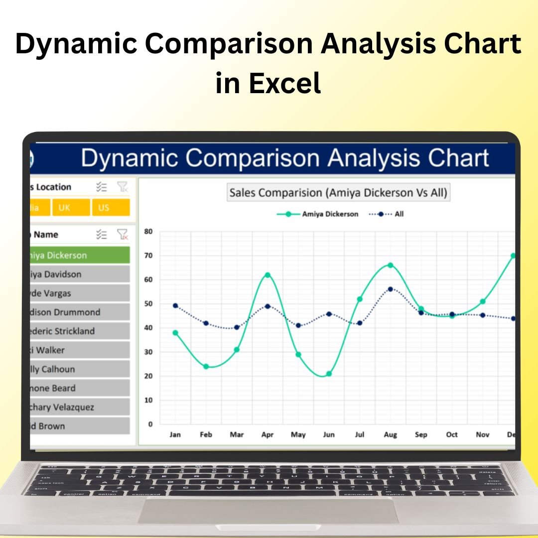
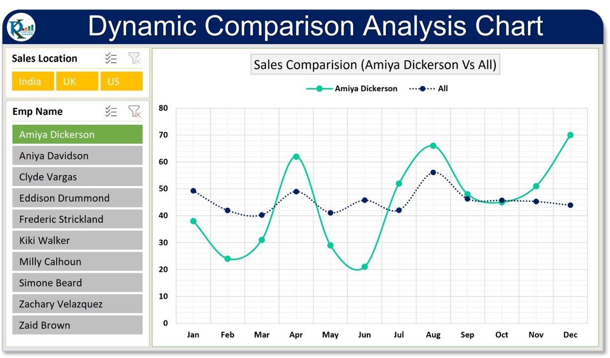
The Dynamic Comparison Analysis Chart in Excel is a powerful tool that enables you to compare multiple data points in a visually dynamic way. This chart is perfect for analyzing trends, comparing performance across categories, or evaluating different data sets side by side. With customizable features, real-time data updates, and an interactive design, this chart helps you make data-driven decisions and present your insights in a clear and engaging format.
This template is ideal for business analysts, project managers, and anyone needing to perform in-depth data comparisons. Whether you’re comparing sales across different regions, tracking progress over time, or evaluating the performance of different teams, the Dynamic Comparison Analysis Chart provides a professional and effective way to visualize and understand your data.
Key Features of the Dynamic Comparison Analysis Chart in Excel
📌 Dynamic Data Comparison
This chart allows you to compare multiple data series across various categories. It dynamically adjusts as you update your data, providing a real-time comparison of key metrics and trends.
🛠 Customizable Data Points
Easily customize the data series, labels, and categories to suit your needs. Whether you’re comparing revenue, project completion, or performance metrics, this chart can be adapted to fit a variety of use cases.
💡 Real-Time Updates
As you input or modify data, the chart automatically updates to reflect the new values, ensuring that your analysis is always up-to-date.
🔢 Interactive Design
The chart features interactive elements that allow you to drill down into specific data points. Filter and analyze your data more effectively by focusing on individual categories or periods.
🚀 Multiple Use Cases
Use this template to compare financial performance, track sales progress, evaluate project milestones, or assess any other metric that requires comparative analysis.
📊 Visual Data Representation
The Dynamic Comparison Analysis Chart uses vibrant colors, trends, and percentage comparisons to make your data visually appealing and easy to interpret at a glance.
⚙ Simple Setup and Customization
With clear instructions and a user-friendly interface, this template is easy to set up and use. You don’t need advanced Excel skills to get started, making it accessible for users of all experience levels.
🚀 Why You’ll Love the Dynamic Comparison Analysis Chart in Excel
✅ Real-Time Data Updates – Automatically adjust your chart as data changes. ✅ Customizable Design – Tailor the chart to match your data and business goals. ✅ Dynamic and Interactive – Easily compare multiple data points and categories. ✅ Clear Visual Analysis – Make your data easy to understand with vibrant, visual comparisons. ✅ User-Friendly Setup – Quick and easy setup with clear instructions.
📂 What’s Inside the Dynamic Comparison Analysis Chart in Excel?
- Multiple Data Series: Compare different data points across categories or periods.
- Customizable Labels and Categories: Adjust the chart to suit your specific data and analysis needs.
- Interactive Design: Drill down into individual data points for deeper insights.
- Real-Time Updates: Automatically update the chart as new data is entered.
- Clear Instructions: Easy-to-follow setup instructions for quick customization.
🔍 How to Use the Dynamic Comparison Analysis Chart in Excel
1️⃣ Download the Template – Instant access to the Excel file upon purchase. 2️⃣ Enter Your Data – Input the data for each category or data point that you wish to compare. 3️⃣ Customize Your Chart – Modify the chart to reflect your specific data and categories. 4️⃣ Analyze and Compare – Use the chart to compare data points across categories and visualize trends. 5️⃣ Present and Share – Use the dynamic chart in presentations, reports, or dashboards for an engaging data analysis.
🎯 Who Can Benefit from the Dynamic Comparison Analysis Chart in Excel? 🔹 Business Analysts 🔹 Sales Teams 🔹 Project Managers 🔹 Financial Analysts 🔹 Marketing Teams 🔹 Anyone needing to perform detailed data comparisons
The Dynamic Comparison Analysis Chart in Excel is the ideal tool for anyone who needs to compare data sets in a dynamic, visually compelling way. Use it to track sales, monitor project progress, analyze performance, or present any other type of data comparison effectively.
Click here to read the Detailed blog post
https://www.pk-anexcelexpert.com/dynamic-comparison-analysis-chart-in-excel/


Reviews
There are no reviews yet.