Managing a dairy business requires precision, speed, and complete visibility across departments. From milk procurement and production to quality checks, logistics, warehousing, and sales—every team handles hundreds of activities every day. When all this data is scattered across multiple spreadsheets, emails, and manual notes, decisions slow down and errors increase.
The Dairy Industry KPI Dashboard in Excel solves this challenge instantly. It transforms raw dairy operational data into meaningful insights using interactive visuals, slicers, drop-downs, and automated calculations. Whether you run a milk collection center, a processing plant, or a multi-location dairy business, this dashboard gives you complete clarity in just a few clicks.
This ready-to-use Excel dashboard helps you track milk collection, production efficiency, wastage levels, logistics performance, quality scores, revenue, and monthly trends—all inside a clean and well-structured interface. It eliminates guesswork and introduces a fast, data-driven decision-making process across your dairy operation.
✨ Key Features of the Dairy Industry KPI Dashboard in Excel
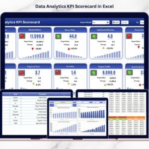
The dashboard is built with seven powerful worksheets, each designed to help dairy businesses track their performance with accuracy and confidence.
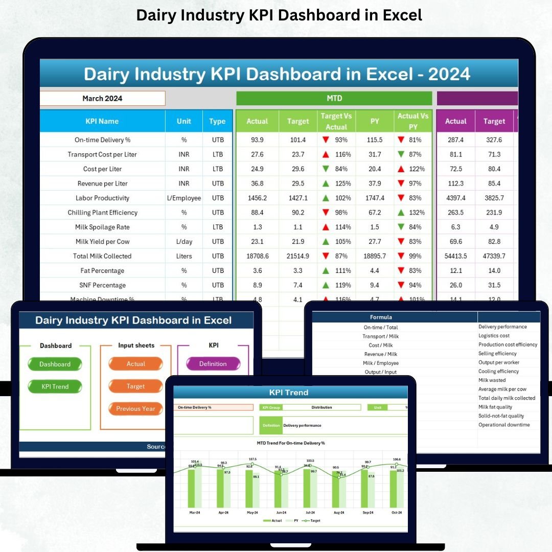
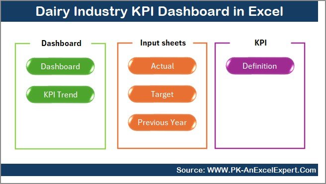
📌 Summary Page – Your Navigation Hub
The Summary Page acts as the home screen, giving you six buttons to jump directly into different analysis sheets. No more searching through tabs—switch between trends, definitions, and data entry pages in seconds.
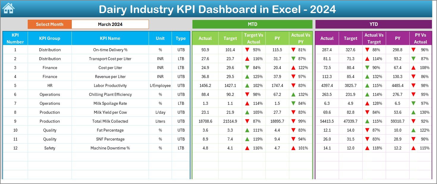
📊 Dashboard Sheet – Complete KPI Overview
This is the heart of the dashboard and the most used page by managers.
✔️ Month selector on cell D3
✔️ Automatic refresh of all KPIs
✔️ MTD (Month-to-Date) and YTD (Year-to-Date) comparisons
✔️ Actual vs Target performance
✔️ Actual vs Previous Year values
✔️ Green & red trend arrows for instant visibility
Track essential KPIs related to milk procurement, production efficiency, wastage, quality checks, logistics, and financial performance.
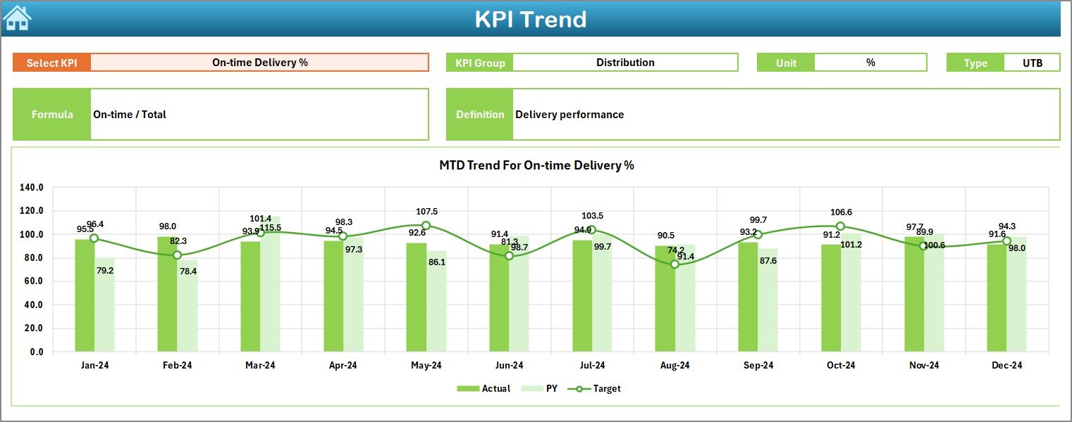
📈 Trend Sheet – Deep Performance Analysis
The Trend Sheet helps you understand long-term KPI movement.
✔️ KPI selector on C3
✔️ Auto-display of KPI formula, unit, type (UTB/LTB), and group
✔️ Monthly charts for Actual, Target, and PY numbers
✔️ Identify seasonal trends, sudden drops, or improvements
Ideal for monthly review meetings and strategic planning.
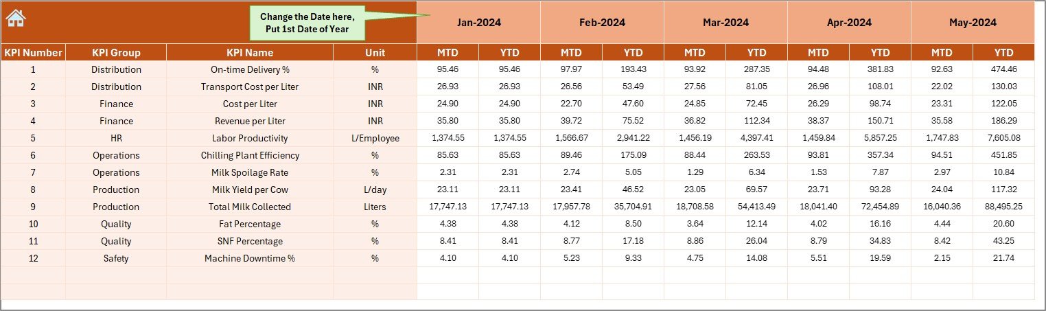
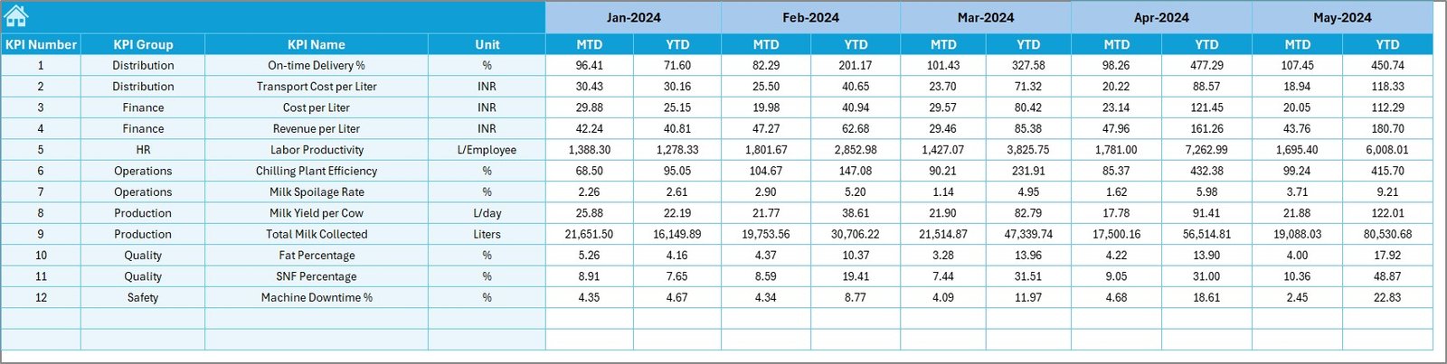
📝 Actual Numbers Input Sheet
Enter MTD and YTD numbers for each KPI.
✔️ Update the first month in E1 and Excel recalculates the year automatically
✔️ User-friendly structure for fast data entry
✔️ Ideal for plant managers and reporting teams
🎯 Target Sheet
Enter all monthly and yearly targets here.
✔️ Set planning numbers once at the beginning of the year
✔️ Supports MTD and YTD budgeting
✔️ Works seamlessly with the main dashboard
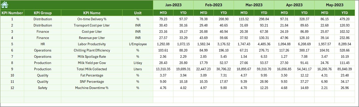
📅 Previous Year Numbers Sheet
Enter last year’s KPI values to compare long-term performance.
✔️ PY vs Actual analysis
✔️ Trend arrows for improvement/decline
✔️ Useful for annual planning and review presentations
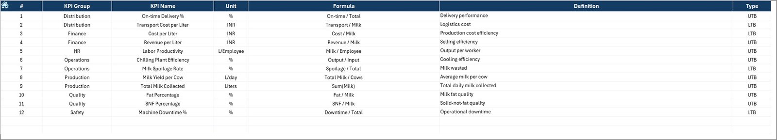
📘 KPI Definition Sheet
Get complete clarity on each KPI:
✔️ KPI Name
✔️ KPI Group
✔️ Unit
✔️ Formula
✔️ Definition
This helps new employees and managers understand every metric instantly.
📦 What’s Inside the Dairy Industry KPI Dashboard in Excel
Inside the downloadable Excel file, you will get:
-
A professionally designed dashboard page
-
Trend analysis page with multiple charts
-
Summary navigation page
-
Actual Data Input sheet
-
Target sheet for planning
-
Previous year comparison sheet
-
KPI Definition sheet
-
Automated formulas, conditional formatting, and slicers
-
Ready-to-customize structure
Everything is fully editable, allowing you to add more KPIs or modify visuals anytime.
🛠️ How to Use the Dairy Industry KPI Dashboard in Excel
Using this dashboard is extremely simple:
-
Update Actual Data – Enter MTD & YTD values in the Actual Numbers Input Sheet.
-
Enter Targets – Add monthly and yearly targets in the Target Sheet.
-
Enter Previous Year Data – Update last year’s numbers in the PY sheet.
-
Select the Month – Choose any month from the drop-down in cell D3.
-
Review Trends – Use the Trend Sheet to analyze performance patterns.
-
Understand KPIs – Refer to the KPI Definition sheet for formulas and meanings.
In seconds, you get complete visibility of your dairy operation without writing a single formula.
👤 Who Can Benefit from This Dairy Industry KPI Dashboard
This dashboard is designed for every department in a dairy company:
-
🥛 Milk Procurement Teams
-
🏭 Plant & Production Managers
-
🔍 Quality Control Teams
-
🚚 Logistics & Distribution Teams
-
💰 Finance & Costing Departments
-
📦 Warehouse Teams
-
📈 Sales & Marketing Teams
-
🧑💼 Top Management & Decision Makers
Whether you manage daily operations or strategic decisions, this dashboard helps you track performance with clarity and confidence.
### Click here to read the Detailed blog post
Watch the step-by-step video tutorial:


Reviews
There are no reviews yet.