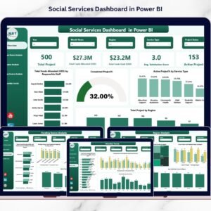
Managing community services without real-time visibility often leads to confusion, delays, and reduced impact. Community programs usually involve multiple service types, beneficiary groups, staff roles, locations, and limited budgets. However, when this information stays scattered across spreadsheets or static reports, leaders struggle to make timely and confident decisions.
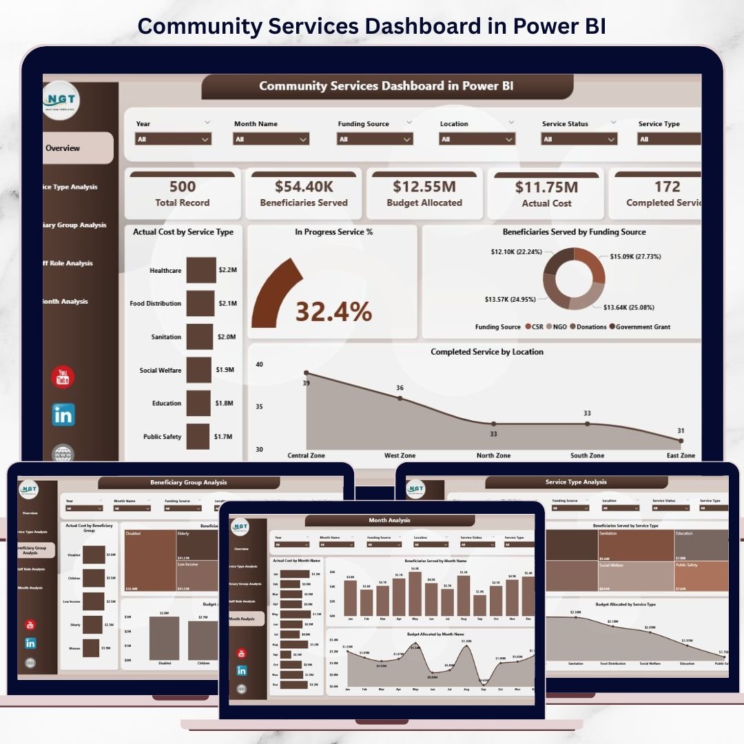
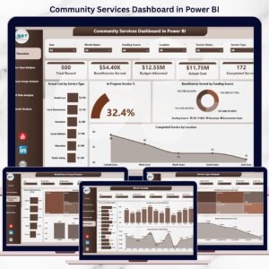
The Community Services Dashboard in Power BI is a ready-to-use, interactive analytics solution that brings all community service data into one centralized dashboard. Instead of manually compiling reports, organizations can instantly monitor beneficiaries served, service progress, budgets, actual costs, staffing impact, and monthly trends.
This dashboard transforms raw community data into clear, actionable insights that help organizations maximize social impact while improving transparency and accountability.
🚀 Key Features of Community Services Dashboard in Power BI
📊 Centralized Community Performance View – Track all services, beneficiaries, and budgets in one dashboard
👥 Beneficiary & Service Insights – Analyze service delivery across different beneficiary groups
💰 Budget vs Actual Cost Tracking – Monitor funding utilization and cost efficiency clearly
🧑🤝🧑 Staff Role Analysis – Understand workforce contribution and resource utilization
📍 Location-Based Insights – Compare performance across service locations
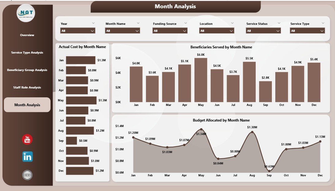
📅 Monthly Trend Analysis – Identify seasonality, growth, and demand patterns
🎛️ Interactive Power BI Slicers – Filter data by service type, group, role, location, or month
🔄 Real-Time Data Refresh – Always work with the latest information
📦 What’s Inside the Community Services Dashboard in Power BI
📁 Power BI (.pbix) File with a professionally designed dashboard
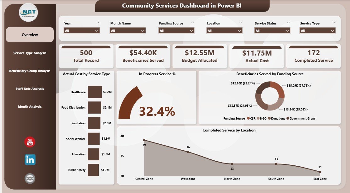
📊 Overview Page – High-level snapshot of overall community service performance
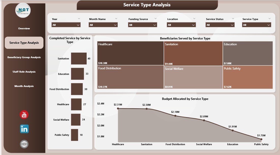
🏥 Service Type Analysis Page – Performance comparison across service categories
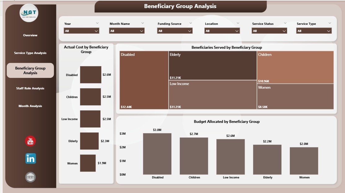
👨👩👧 Beneficiary Group Analysis Page – Insights into who receives services
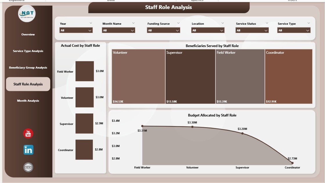
👔 Staff Role Analysis Page – Workforce utilization and cost insights
📆 Monthly Trends Page – Time-based analysis for planning and forecasting
📊 Interactive Charts & KPI Cards – Clean visuals for fast understanding
⚙️ Scalable Data Model – Supports growing programs and datasets
Each page focuses on a specific operational question, making analysis fast and intuitive.
🧠 How to Use the Community Services Dashboard in Power BI
1️⃣ Connect your community service data (Excel, database, or system export)
2️⃣ Open the Power BI dashboard file
3️⃣ Refresh the data to update all visuals
4️⃣ Use slicers to filter by service type, beneficiary group, staff role, location, or month
5️⃣ Review KPIs, charts, and trends
6️⃣ Identify gaps, optimize budgets, and improve service delivery
No advanced Power BI skills are required. The dashboard is user-friendly and decision-ready.
👥 Who Can Benefit from This Community Services Dashboard in Power BI
🤝 NGOs & Non-Profit Organizations – Track impact and program effectiveness
🏛️ Government & Municipal Departments – Monitor community initiatives
🌍 CSR & Social Impact Teams – Improve transparency and reporting
📋 Program Managers & Coordinators – Optimize services and staffing
💼 Donors & Funding Agencies – View clear, data-driven impact reports
This dashboard works for small community programs as well as large multi-location organizations.
🔗 Click here to read the Detailed Blog Post
🎥 Visit our YouTube channel to learn step-by-step video tutorials
https://www.youtube.com/@PKAnExcelExpert


Reviews
There are no reviews yet.