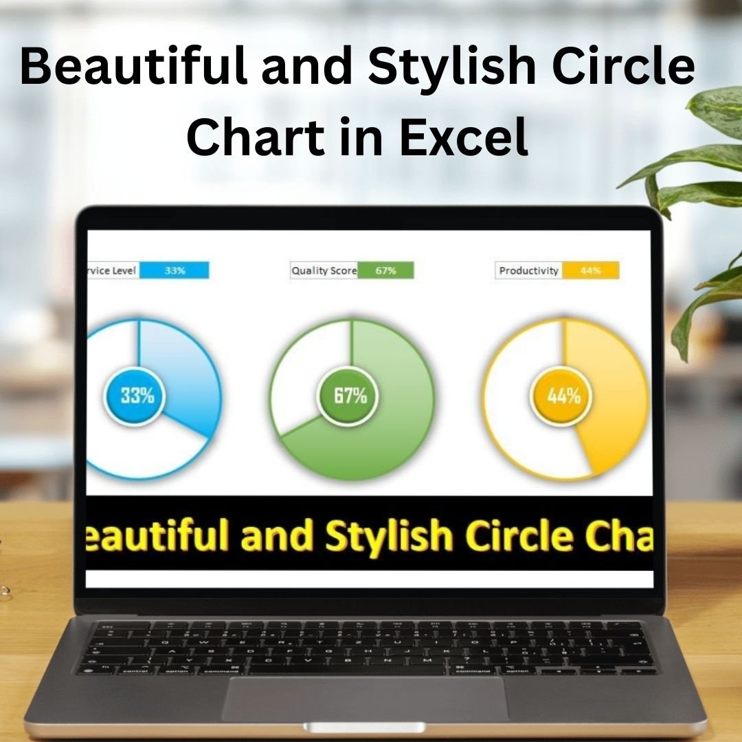
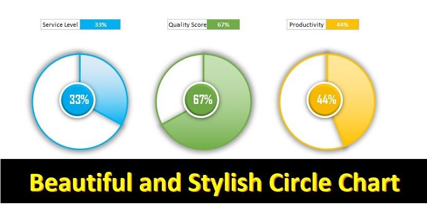
The Beautiful and Stylish Circle Chart in Excel is a visually stunning and highly effective way to present your data. Perfect for showcasing proportions and percentages, this chart style offers a fresh alternative to traditional pie charts and bar graphs. With a circular layout, this chart allows you to highlight data distribution in an engaging and visually appealing manner.
The Circle Chart in Excel is fully customizable, allowing you to adjust the design, colors, and size to match your presentation needs or brand guidelines. Whether you’re presenting business metrics, survey results, or any other percentage-based data, this stylish chart provides a clear, professional, and attractive way to communicate key insights.
Key Features of the Beautiful and Stylish Circle Chart in Excel
📌 Stylish Circular Design
The chart uses a clean and elegant circular layout, which is not only visually appealing but also easy to interpret. The circle chart is perfect for displaying data that relates to parts of a whole, such as market share, progress completion, or customer satisfaction.
🛠 Customizable Color Scheme
You have the flexibility to choose from a variety of color schemes or design your own to match the branding of your presentation or report. This customization ensures that your chart fits seamlessly into any design, making it more attractive and cohesive.
💡 Intuitive Data Visualization
The Circle Chart simplifies the presentation of complex data by visually breaking it down into easily digestible sections. Each segment of the circle represents a portion of the whole, helping your audience quickly grasp proportions and key insights at a glance.
🔢 Real-Time Data Updates
As you update your data in Excel, the circle chart adjusts automatically, ensuring that your chart always reflects the most current information. This real-time update feature is particularly useful for ongoing reports and dashboards where data changes frequently.
🚀 Multiple Data Series Support
The Circle Chart in Excel allows you to add multiple data series, enabling you to compare different categories or time periods side by side. Whether you’re comparing sales figures over multiple months or comparing market share by product, this chart makes it easy to visualize multiple datasets at once.
📊 Interactive and Dynamic
The chart is dynamic, meaning you can adjust data points, labels, and formatting options to explore different parts of your data. By interacting with the chart, you can instantly see how changes in data affect the overall picture.
⚙ Simple Setup and Easy Customization
Setting up the Circle Chart in Excel is straightforward. With simple instructions, you can quickly create a beautiful and functional chart for your data analysis. You can also customize the chart’s look, making it perfect for reports, presentations, or dashboards.
🚀 Why You’ll Love the Beautiful and Stylish Circle Chart in Excel
✅ Visually Appealing Design – Present your data in a fresh, circular format that stands out. ✅ Customizable Colors – Tailor the design to fit your brand and presentation style. ✅ Real-Time Data Updates – The chart adjusts automatically as data is updated in Excel. ✅ Multiple Data Series – Compare different datasets side by side with ease. ✅ Interactive and Engaging – Dive deeper into data by adjusting parameters dynamically.
📂 What’s Inside the Beautiful and Stylish Circle Chart in Excel?
- Stylish Circular Chart: A visually appealing way to present data in a circular format.
- Customizable Design: Adjust colors, sizes, and labels to fit your branding.
- Real-Time Data Updates: The chart refreshes automatically as you modify your data.
- Multiple Data Series: Compare various categories or time periods with ease.
- Clear Setup Instructions: Simple guide to get the chart up and running quickly.
🔍 How to Use the Beautiful and Stylish Circle Chart in Excel
1️⃣ Download the Template – Instant access to the Excel file upon purchase. 2️⃣ Input Your Data – Enter your data into the Excel template. 3️⃣ Customize the Design – Adjust colors, labels, and segment sizes to match your style. 4️⃣ Track and Monitor – Use the circle chart to visualize proportions and key metrics. 5️⃣ Present and Share – Use the chart in presentations or reports to showcase your findings.
🎯 Who Can Benefit from the Beautiful and Stylish Circle Chart in Excel? 🔹 Business Analysts
🔹 Marketing Teams
🔹 Project Managers
🔹 Data Scientists
🔹 Anyone presenting or analyzing percentage-based data
🔹 Professionals looking for visually engaging data presentation tools
Present your data in a visually stunning and easy-to-understand format with the Beautiful and Stylish Circle Chart in Excel. This dynamic tool helps you highlight proportions and track progress in a way that captures attention and simplifies complex data.
Click here to read the Detailed blog post
https://www.pk-anexcelexpert.com/beautiful-and-stylish-circle-chart-in-excel/


Reviews
There are no reviews yet.