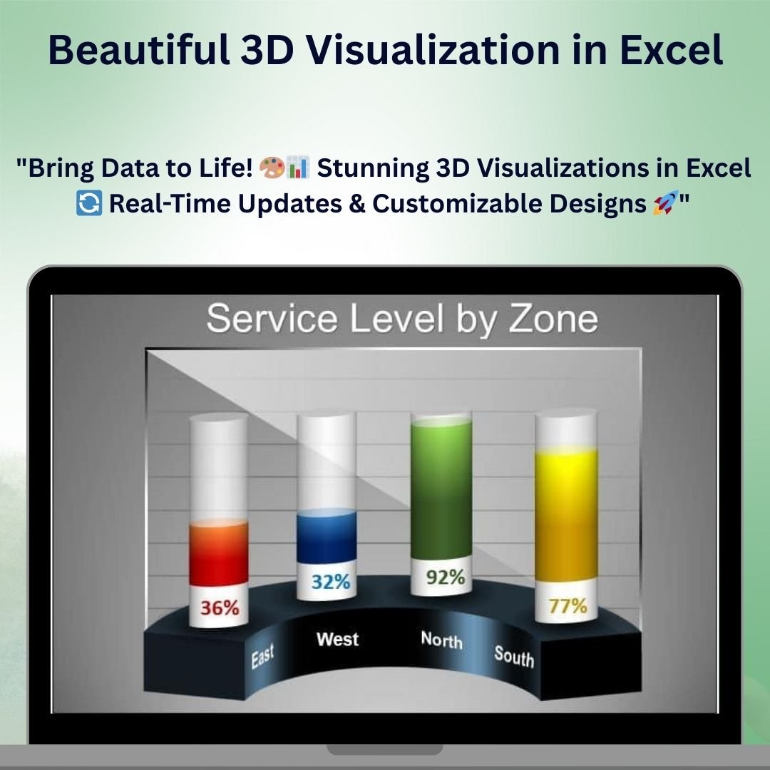
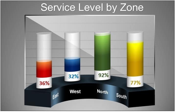
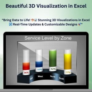
The Beautiful 3D Visualization in Excel is an innovative tool designed to take your data presentation to the next level. This Excel template allows you to create stunning 3D visualizations that enhance the impact of your reports, dashboards, and presentations. With vibrant, dynamic visuals, you can showcase trends, comparisons, and data insights in an eye-catching and professional way, making your data easier to understand and more engaging for your audience.
Whether you’re presenting financial data, sales figures, or project performance metrics, the Beautiful 3D Visualization in Excel helps you communicate your data more effectively. The tool is fully customizable, allowing you to tailor the 3D chart designs and data inputs to suit your specific needs. You can adjust colors, shapes, and styles to match your brand or preferred visual style.
Key Features of the Beautiful 3D Visualization in Excel
📌 Dynamic 3D Visualization
Create stunning 3D charts that bring your data to life. The dynamic 3D visualization adds depth and perspective to your charts, making it easier to identify trends and spot key insights.
🛠 Customizable 3D Designs
Easily modify the design of your 3D charts to match your brand or presentation style. You can adjust the chart’s colors, shapes, and effects to make your data visualization unique and tailored to your needs.
💡 Real-Time Data Updates
As you input or modify your data, the 3D visualizations update automatically to reflect the changes. This real-time functionality ensures that you are always presenting the most current and accurate information.
🔢 Clear Data Representation
The 3D charts provide a clear and visually appealing way to compare multiple data points. Whether you’re tracking performance over time, comparing different categories, or analyzing KPIs, the 3D chart makes your data more digestible and easier to interpret.
🚀 Interactive and Engaging
The 3D design adds interactivity to your data presentation, making it more engaging for your audience. The ability to rotate and view the chart from different angles makes it easier to explore the data and identify areas of interest.
📊 Multiple Data Sets Comparison
Easily compare multiple data sets in one 3D chart. Whether you’re comparing sales, expenses, or other metrics, the 3D visualization helps you visualize the differences and trends at a glance.
⚙ Simple Setup and Customization
Setting up the Beautiful 3D Visualization is quick and easy. With clear instructions and simple customization options, you can create professional 3D charts in minutes, even without advanced Excel skills.
🚀 Why You’ll Love the Beautiful 3D Visualization in Excel
✅ Dynamic and Engaging – Bring your data to life with stunning 3D visuals. ✅ Customizable to Your Needs – Modify the design, colors, and layout to suit your preferences. ✅ Real-Time Data Updates – Ensure your charts are always up-to-date as data changes. ✅ Clear and Visual Data Comparison – Compare multiple data sets with ease. ✅ Simple Setup – Easy-to-use, with quick setup instructions for instant use.
📂 What’s Inside the Beautiful 3D Visualization in Excel?
- 3D Charts: Create dynamic and visually striking 3D visualizations for your data.
- Customizable Designs: Adjust the color schemes, shapes, and effects to match your brand or style.
- Real-Time Updates: Automatically adjust the 3D chart as data is entered or modified.
- Multiple Data Sets Comparison: Compare various data points in a single 3D visualization.
- Clear Setup Instructions: Simple and clear steps to customize and set up the chart.
🔍 How to Use the Beautiful 3D Visualization in Excel
1️⃣ Download the Template – Instantly access the Excel file upon purchase. 2️⃣ Input Your Data – Enter your data for real-time updates in the 3D chart. 3️⃣ Customize the Design – Adjust the color scheme, layout, and shapes to fit your style. 4️⃣ Analyze and Present – Use the chart to visualize data trends and compare multiple data sets. 5️⃣ Present and Share – Share the stunning 3D chart in presentations, reports, or dashboards.
🎯 Who Can Benefit from the Beautiful 3D Visualization in Excel? 🔹 Business Analysts
🔹 Project Managers
🔹 Sales Teams
🔹 Financial Analysts
🔹 Marketing Professionals
🔹 Anyone presenting data to an audience
Transform your data presentations with the Beautiful 3D Visualization in Excel. Enhance your reports and dashboards, compare multiple data sets, and present your insights in a visually engaging way.
Click here to read the Detailed blog post
https://www.pk-anexcelexpert.com/beautiful-3d-visualization-in-excel/


Reviews
There are no reviews yet.