
Aquaculture Dashboard a critical role in the global food supply chain. As the demand for seafood continues to grow worldwide, aquaculture farms must efficiently manage production cycles, monitor environmental conditions, track fish health, and maintain profitability. However, many aquaculture operations still rely on scattered spreadsheets and manual reports to manage their data. This often leads to delayed insights, inconsistent reporting, and difficulty in identifying operational issues.
To overcome these challenges, aquaculture businesses increasingly rely on data-driven dashboards that centralize information and transform raw farm data into meaningful insights. One powerful solution designed for this purpose is the Aquaculture Dashboard in Excel.
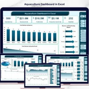
The Aquaculture Dashboard in Excel is a ready-to-use Excel-based analytical tool designed to help aquaculture farms monitor production performance, evaluate fish health indicators, analyze operational costs, and track revenue trends. By converting complex datasets into visual charts and performance indicators, the dashboard enables farm managers to quickly understand operational performance and make data-driven decisions.
Instead of analyzing multiple spreadsheets manually, farm managers can view all critical metrics from a centralized dashboard interface. The dashboard uses Excel pivot tables, slicers, charts, and KPI indicators to present insights in a clear and interactive way.
This solution is especially useful for aquaculture farms that manage multiple species, farming methods, feed types, and farm locations. With this dashboard, managers can analyze mortality rates, disease cases, production costs, revenue performance, and environmental health indicators in one place.
The dashboard also provides multiple analytical pages, allowing users to explore different operational aspects of aquaculture production such as species performance, production efficiency, environmental health, and seasonal trends.
Whether you manage fish farms, shrimp farms, aquaculture hatcheries, or multi-species aquaculture operations, this dashboard helps you monitor production performance, reduce operational risks, and improve profitability.
By turning aquaculture data into visual insights, this dashboard empowers managers to optimize farming strategies, control costs, improve fish health monitoring, and enhance overall farm efficiency.
🚀 Key Feature of Aquaculture Dashboard in Excel
📊 Interactive Aquaculture Performance Dashboard
Analyze farm performance through dynamic Excel charts and KPI indicators.
🐟 Species-Level Production Monitoring
Track production performance, mortality rates, and revenue for different species.
💰 Revenue & Profit Analysis
Evaluate farm profitability using revenue and cost comparison charts.
📦 Production Batch Tracking
Monitor total production batches across farming methods and species.
🌿 Environmental Health Monitoring
Analyze disease rates and environmental risks affecting production.
📈 Production Efficiency Insights
Compare farming methods, feed types, and certification levels.
📅 Seasonal Trend Analysis
Track monthly changes in production costs, revenue, and disease rates.
🎛 Interactive Slicers for Filtering
Filter data instantly by species, farm, region, or production method.
📊 Excel Pivot Chart Visualizations
Charts update automatically when the dataset changes.
⚙️ Customizable Excel Structure
Users can easily modify the dashboard to fit different aquaculture operations.
📊 What’s Inside the Aquaculture Dashboard in Excel
The dashboard includes multiple analytical pages designed to provide insights into different aspects of aquaculture operations.
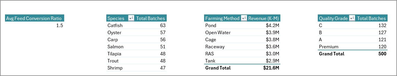
🏠 Overview Page – Farm Performance Snapshot
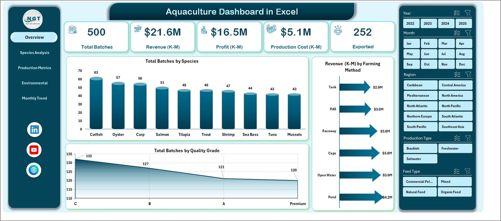
The Overview Page acts as the central dashboard providing a quick summary of farm performance.
Key KPI cards displayed include:
• Total Batches
• Total Revenue
• Average Mortality Rate
• Total Profit
These KPIs provide an instant overview of operational performance.
The page also includes charts such as:
• Total Batches by Species
• Revenue by Farming Method
• Total Batches by Quality Grade
These insights help managers quickly understand production distribution and revenue performance.
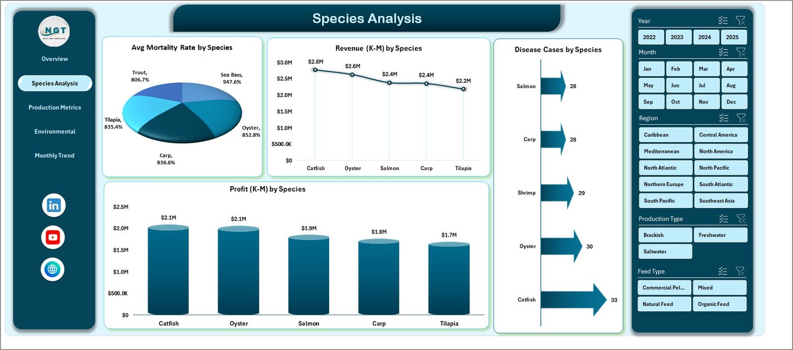
🐟 Species Analysis Page
Aquaculture farms often cultivate multiple species. Therefore, comparing species performance is essential.
Charts included:
• Average Mortality Rate by Species
• Revenue by Species
• Disease Cases by Species
• Profit by Species
These insights help managers identify the most profitable species and optimize production planning.
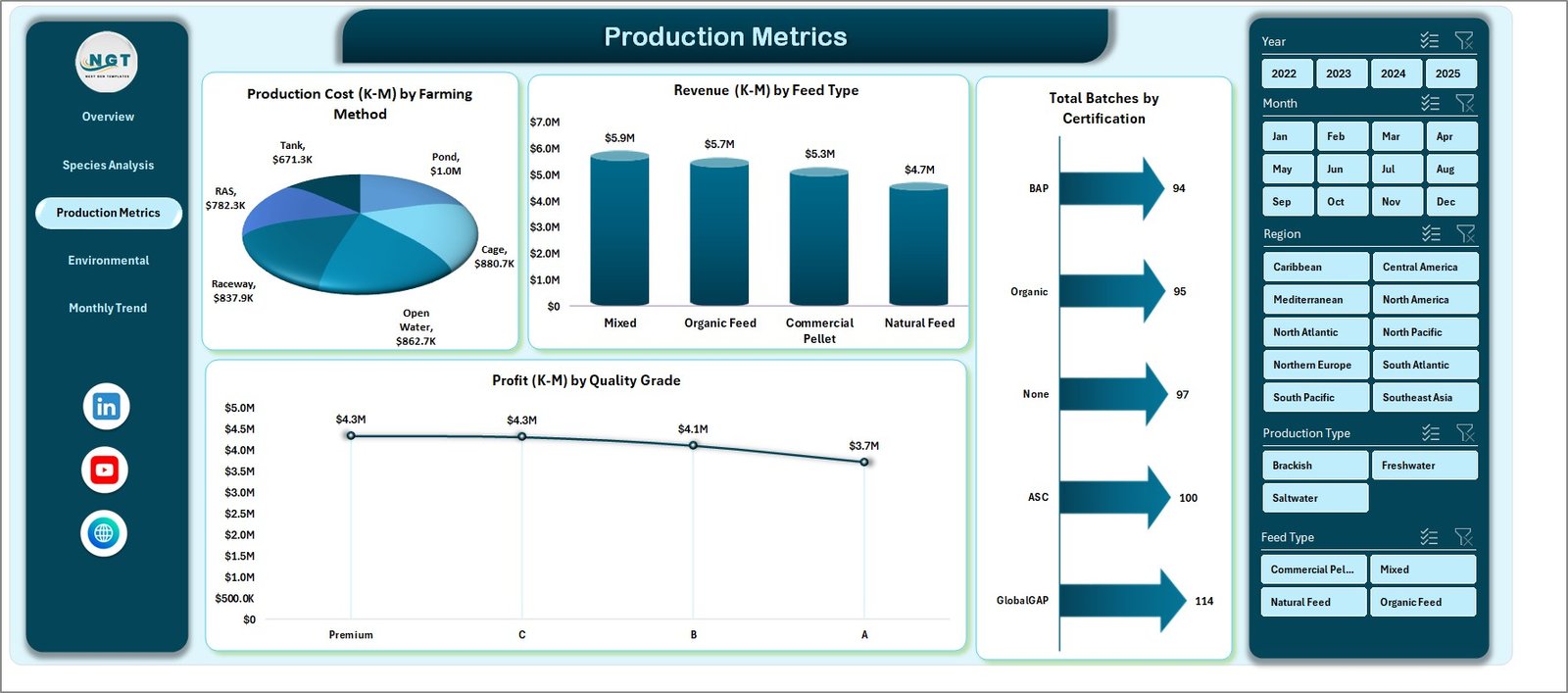
⚙️ Production Metrics Page
The Production Metrics Page focuses on operational efficiency and cost management.
Charts available:
• Production Cost by Farming Method
• Revenue by Feed Type
• Total Batches by Certification
• Profit by Quality Grade
These insights allow farm managers to evaluate cost efficiency and production quality.
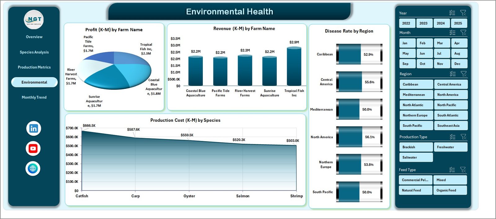
🌿 Environmental Health Page
Environmental conditions directly affect aquaculture production success.
This page includes charts such as:
• Production Cost by Species
• Profit by Farm Name
• Revenue by Farm Name
• Disease Rate by Region
These insights help identify environmental risks and monitor farm-level performance.
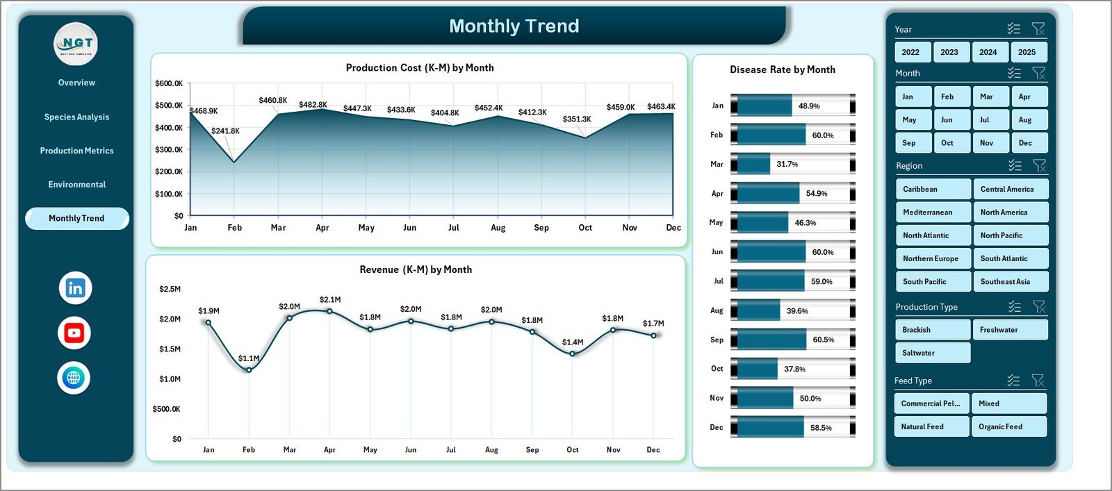
📅 Month Analysis Page
Seasonal trends often impact aquaculture production.
The Month Analysis Page focuses on time-based insights using charts such as:
• Production Cost by Month
• Disease Rate by Month
• Revenue by Month
Managers can analyze seasonal patterns and adjust farming strategies accordingly.
⚙️ How to Use the Aquaculture Dashboard in Excel
Using the dashboard is simple and efficient.
1️⃣ Enter operational data in the Data Sheet including species, production batches, feed type, and revenue.
2️⃣ Ensure data follows a structured format suitable for pivot tables.
3️⃣ Refresh pivot tables to update charts and KPIs.
4️⃣ Use slicers to filter data by species, farm, or region.
5️⃣ Analyze insights across the different dashboard pages.
Within minutes, farm managers can convert raw aquaculture data into powerful analytical insights.
👨🌾 Who Can Benefit from This Dashboard
This dashboard is ideal for professionals working in aquaculture and fisheries management.
🐟 Aquaculture Farm Owners
🌊 Fish & Shrimp Farm Managers
📊 Aquaculture Analysts
🏢 Seafood Production Companies
🌱 Environmental Monitoring Teams
🎓 Agriculture & Aquaculture Researchers
Organizations that implement this dashboard gain better operational visibility, improved production monitoring, and stronger data-driven decision-making capabilities.
### Click hare to read the Detailed blog post
Visit our YouTube channel to learn step-by-step video tutorials
https://youtube.com/@PKAnExcelExpert