
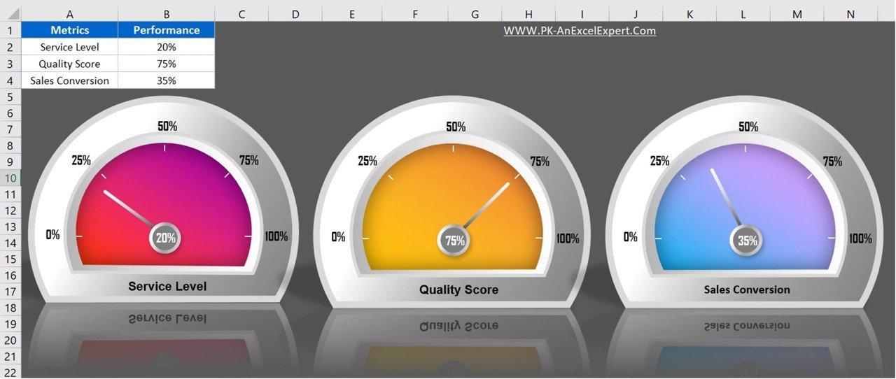
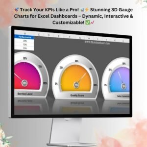
Visualizing key performance indicators (KPIs) is crucial for effective data analysis. The 3D Gauge Chart in Excel is an innovative solution that provides a visually appealing and dynamic representation of data. Whether you’re tracking service levels, quality scores, or sales conversion rates, this tool enables users to interpret performance metrics with ease. Unlike standard bar or line charts, the 3D gauge chart adds a professional touch to reporting, making it perfect for dashboards and business presentations.
Key Features of the 3D Gauge Chart in Excel
1. Effective Data Visualization
The 3D gauge chart presents data in an intuitive, semi-circular dial format that mimics speedometers. This format is especially useful when displaying progress, performance levels, or completion percentages, as it allows users to understand trends at a glance. The dial indicator highlights the exact value, making data interpretation seamless.
2. Highly Customizable
This Excel template offers flexibility in customizing colors, labels, and ranges to suit specific business needs. Users can adjust thresholds to categorize data into different performance levels, such as poor, average, and excellent. This customization ensures that the visual representation aligns with corporate branding or reporting standards.
3. Interactive & Dynamic
Unlike static charts, the 3D gauge chart is interactive and updates dynamically when input values change. Whether you’re monitoring real-time data or periodic performance updates, this feature helps keep dashboards up to date. The needle moves automatically based on the entered percentage, providing a real-time tracking mechanism.
4. Easy to Use – No Coding Required
The 3D Gauge Chart in Excel is designed with simplicity in mind. Even users with basic Excel knowledge can effortlessly create, modify, and use the chart. No VBA or macros are required, making it accessible to a broad range of users.
5. Suitable for Business & Personal Use
This chart can be used across industries and departments. Whether for business reporting, sales analysis, performance tracking, or project management, it helps stakeholders grasp critical insights efficiently. Managers, analysts, and executives can use it to present data-driven stories in a compelling manner.
6. Supports Multiple Metrics
The template allows multiple gauge charts on a single sheet, making it possible to track various KPIs simultaneously. For example, the service level, quality score, and sales conversion rates can be visualized together, as seen in the sample template. This multi-metric support helps in comparing and analyzing performance trends across different business areas.
7. Professional Dashboard Integration
The gauge chart enhances Excel dashboards by adding aesthetic appeal and functional insights. It can be used alongside bar charts, line charts, and pivot tables to create a comprehensive performance review system.
8. No Need for External Software
Many businesses rely on third-party applications for visualization, but this Excel-based solution eliminates the need for additional software. It is lightweight, portable, and compatible with all versions of Microsoft Excel, making it an excellent alternative to costly BI tools.
9. Instant Performance Tracking
With real-time updates, users can see instant changes when entering new values. This makes it an excellent tool for monitoring KPIs such as monthly sales targets, customer service performance, project completion rates, or employee productivity.
10. Time-Saving & Efficient
Manually creating KPI charts can be time-consuming. This pre-designed template reduces the effort by automating calculations and visuals, allowing users to focus on analysis rather than formatting.
Use Cases of the 3D Gauge Chart in Excel
📊 Sales & Marketing – Track conversion rates, lead performance, and customer retention metrics.
📈 Finance & Budgeting – Monitor expense utilization, revenue growth, and profit margins.
💼 HR & Employee Performance – Measure employee engagement, productivity, and goal achievement.
🔍 Quality Assurance – Visualize quality scores, defect rates, and operational efficiency.
📆 Project Management – Evaluate project completion percentage and milestone tracking.
Conclusion
The 3D Gauge Chart in Excel is a must-have tool for professionals who need to present data in a clear, interactive, and visually appealing way. Its customizability, real-time updates, and professional aesthetics make it ideal for business dashboards and executive reports. With no coding required, it’s easy to implement and use across various departments.
🚀 Upgrade your Excel dashboards today with the 3D Gauge Chart! 🚀
Click here to read the detailed blog post
Visit our YouTube channel to learn step-by-step video tutorials
Watch the step-by-step video tutorial:
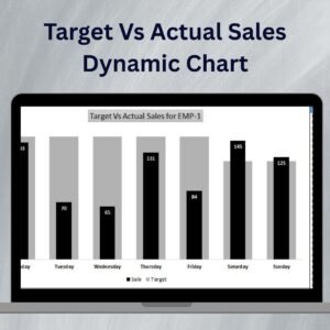
Also check our Power Gantt Chart in Excel


Reviews
There are no reviews yet.