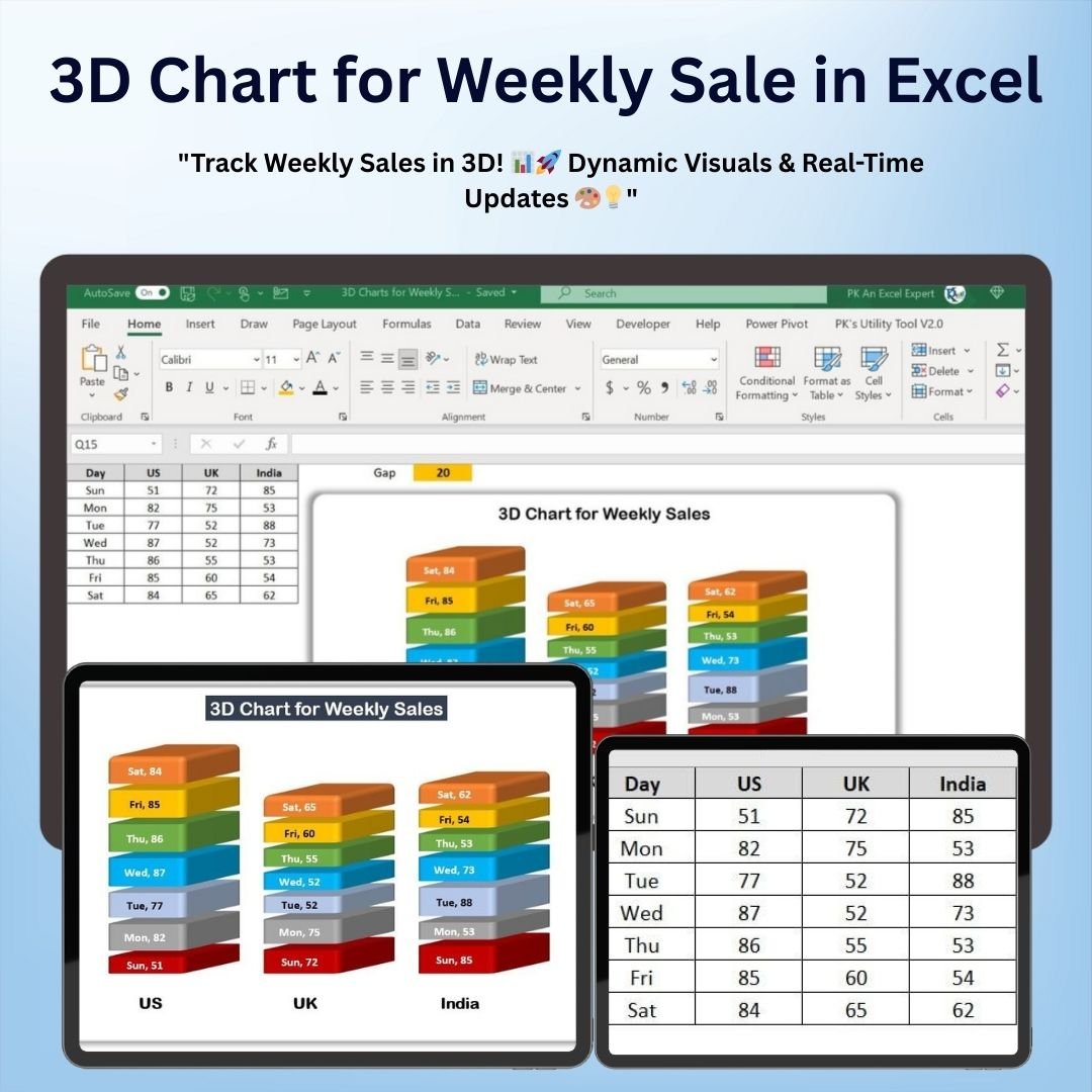
The 3D Chart for Weekly Sale in Excel is an advanced yet easy-to-use tool designed to help you track and visualize your weekly sales performance in a dynamic and engaging way. This powerful chart displays sales data in a visually stunning 3D format, making it easier to interpret trends, track progress, and make data-driven decisions.
The 3D chart allows you to compare weekly sales figures, spot performance trends, and evaluate how each week’s sales compare to your goals or expectations. It’s perfect for sales managers, business owners, and analysts who want to present sales data in a clear, professional, and impactful manner.

Key Features of the 3D Chart for Weekly Sales in Excel
📌 Stunning 3D Visualization
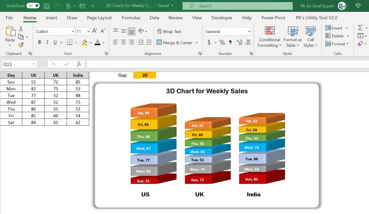
The chart offers a 3D view of your weekly sales, making it easier to visualize trends, comparisons, and fluctuations over time. This dynamic presentation enhances your ability to interpret sales data quickly and effectively.
🛠 Customizable Data Inputs
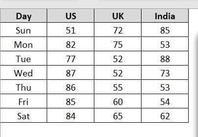
You can easily input your sales data for each week, and the chart automatically updates to reflect changes. The 3D chart adjusts based on your specific data, allowing you to track sales progress, compare actual results with targets, and make informed decisions.
💡 Visual Performance Tracking
Track sales performance week by week and see the data represented in an engaging 3D format. The chart makes it easy to compare sales figures, identify patterns, and analyze performance gaps, helping you spot areas of improvement or growth opportunities.
🔢 Real-Time Updates
As you enter new data or update existing sales figures, the 3D chart automatically adjusts to show the most current performance, providing real-time insights and making it easy to stay on top of sales trends.
🚀 Multiple Customization Options
Customize the chart’s colors, labels, and data points to match your business needs. Whether you want to track total sales, individual product sales, or performance against targets, the 3D chart can be easily adapted to suit your specific requirements.
📊 Clear and Professional Design
The 3D chart offers a professional and visually appealing way to present sales data. Whether you’re preparing for internal meetings, client presentations, or reports, the chart’s stunning design will help you communicate sales performance effectively.
⚙ Easy Setup and Customization
Setting up the 3D sales chart is simple, even for Excel beginners. With clear instructions and an intuitive interface, you can get started quickly and start visualizing your sales data in a dynamic way.
🚀 Why You’ll Love the 3D Chart for Weekly Sales in Excel
✅ Dynamic 3D Visualization – Present sales data in an engaging 3D format for easy interpretation. ✅ Customizable Data – Track your sales, compare targets, and adjust labels and colors to suit your needs. ✅ Real-Time Updates – Automatically adjust the chart as new data is entered. ✅ Professional Design – Create stunning presentations with clear, effective sales visuals. ✅ Simple Setup – Easy to use with clear setup instructions.
📂 What’s Inside the 3D Chart for Weekly Sales in Excel?
- 3D Sales Visualization: A dynamic 3D chart that represents your weekly sales data.
- Customizable Labels and Data: Adjust the chart to track total sales, product sales, or performance against targets.
- Real-Time Data Updates: The chart automatically adjusts as you modify your sales data.
- Easy-to-Follow Setup Instructions: Simple steps to get started and customize the chart.
🔍 How to Use the 3D Chart for Weekly Sales in Excel
1️⃣ Download the Template – Instant access to the Excel file upon purchase. 2️⃣ Enter Your Sales Data – Input weekly sales figures, and the chart will populate automatically. 3️⃣ Customize the Chart – Adjust the labels, colors, and data points to match your needs. 4️⃣ Track Performance – Use the 3D chart to analyze sales trends and compare data week by week. 5️⃣ Present and Share – Use the chart in meetings, reports, or presentations to showcase your sales performance.
🎯 Who Can Benefit from the 3D Chart for Weekly Sales in Excel? 🔹 Sales Managers
🔹 Business Owners
🔹 Marketing Teams
🔹 Financial Analysts
🔹 Project Managers
🔹 Anyone tracking and analyzing weekly sales data
Make your weekly sales analysis more engaging and insightful with the 3D Chart for Weekly Sales in Excel. This tool will help you visualize performance, spot trends, and communicate your sales results in a more impactful way.
Click here to read the Detailed blog post
https://www.pk-anexcelexpert.com/3d-chart-for-weekly-sale-in-excel/


Reviews
There are no reviews yet.