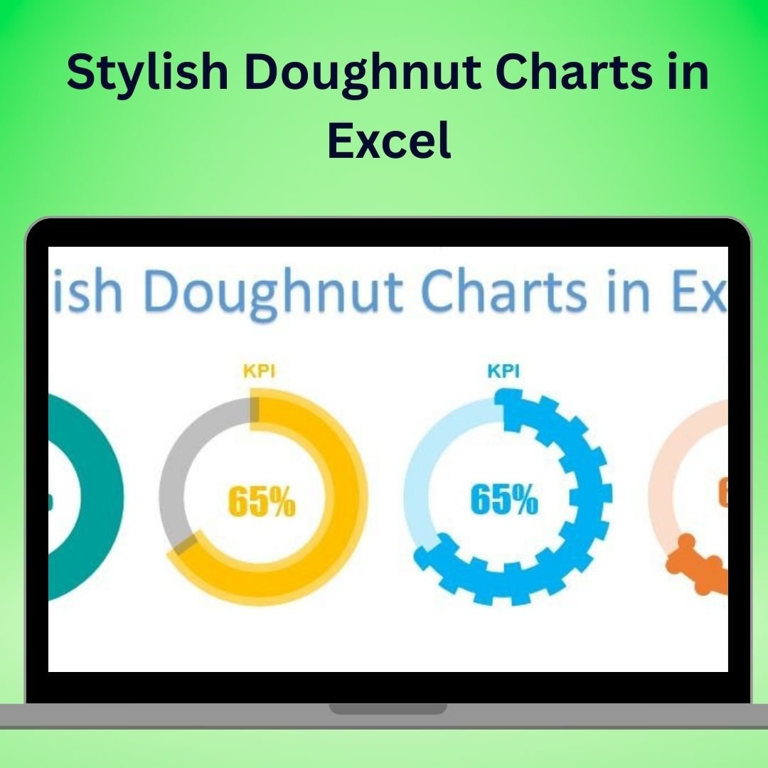
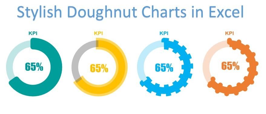
The Stylish Doughnut Charts in Excel are an elegant and effective way to present your data in a visually appealing format. Unlike traditional pie charts, doughnut charts offer a cleaner, more modern look while maintaining the ability to display meaningful information about proportions and comparisons. With this Excel template, you can create professional and eye-catching doughnut charts that will stand out in presentations, reports, and dashboards.
This template takes your data visualization to the next level by offering customization options for creating unique, stylish charts that will captivate your audience. Whether you’re presenting sales data, project status, or any other type of information, these stylish doughnut charts are perfect for adding a modern touch to your data presentations.
Key Features of the Stylish Doughnut Charts in Excel
🎨 Visually Attractive & Customizable Design
Customize the colors, sizes, and elements of the doughnut chart to create an aesthetically pleasing and unique design that aligns with your brand or presentation style.
📊 Track Multiple Data Points
Use the doughnut charts to track and compare multiple data points simultaneously. Display KPIs, progress toward goals, or product performance in one unified chart.
🖥️ Interactive & Dynamic Charts
Create dynamic, interactive charts that can be updated in real-time. With just a few clicks, you can modify data inputs, and the chart will automatically adjust to reflect changes.
🔄 Advanced Data Visualization
Enhance the understanding of your data with the clean and intuitive design of doughnut charts. View the relative proportions of categories and track performance in a clear, easy-to-digest format.
📈 Ideal for Dashboards & Reports
These stylish doughnut charts are perfect for use in business dashboards, financial reports, and project management tools, helping you convey complex data in a visually engaging way.
Why You’ll Love the Stylish Doughnut Charts in Excel
✅ Create Stunning, Professional Charts
Craft beautiful doughnut charts that add a polished, modern look to your data presentations, helping you communicate your data more effectively.
✅ Customize Your Charts for Maximum Impact
With full control over the design, you can tailor each chart to suit your presentation style, making it easy to align with your branding or theme.
✅ Track & Compare Multiple Metrics
Monitor a range of data points in one chart. Compare multiple KPIs or categories to gain quick insights into performance.
✅ Simplify Data Visualization
Doughnut charts make it easier to convey proportional data without overwhelming your audience with too much information. Present complex data in a simple, easy-to-understand format.
✅ Perfect for Professional Reports
Whether for internal reporting, client presentations, or investor updates, stylish doughnut charts elevate the quality and effectiveness of your reports and dashboards.
What’s Inside the Stylish Doughnut Charts in Excel Template?
- Customizable Chart Design: Adjust the color, size, and appearance of the doughnut chart to meet your needs.
- Multi-Category Tracking: Track multiple categories or KPIs in one chart for a comprehensive overview of your data.
- Interactive & Real-Time Updates: Modify your data, and the chart will automatically update to reflect changes.
- Easy-to-Use Template: Create stylish doughnut charts quickly and effortlessly with this intuitive Excel template.
- Step-by-Step Guidance: Access detailed instructions to help you set up and customize your doughnut charts.
How to Use the Stylish Doughnut Charts in Excel
1️⃣ Download the Template: Get immediate access to the Stylish Doughnut Chart template in Excel.
2️⃣ Input Your Data: Enter your data into the designated cells in the template.
3️⃣ Customize the Design: Adjust the colors, sizes, and chart elements to fit your needs.
4️⃣ Track & Visualize Progress: Monitor progress, compare data points, and track KPIs in a visually engaging format.
5️⃣ Update & Share: Easily update the chart as your data changes and use it in your reports, presentations, or dashboards.
Who Can Benefit from the Stylish Doughnut Charts in Excel?
🔹 Business Analysts & Data Analysts
🔹 Marketing & Sales Teams
🔹 Financial Analysts & CFOs
🔹 Project Managers & Team Leaders
🔹 HR & Operations Teams
🔹 Anyone Who Wants to Present Data in a Modern, Engaging Format
Enhance your data visualization with the Stylish Doughnut Charts in Excel. Whether you’re tracking KPIs, sales performance, or project progress, these charts offer a sleek and effective way to present your data.
Click here to read the Detailed blog post
Visit our YouTube channel to learn step-by-step video tutorials
Youtube.com/@PKAnExcelExpert


Reviews
There are no reviews yet.