Managing multiple departments within Shared Services Centers (SSC) can quickly become complicated. Finance, HR, procurement, IT support, payroll processing, and customer service teams generate large volumes of operational data every day. Without a structured monitoring system, managers often struggle to measure performance, track efficiency, and evaluate whether departments are meeting organizational goals.
That is exactly why organizations increasingly rely on KPI dashboards to monitor operational performance.
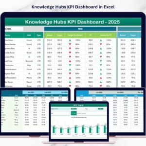
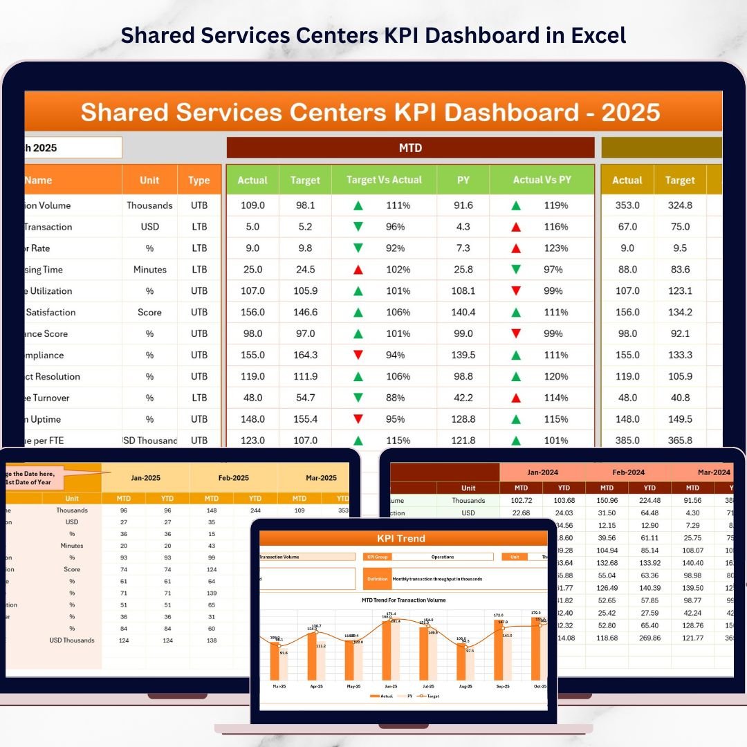
The Shared Services Centers KPI Dashboard in Excel is a powerful and ready-to-use performance monitoring solution designed to help organizations track, analyze, and improve shared service operations.
This professionally designed Excel dashboard transforms complex operational data into clear visual insights, enabling managers and executives to monitor performance indicators, compare targets vs actual values, analyze historical trends, and identify improvement opportunities.
Because the dashboard uses Excel automation, formulas, charts, and conditional formatting, organizations can easily track performance metrics without expensive business intelligence software.
Whether you manage HR services, finance operations, procurement processes, IT support, or customer service teams, this dashboard helps you turn raw data into actionable insights instantly.
🚀 Key Feature of Shared Services Centers KPI Dashboard in Excel
This Excel dashboard includes powerful analytical features that simplify KPI monitoring and performance tracking.
📊 Interactive KPI Dashboard – Monitor key performance indicators with a centralized visual dashboard that updates automatically when data changes.
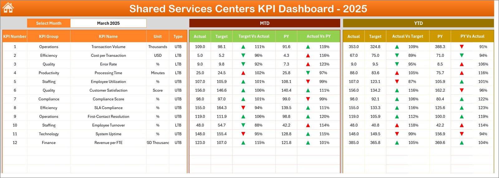
📅 Month Selection Filter – Easily select the reporting month using a drop-down menu to instantly refresh dashboard insights.
📈 MTD and YTD Performance Tracking – Track both Month-To-Date and Year-To-Date performance metrics for deeper operational insights.
🎯 Target vs Actual Comparison – Instantly evaluate whether operational goals are being achieved using visual comparisons.
📉 Previous Year Performance Comparison – Analyze growth and performance improvements by comparing current results with previous year data.
🚦 Conditional Formatting Indicators – Green and red arrows automatically highlight positive and negative performance trends.
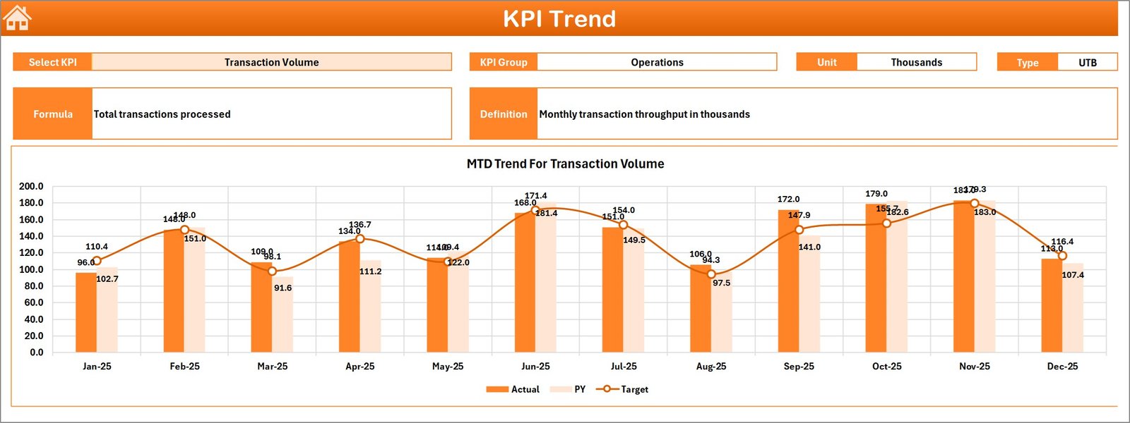
📊 Dynamic KPI Trend Analysis – Monitor monthly performance trends using interactive charts and KPI selection tools.
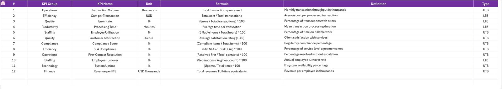
📑 Structured KPI Definition Library – Maintain a centralized sheet containing KPI definitions, formulas, and measurement units.
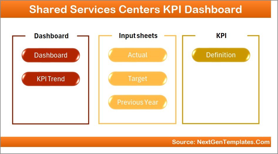
📦 What’s Inside the Shared Services Centers KPI Dashboard in Excel
This ready-to-use Excel template includes 7 well-structured worksheets designed for efficient KPI analysis.
📍 Summary Page – Acts as the navigation hub with buttons that quickly guide users to each analysis sheet.
📊 Dashboard Sheet – Displays key KPI metrics including MTD and YTD values, target comparisons, and performance indicators.
📈 Trend Analysis Sheet – Provides KPI trend charts where users can select any KPI to analyze performance over time.
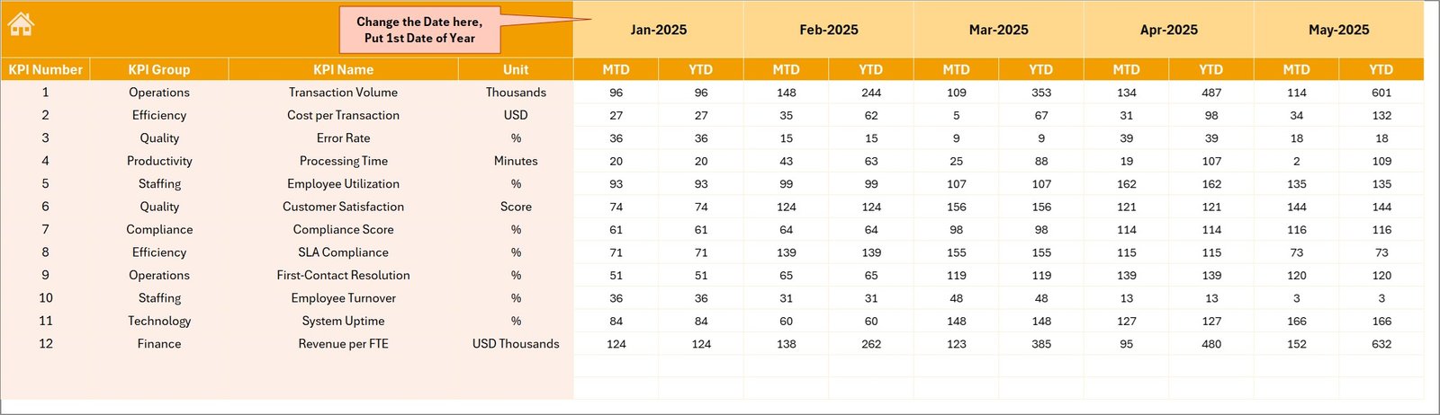
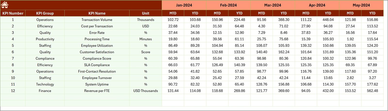
📥 Actual Numbers Input Sheet – Allows users to enter operational data for current year KPI tracking.
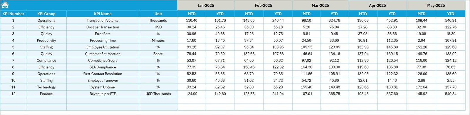
🎯 Target Sheet – Stores KPI target values used for performance comparisons.
📅 Previous Year Data Sheet – Maintains historical KPI values for year-over-year analysis.
📘 KPI Definition Sheet – Stores KPI formulas, units, groups, and definitions to maintain KPI standardization.
⚙️ How to Use the Shared Services Centers KPI Dashboard in Excel
Using this dashboard is simple and requires no advanced Excel skills.
1️⃣ Enter Actual KPI Data
Update operational KPI values in the Actual Numbers Input sheet.
2️⃣ Input KPI Targets
Define monthly and yearly targets in the Target sheet.
3️⃣ Add Previous Year Data
Enter historical KPI data to enable year-over-year performance analysis.
4️⃣ Select the Reporting Month
Choose the desired month from the drop-down menu on the dashboard.
5️⃣ Analyze KPI Performance
The dashboard automatically updates charts, indicators, and comparisons.
This automation allows managers to monitor performance instantly without manual reporting.
👥 Who Can Benefit from This Shared Services Centers KPI Dashboard in Excel
This dashboard is designed for professionals and organizations that manage shared service operations.
👨💼 Shared Services Managers – Monitor departmental performance and operational efficiency.
📊 Finance Teams – Track financial processing efficiency and transaction metrics.
👩💻 HR Departments – Analyze workforce productivity and HR service performance.
⚙️ Operations Managers – Monitor operational KPIs and identify improvement opportunities.
🏢 Corporate Leaders & Executives – Review strategic performance insights during management meetings.
📈 Business Analysts – Perform KPI trend analysis and operational performance reporting.
Because of its flexible structure, this dashboard can be used by small businesses, mid-size companies, and large enterprises.
Organizations can use it for monthly reviews, management reporting, performance analysis, and strategic planning.
The dashboard improves transparency, enhances operational efficiency, and supports data-driven decision making across departments.
Click here to read the Detailed blog post
Watch the step-by-step video tutorial: