
Master the Art of Team Comparison with Tornado or Butterfly Charts in Excel is a unique tool that allows you to create dynamic and visually engaging charts for comparing data across multiple categories or teams. Tornado charts, also known as Butterfly charts, are a great way to represent positive and negative values, making them perfect for performance comparisons, budget analysis, survey results, and more.
These charts provide a clear visual representation of data by displaying categories or teams side by side, making it easy to compare performance or outcomes. With this template, you can create professional-looking Tornado or Butterfly charts in Excel with minimal effort, providing insights that are easy to interpret for stakeholders and team members.

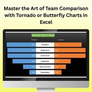
Key Features of the Tornado or Butterfly Charts in Excel
📌 Side-by-Side Team or Category Comparison
The Tornado or Butterfly chart allows you to compare two sets of data (e.g., two teams or two categories) side by side, helping you analyze differences, trends, and outliers in a simple and visually engaging way.
🛠 Customizable Chart Elements
Customize the chart’s appearance by adjusting colors, labels, axis, and more. Tailor the chart to fit your specific data needs, whether you’re tracking sales, performance, or other key metrics.
💡 Visual Comparison of Positive and Negative Data
Tornado charts display both positive and negative data, making them ideal for performance analysis, budget comparisons, or survey data. Easily spot discrepancies, strengths, or areas needing improvement.
🔢 Real-Time Data Updates
As new data is entered, the chart automatically updates in real-time to reflect the latest numbers. This ensures that your chart is always current and provides up-to-date insights for decision-making.
🚀 Multiple Use Cases
Whether you’re comparing team performance, sales results, or financial data, the Tornado or Butterfly chart is versatile enough for any scenario that involves comparing two sets of data across multiple categories.
📊 Clear and Professional Design
The Tornado chart’s design is both professional and easy to read, making it perfect for presentations, reports, and team meetings. The clean layout helps highlight the most important comparisons, making it easier to communicate insights.
⚙ Easy Setup and Customization
This template is designed to be user-friendly, with clear instructions that make setting up the chart quick and simple. No advanced Excel skills are needed to get started.
🚀 Why You’ll Love the Tornado or Butterfly Chart in Excel
✅ Side-by-Side Comparison – Compare two data sets across categories in a clear, engaging way. ✅ Customizable Design – Modify chart colors, labels, and data points to match your needs. ✅ Visualize Positive and Negative Data – Effectively display both positive and negative comparisons. ✅ Real-Time Updates – Automatically update the chart as data changes. ✅ Simple Setup – Easy to use with clear instructions and minimal setup required.
📂 What’s Inside the Tornado or Butterfly Chart in Excel?
- Tornado Chart Design: A side-by-side comparison of data for clear visualization.
- Customizable Labels and Data: Modify labels, colors, and chart elements to suit your needs.
- Real-Time Updates: The chart automatically adjusts as new data is entered.
- Professional Layout: A clean, professional design for easy interpretation of data.
- Clear Setup Instructions: Simple steps to set up and customize the chart quickly.
🔍 How to Use the Tornado or Butterfly Chart in Excel
1️⃣ Download the Template – Get instant access to the Excel file upon purchase. 2️⃣ Input Your Data – Enter your team or category data for comparison. 3️⃣ Customize the Chart – Modify labels, colors, and data points to fit your needs. 4️⃣ Track Performance – Use the chart to compare performance or other metrics side by side. 5️⃣ Present and Share – Use the chart in meetings, reports, or presentations to showcase your data.
🎯 Who Can Benefit from the Tornado or Butterfly Chart in Excel? 🔹 Business Analysts
🔹 Sales Teams
🔹 Project Managers
🔹 Marketing Teams
🔹 Financial Analysts
🔹 Anyone needing to compare data across categories or teams
Create clear and professional side-by-side data comparisons with the Tornado or Butterfly Chart in Excel. Track performance, spot trends, and communicate data insights effectively with this powerful charting tool.


Reviews
There are no reviews yet.