Quality control is no longer just a checkbox — it’s a competitive advantage. Businesses that actively monitor their quality metrics consistently outperform those that rely on guesswork. But tracking quality performance manually using spreadsheets or paper-based systems? That’s a recipe for errors, delays, and missed opportunities.
That’s where a dedicated Quality KPI Dashboard changes everything. Whether you work in manufacturing, service delivery, healthcare, or retail — having a real-time, visual dashboard to monitor key quality indicators can transform how your team operates.
At NextGenTemplates, we’ve built three purpose-designed Quality KPI Dashboards — one each for Excel, Power BI, and Google Sheets — so you can work with the platform your team already uses.
What Is a Quality KPI Dashboard?
A Quality KPI Dashboard is a visual management tool that consolidates all your critical quality metrics into a single, easy-to-read interface. Instead of digging through rows of raw data, you get a clear, at-a-glance view of performance trends, compliance rates, defect volumes, and customer satisfaction scores — updated in real time.
Common quality KPIs tracked include:
- Defect Rate — percentage of defective units in production
- First Pass Yield (FPY) — products that pass quality checks on the first attempt
- Rework Rate — effort spent correcting quality issues
- Customer Complaints — volume and type of quality-related feedback
- Process Compliance — adherence to quality standards and procedures
- Cycle Time & Throughput — efficiency metrics linked to quality outcomes
The 3 Quality KPI Dashboard Templates — At a Glance
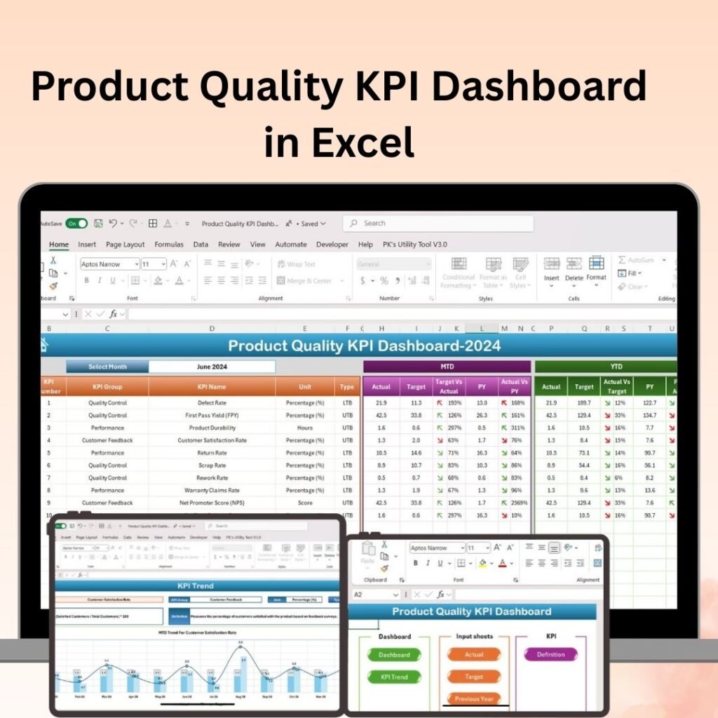
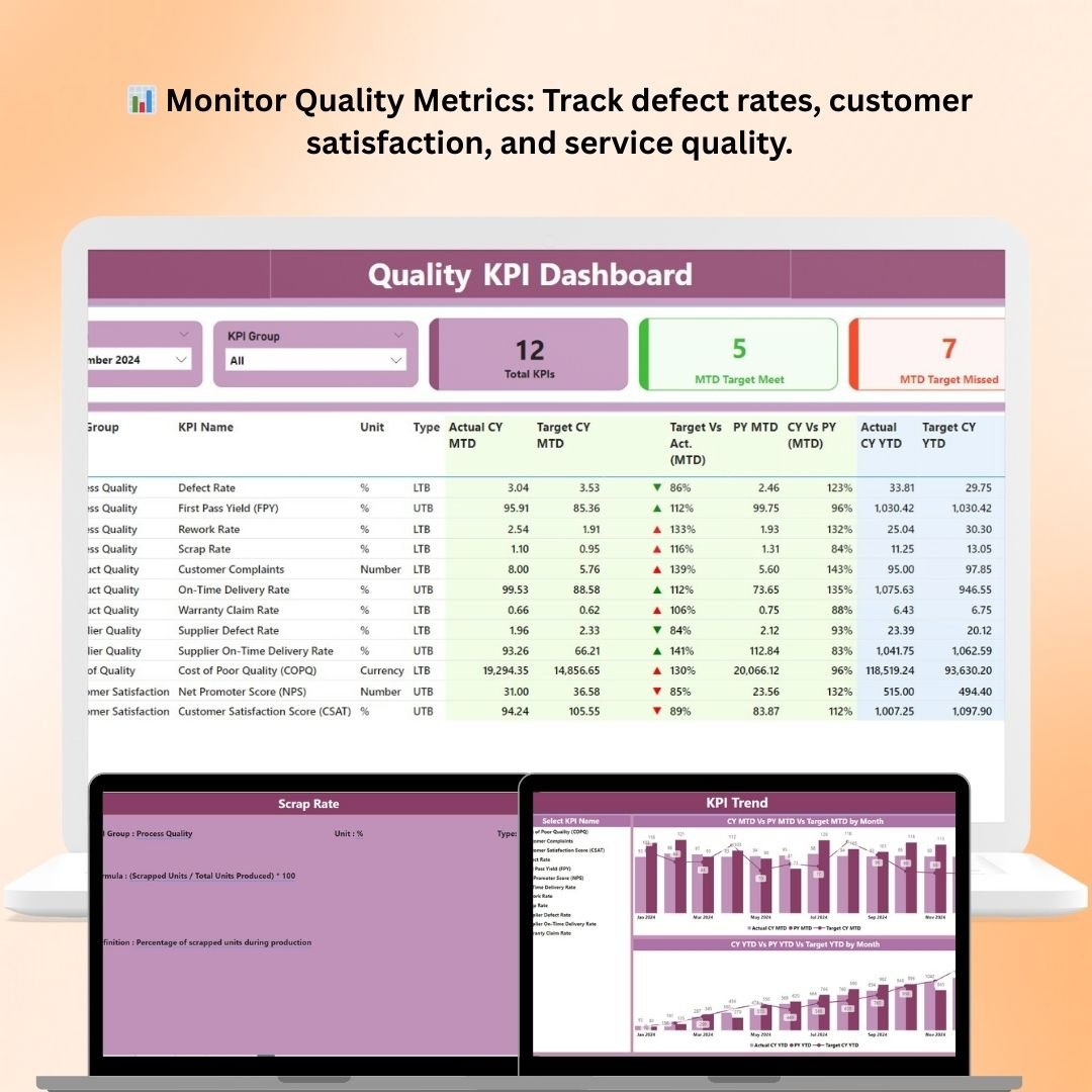
1. Quality KPI Dashboard in Excel
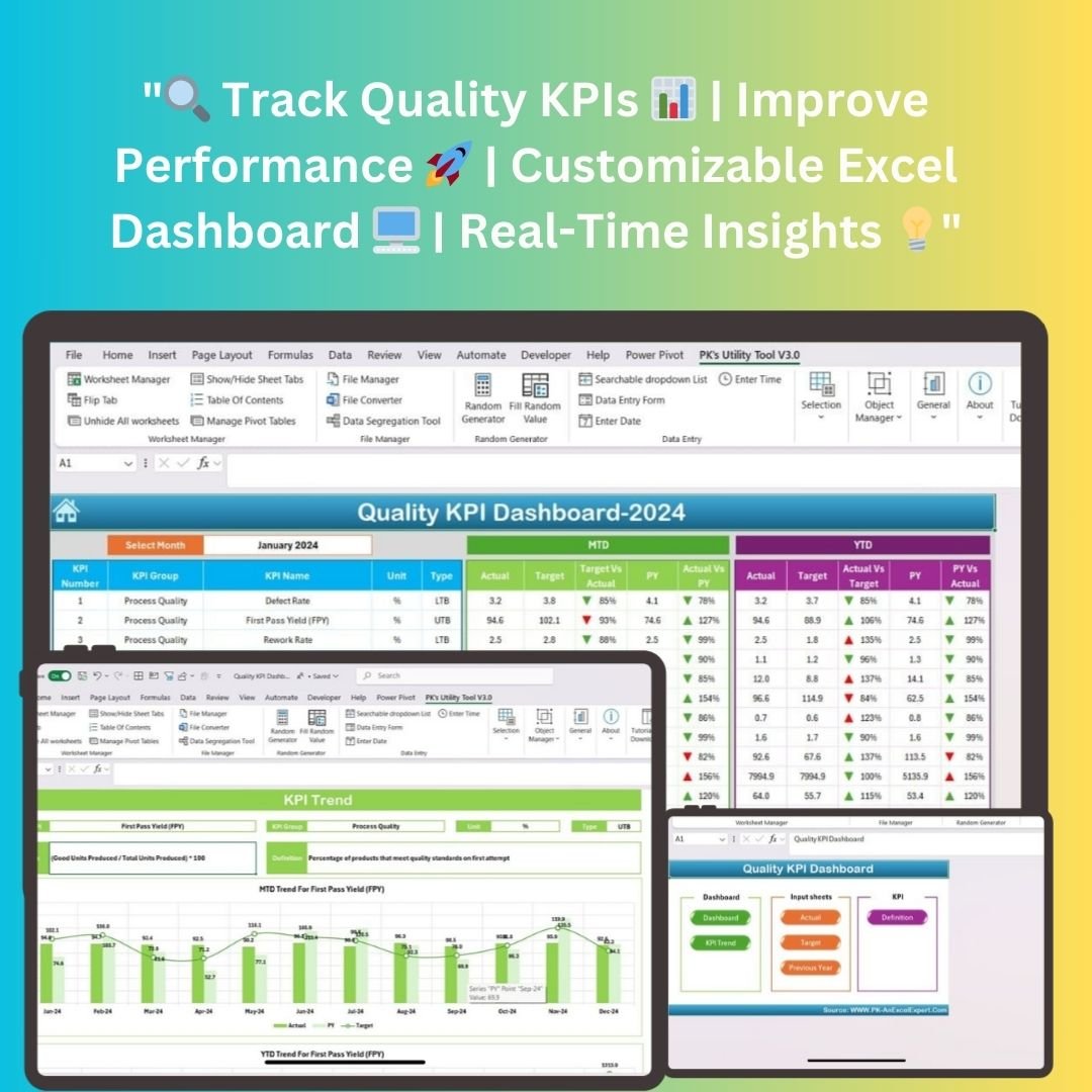
The Quality KPI Dashboard in Excel is built for teams who live and breathe Microsoft Excel. It requires zero advanced technical knowledge to set up or use, making it ideal for quality managers, operations teams, and analysts who need immediate, actionable insights.
Key highlights:
- Track KPIs like Defect Rate, FPY, Rework Rate, and Customer Complaints all in one place
- Automated charts and tables update the moment you input data — no manual reformatting required
- Supports both MTD (Month-to-Date) and YTD (Year-to-Date) performance comparisons
- Dedicated input sheets for Actual, Target, and Previous Year values
- Includes KPI definitions and calculation formulas — great for onboarding new team members
- Compatible with Excel 2016 and later, including Excel 365 (Windows & macOS)
Whether you’re a small business or a large enterprise, this dashboard is plug-and-play. Download it, enter your data, and your quality story is instantly visualized.
2. Quality KPI Dashboard in Power BI
For organizations that want enterprise-grade analytics and advanced interactivity, the Quality KPI Dashboard in Power BI is the ultimate quality management solution.
Power BI’s dynamic data engine allows this dashboard to pull live data, apply filters across departments, and generate reports that update automatically — without any manual intervention.
Key highlights:
- Monitor quality KPIs across multiple departments — production, supply chain, customer service, and more
- Real-time data tracking keeps performance insights current and accurate at all times
- Defect & Failure Rate Analysis — identify recurring patterns and take corrective action before problems escalate
- Track Process Efficiency metrics such as cycle time, rework time, and throughput
- Monitor Customer Satisfaction scores and complaints to improve the end-user experience
- Fully customizable: filter by department, product line, or time period with a single click
- Ideal for Quality Managers, Operations Teams, Business Analysts, and Senior Executives
The Power BI dashboard is designed for teams who need deep analytical capability and cross-departmental visibility in one centralized view.
3. Quality KPI Dashboard in Google Sheets

Cloud-first teams will love the Quality KPI Dashboard in Google Sheets. It combines the accessibility of Google’s ecosystem with the analytical power of a professionally designed KPI dashboard.
Because it lives in the cloud, it’s accessible from any device, anywhere — making it a perfect fit for remote teams or organizations with distributed operations.
Key highlights:
- Track defect rates, process compliance, and customer feedback all in one live dashboard
- Interactive charts and graphs (bar charts, pie charts, line graphs) make trends easy to interpret
- Dashboards update in real time as new data is entered — no need to refresh or rebuild
- Cloud-based access means your team can collaborate and monitor quality data from anywhere
- Customizable layouts allow you to focus on the KPIs that matter most to your organization
- Permission settings let you control who can view or edit sensitive quality data
This is the ideal solution for teams already using Google Workspace who want a ready-to-use quality monitoring tool without the setup complexity.
Which Dashboard Should You Choose?
Each tool serves a different workflow, but all three share the same core mission — helping you monitor quality, reduce defects, and make smarter decisions, faster.
| Feature | Excel | Power BI | Google Sheets |
|---|---|---|---|
| Best For | Offline/Desktop Users | Enterprise Analytics | Cloud/Remote Teams |
| Real-Time Updates | ✅ (on data entry) | ✅ (live data) | ✅ (live collaborative) |
| Customizable KPIs | ✅ | ✅ | ✅ |
| Cross-Department Views | Limited | ✅ Full | Limited |
| Cloud Access | ❌ | Partial | ✅ Full |
| Skill Level Required | Beginner-Friendly | Intermediate | Beginner-Friendly |
If your team uses Microsoft Excel daily, start with the Excel version. If you need advanced analytics and enterprise reporting, go for the Power BI dashboard. And if collaboration and cloud access are your priorities, the Google Sheets dashboard is your best bet.
Why Quality KPI Dashboards Matter More Than Ever
Quality issues are expensive — both financially and reputationally. The cost of poor quality (COPQ) can range from 5% to 30% of annual revenue for many organizations. Tracking the right KPIs early helps you catch small problems before they become costly crises.
Here’s what you gain when you use a dedicated Quality KPI Dashboard:
- Faster decision-making — real-time visuals remove the guesswork
- Proactive issue resolution — spot trends before they become failures
- Better compliance management — ensure standards are met consistently
- Improved customer satisfaction — use feedback data to continuously enhance your products or services
- Streamlined reporting — share clean, professional dashboards with leadership and stakeholders in minutes
Get Started Today
All three dashboards are available for instant download on NextGenTemplates.com. No complex installation, no technical expertise required — just download, input your data, and start monitoring your quality performance today.
- 📊 Quality KPI Dashboard in Excel
- 📈 Quality KPI Dashboard in Power BI
- 🟢 Quality KPI Dashboard in Google Sheets
Stop managing quality in the dark. Choose the dashboard that fits your workflow and start driving measurable improvements today.
▶️ Visit our YouTube channel to watch the demo.
YouTube.com/@NextGenTemplates