Refinery Dashboard is one of the most data-intensive and decision-critical operations in any industry. Every day, refinery leaders must control operating costs, reduce downtime, optimize energy usage, and maximize output—often under tight margins and strict safety standards. However, when refinery data remains locked in scattered spreadsheets and static reports, insights arrive late and decisions become reactive.
That is exactly why the Refinery Dashboard in Power BI becomes a mission-critical analytics solution for modern refinery operations.
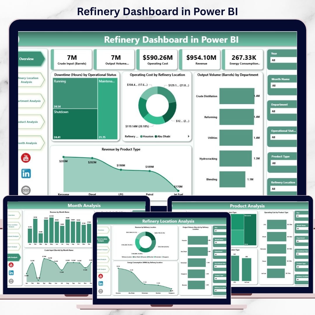
This ready-to-use Power BI dashboard transforms complex refinery data into clear KPIs, interactive visuals, and actionable insights. Instead of spending time compiling reports, refinery managers and executives gain real-time visibility into performance across locations, departments, products, and time periods—all in one centralized dashboard.
Built using Microsoft Power BI with dynamic visuals, slicers, and scalable data models, this dashboard delivers enterprise-grade refinery analytics that support both daily operational control and long-term strategic planning.
🔑 Key Features of Refinery Dashboard in Power BI
📊 Centralized Refinery Performance Monitoring
Track downtime, operating cost, energy usage, output volume, and revenue in one interactive dashboard.
⚡ Real-Time & Interactive Analytics
Explore refinery data instantly using slicers and dynamic visuals.
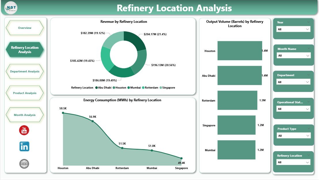
🏭 Location-Wise Performance Analysis
Compare refinery sites to identify high-performing and underperforming plants.
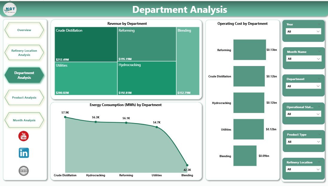
🏢 Department-Wise Operational Insights
Monitor cost, revenue, and energy consumption at the department level.
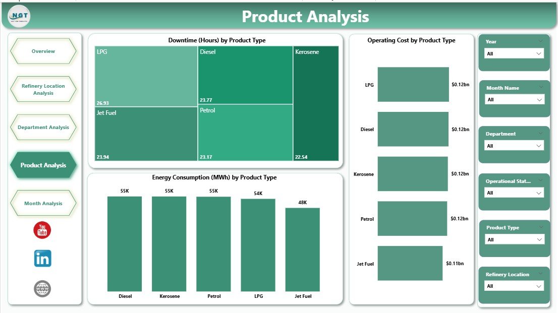
🛢️ Product-Wise Performance Tracking
Analyze downtime, cost, and energy impact by product type.
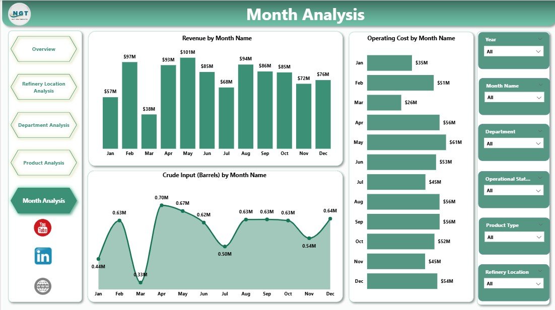
📈 Monthly Trend Analysis
Identify seasonal patterns, cost escalation, and output trends early.
🎯 Decision-Focused KPI Cards
Get instant clarity with high-level KPIs on downtime, cost, output, and revenue.
🔧 Scalable Power BI Design
Easily extend the dashboard with new KPIs, locations, or products as operations grow.
📂 What’s Inside the Refinery Dashboard in Power BI
📄 Overview Page
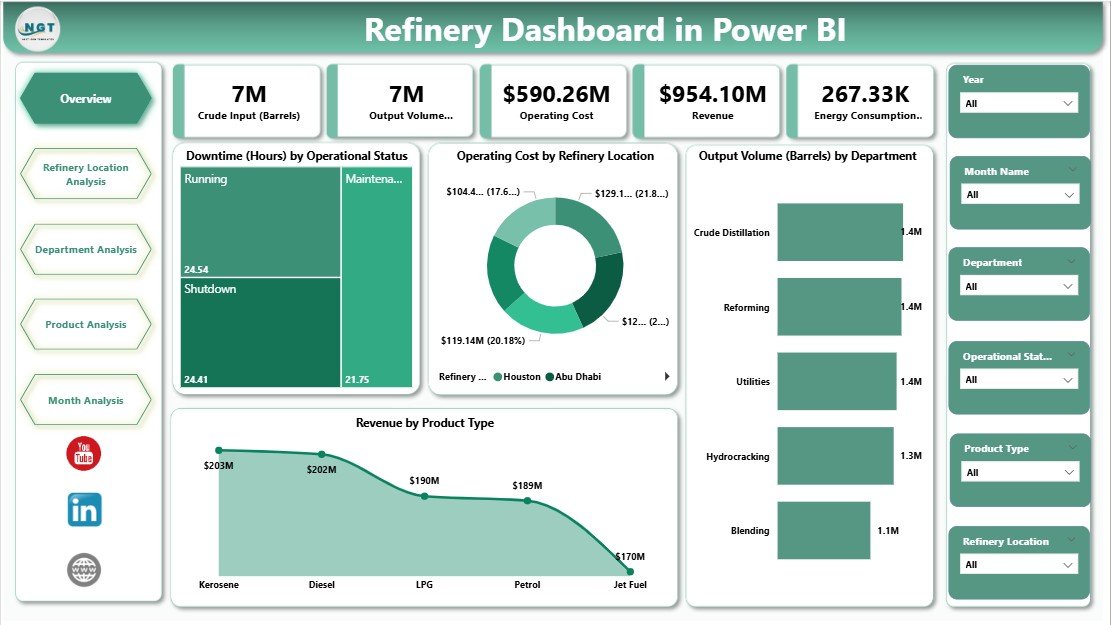
High-level snapshot with KPI cards and core operational charts.
📄 Refinery Location Analysis Page
Location-wise comparison of revenue, output, and energy consumption.
📄 Department Analysis Page
Department-level insights into cost, revenue, and energy usage.
📄 Product Analysis Page
Product-wise analysis of downtime, cost, and energy efficiency.
📄 Monthly Trends Page
Time-based trends for revenue, cost, and crude input.
🔗 Interactive Slicers
Filter data by refinery location, department, product type, and time period.
Together, these pages provide a 360-degree view of refinery performance in Power BI.
🛠️ How to Use the Refinery Dashboard in Power BI
1️⃣ Connect refinery data sources (Excel, ERP, database, or system exports)
2️⃣ Refresh the Power BI dataset
3️⃣ Use slicers to filter by location, department, product, or period
4️⃣ Review KPI cards on the Overview Page
5️⃣ Drill into detailed analysis pages for deeper insights
6️⃣ Identify inefficiencies and take corrective action
7️⃣ Use trend analysis for planning and forecasting
No advanced technical skills are required. The dashboard is designed for operations teams, managers, and executives.
👥 Who Can Benefit from This Refinery Dashboard in Power BI
🏭 Refinery and plant managers
⚙️ Operations and production teams
⚡ Energy and sustainability managers
💰 Finance and cost-control teams
📊 Process engineers and analysts
🧑💼 Executive leadership
If your refinery depends on accurate, timely, and actionable insights, this dashboard is built for you.
📘 Click here to read the Detailed blog post
🎥 Visit our YouTube channel to learn step-by-step video tutorials
👉 YouTube Channel


Reviews
There are no reviews yet.