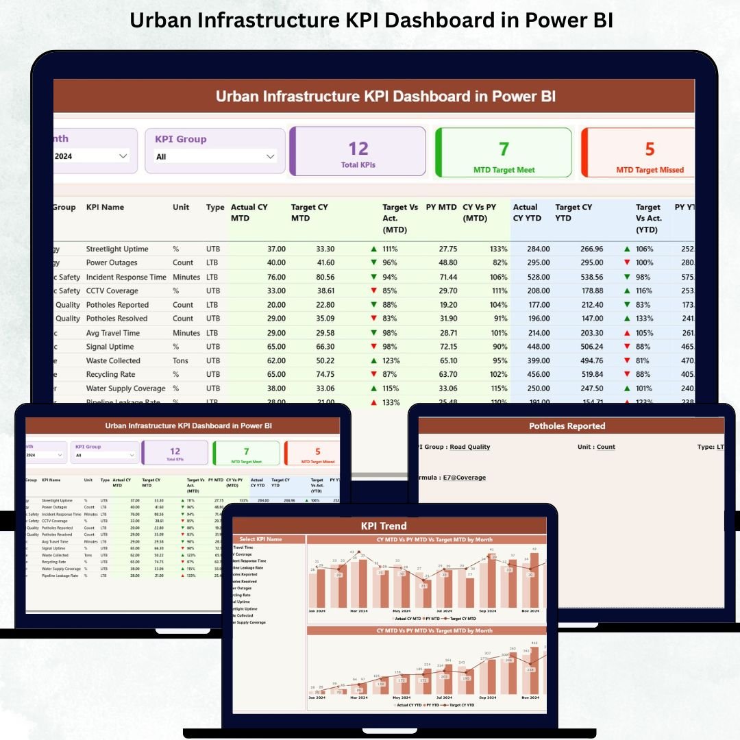
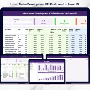
Urban development evolves every day, and infrastructure performance plays a major role in how fast cities grow. Roads, transport systems, water supply, electricity, waste handling, and public services all operate continuously. With so many departments and systems running in parallel, city leaders need clear insights—not scattered spreadsheets or slow reporting. Urban Infrastructure KPI Dashboard in Power BI This is exactly why the Urban Infrastructure KPI Dashboard in Power BI has become an essential tool for modern city management.
This dashboard converts raw infrastructure numbers into clean visual insights using Power BI’s smart charts, slicers, tables, cards, and drill-through features. Whether you want to monitor monthly performance, compare year-to-year progress, or check if KPIs meet the target, this dashboard provides every insight in seconds. Built with Excel as the backend data source, it takes zero technical expertise to update—just enter values, refresh, and start analyzing.
Let’s explore everything this dashboard offers, along with its features, benefits, and usage guidelines 👇
✨ Key Features of the Urban Infrastructure KPI Dashboard in Power BI
🏙 Complete Infrastructure Monitoring in One Dashboard
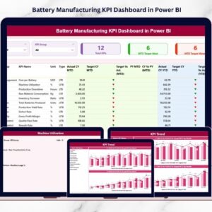
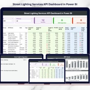
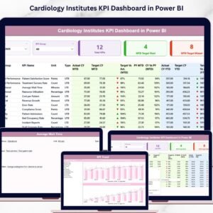
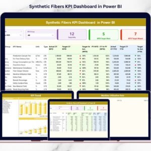
Track KPIs for roads, electricity, water systems, waste handling, public transport, and facility services—all in one place.
🎯 Smart KPI Cards for Instant Insights
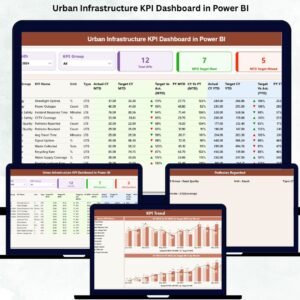
The Summary Page displays three powerful KPI cards:
-
Total KPIs Count
-
MTD Target Met Count
-
MTD Target Missed Count
With green and red arrows, you instantly know which KPIs perform well and which need attention.
🧭 Dynamic Slicers for Quick Filtering
Filter by Month or KPI Group and watch the entire dashboard update instantly. This saves time during meetings and improves clarity.
📊 MTD & YTD KPI Breakdown
The dashboard shows monthly and yearly performance together, allowing you to evaluate progress from multiple angles.
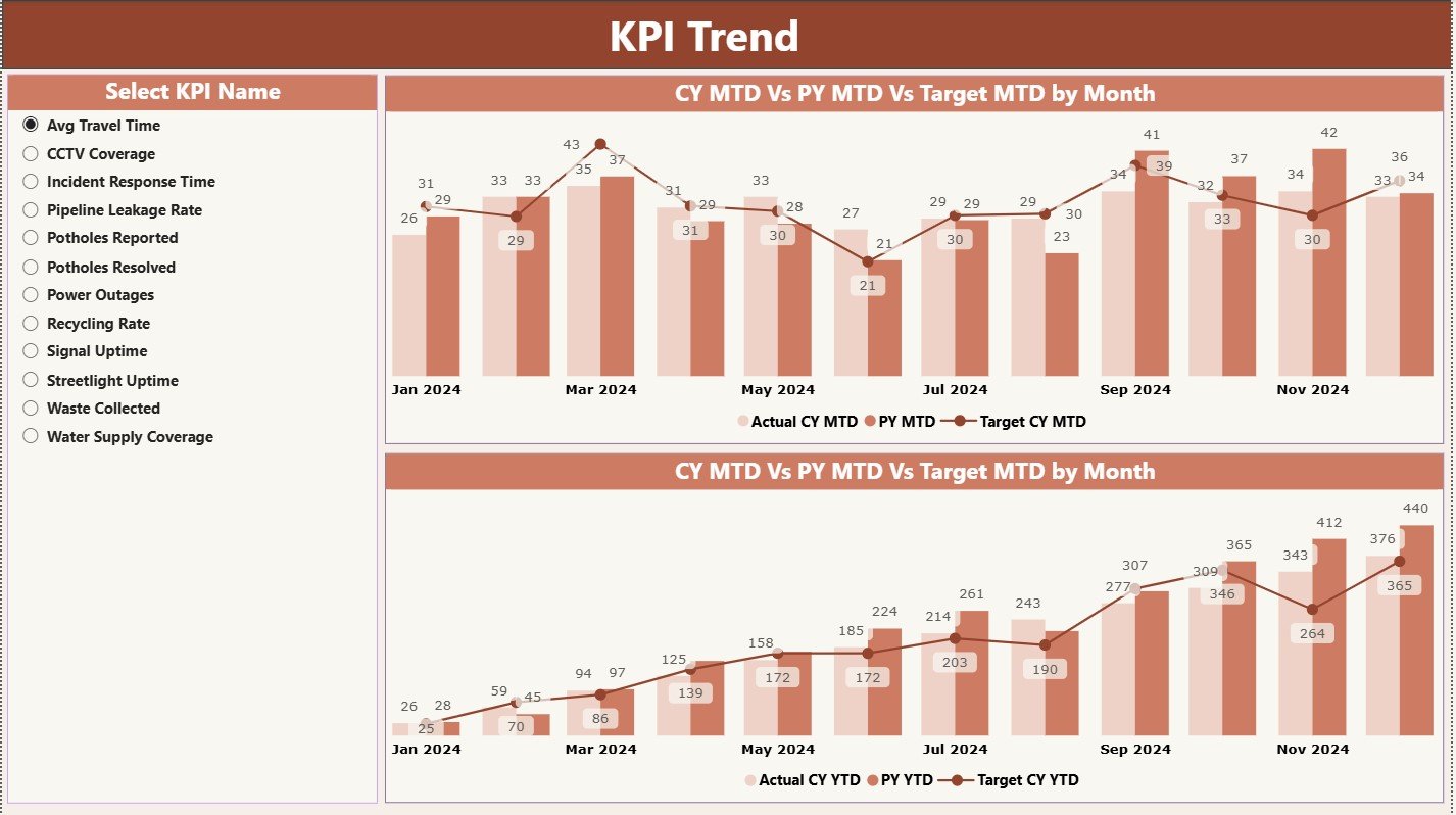
📈 Trend Analysis for Better Planning
The KPI Trend Page includes combo charts showing:
-
Current Year Actual
-
Previous Year Actual
-
Targets
For both MTD and YTD.
These trends help identify issues early and plan smarter.
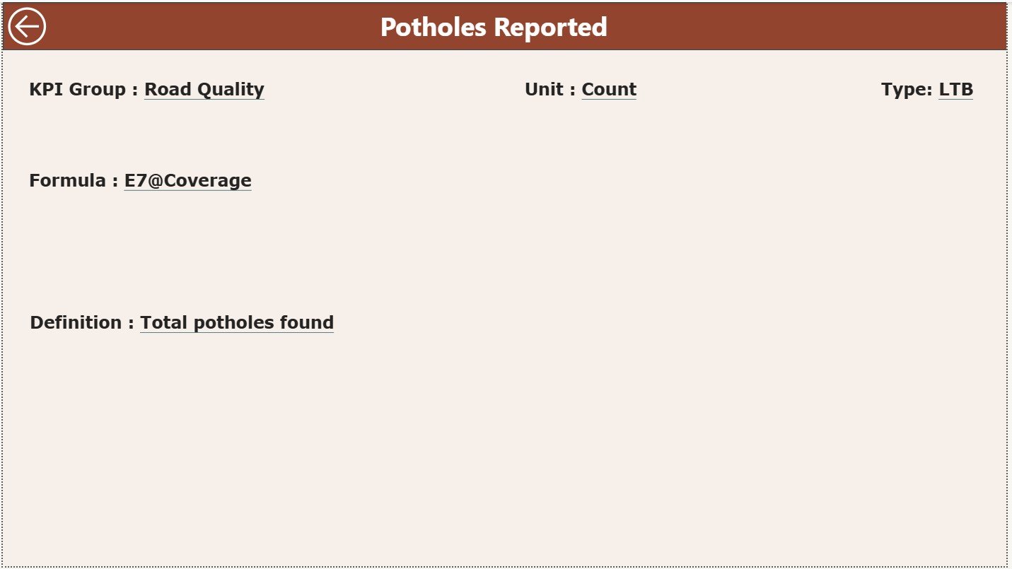
🔍 Drill-Through KPI Definition Page
Right-click any KPI in the Summary Page to view the full definition, formula, unit, and KPI type (UTB/LTB). Perfect for documentation and training.
📥 Excel-Based Data Entry
All data—Actual, Target, and KPI Definitions—comes from Excel sheets. No complex data preparation needed.
📦 What’s Inside the Urban Infrastructure KPI Dashboard in Power BI
Your dashboard file contains three powerful analytical pages, each designed to support city-level decision-making.
✔ Summary Page – The Main Control Center
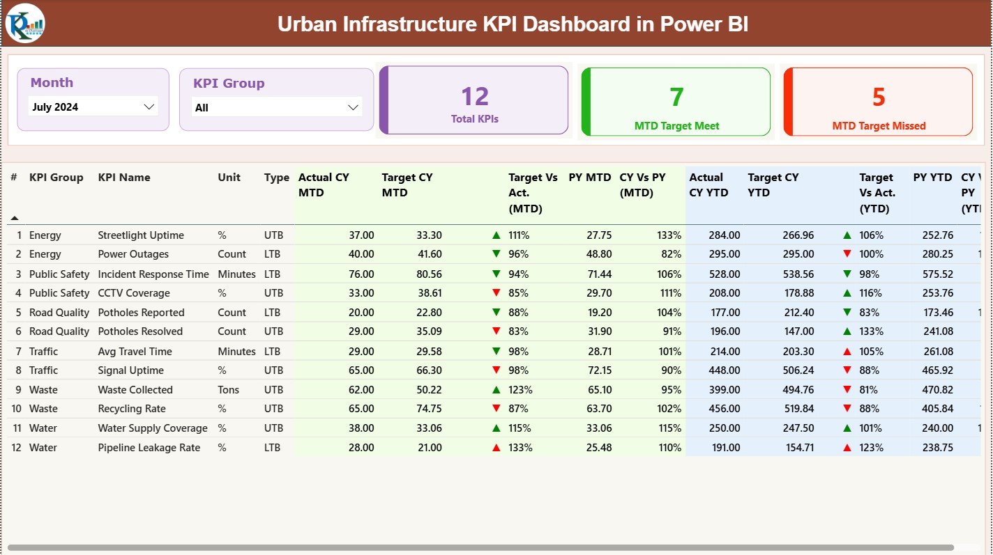
This page provides a complete overview of all city KPIs.
It includes:
-
Month & KPI Group slicers
-
Target Met vs Missed KPI cards
-
A detailed performance table with Actuals, Targets, PY Comparisons, CY vs PY %, Target vs Actual %, and performance icons
This gives leaders a quick snapshot of where the city stands.
✔ KPI Trend Page – Understand Movement Over Time
This page reveals important performance patterns through month-wise and year-wise trends.
It includes:
-
KPI selector via slicers
-
MTD combo chart
-
YTD combo chart
These visuals help you identify patterns, improvements, declines, and seasonal variations.
✔ KPI Definition Page – The Drill-Through Documentation Sheet
This page appears only when you drill through from the Summary Page. It includes:
-
KPI Number
-
KPI Group
-
Unit
-
Formula
-
Type (LTB or UTB)
-
KPI Definition
This ensures high visibility, accuracy, and transparency across departments.
✔ Excel Input Sheets
The dashboard connects to three structured sheets:
-
Input Actual
-
Input Target
-
KPI Definition
Simply update these sheets, refresh Power BI, and get instant analytics.
🛠 How to Use the Urban Infrastructure KPI Dashboard in Power BI
Using this dashboard is simple and clear:
➤ Step 1: Fill Input Actual Sheet
Add MTD & YTD values for each KPI.
➤ Step 2: Update Targets
Fill the monthly and yearly target values in the Input Target sheet.
➤ Step 3: Maintain KPI Definitions
Enter KPI Name, Group, Unit, Formula, and Type.
➤ Step 4: Refresh the Dashboard
Power BI instantly updates all visuals.
➤ Step 5: Use Slicers & Trend Charts
Filter data during meetings and analyze long-term patterns.
This workflow helps city teams make faster, more confident decisions.
👥 Who Can Benefit from This Urban Infrastructure KPI Dashboard
This dashboard is designed for:
🏙 Urban planners
🏛 Municipal authorities
🛠 Infrastructure departments
🚧 Engineers & supervisors
🚍 Public service teams
⚡ Utility management groups
📊 City administrators & data analysts
If your city handles roads, electricity, water, transport, waste, or public facilities—this dashboard is a must-have.


Reviews
There are no reviews yet.