Running a test preparation centre requires constant monitoring, real-time tracking, and quick decision-making. With multiple courses, batches, trainers, expenses, revenue streams, and student enrolments, it becomes extremely challenging to manage everything manually. The Test Preparation Centres Dashboard in Power BI solves these problems instantly. It transforms complex academic and operational data into clear visuals and powerful insights that help centres run smoothly and grow consistently.
This dashboard is designed for institutes that offer test preparation courses such as IELTS, SAT, GRE, GMAT, government exams, and college entrance tests. With five analytical pages, automated charts, interactive slicers, and performance KPIs, this Power BI dashboard gives managers, trainers, and academic leaders the full picture in seconds.
Whether you run a single centre or multiple branches, this dashboard helps you analyse trends, improve trainer quality, optimise batch schedules, reduce costs, and boost profitability.
📦 What’s Inside the Test Preparation Centres Dashboard in Power BI
This dashboard contains five detailed analytical pages, each answering a major management question.
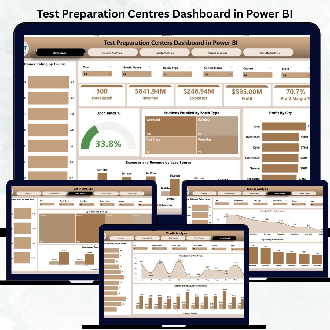
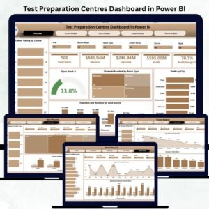
⭐ 1. Overview Page – Your Entire Centre at a Glance
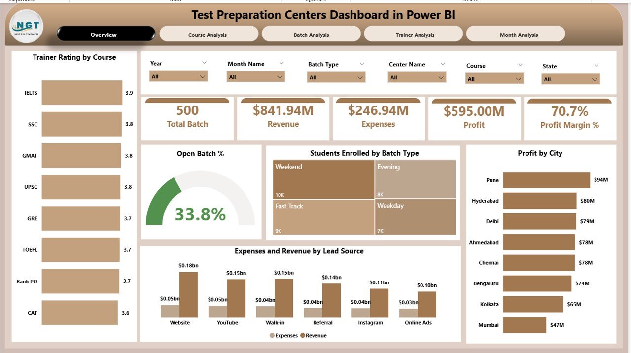
The Overview Page acts as the control centre for performance tracking. It includes:
KPI Cards:
-
Total Student Enrolments
-
Trainer Rating
-
Open Batch %
-
Total Revenue
-
Total Expenses
Charts Displayed:
-
Trainer Rating by Course
-
Open Batch %
-
Student Enrollment by Batch Type
-
Profit by City
-
Expenses & Revenue by Lead Source
This page helps decision-makers understand centre performance in seconds and identify where improvements are needed.
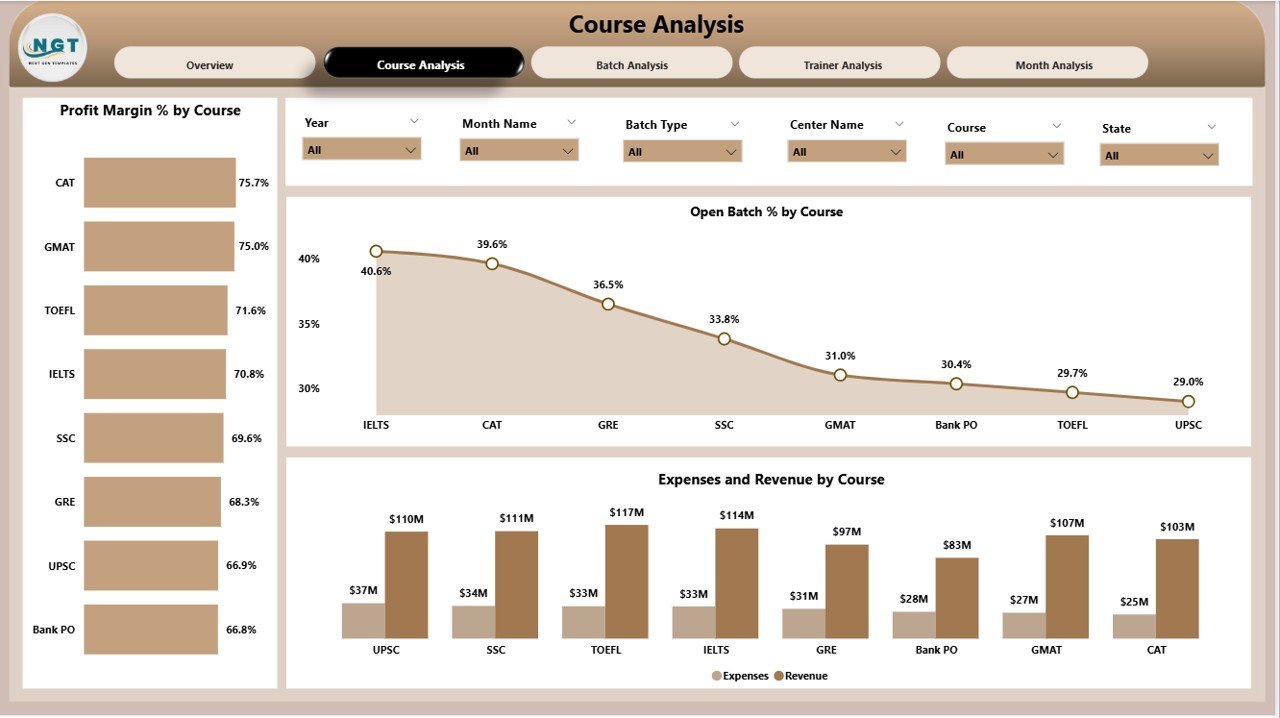
⭐ 2. Course Analysis Page – Track Course-Level Success
Every test preparation centre offers multiple programs, and each performs differently. This page helps you compare them easily.
Charts displayed:
-
Profit Margin %
-
Open Batch % by Course
-
Expenses and Revenue by Course
This page helps you answer:
✔ Which course is the most profitable?
✔ Which course attracts more students?
✔ Which course has higher expenses?
These insights guide you in adjusting fee structure, trainer allocation, and marketing focus.
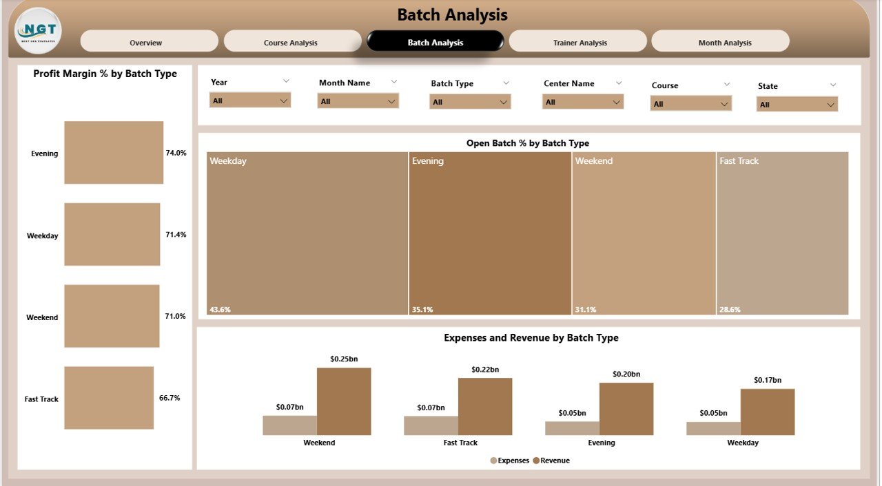
⭐ 3. Batch Analysis Page – Understand Batch Performance
Batch-wise analysis is critical because each batch can differ based on timing, trainer, student capability, and schedule.
Charts displayed:
-
Profit Margin %
-
Batch Type Analysis
-
Open Batch % by Batch Type
-
Expenses and Revenue by Batch Type
With this page, managers can identify:
✔ High-performing batches
✔ Batches with low enrolment
✔ Batches with scheduling issues
✔ Batches with high operational cost
This helps in better planning and resource optimisation.
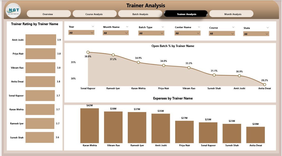
⭐ 4. Trainer Analysis Page – Evaluate Trainer Performance
Trainers have a direct impact on student success. This page helps you monitor trainer performance deeply.
Charts displayed:
-
Trainer Rating by Trainer Name
-
Open Batch % by Trainer
-
Expenses by Trainer Name
With this information, you can:
✔ Identify top-rated trainers
✔ Balance workload across trainers
✔ Review trainer-related expenses
✔ Improve training quality
This page strengthens your academic strategy and improves student satisfaction.
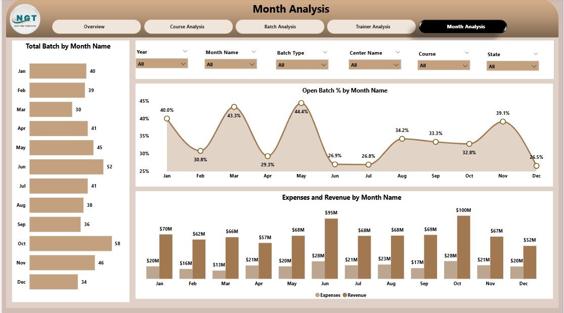
⭐ 5. Monthly Trends Page – Track Yearly Patterns
Monthly trends help you understand how performance changes throughout the year.
Charts displayed:
-
Total Batch Count by Month
-
Open Batch % by Month
-
Expenses and Revenue by Month
You can identify:
✔ Best months for enrolments
✔ Times when expenses spike
✔ Revenue-based seasonal patterns
This helps you plan budgets, schedules, and promotions more efficiently.
🛠️ How to Use the Test Preparation Centres Dashboard in Power BI
This dashboard is extremely user-friendly and requires no technical expertise.
How to use it:
➡️ Import your centre’s data into Power BI
➡️ Apply slicers to filter by month, course, batch type, trainer, or lead source
➡️ Explore charts to understand enrolment patterns
➡️ Review Profit, Revenue, and Expenses visuals
➡️ Compare performance across cities, courses, and trainers
➡️ Export reports for meetings and presentations
Because Power BI updates visuals automatically, you can make decisions instantly without preparing manual reports.
👥 Who Can Benefit from This Test Preparation Centres Dashboard in Power BI
🎯 Centre Owners & Directors
Monitor overall profitability and institute-wide performance.
🎯 Academic Heads
Optimize course quality and monitor batch success.
🎯 Trainers & Faculties
Review ratings and workload distribution.
🎯 Finance Teams
Track expenses, revenue, and profit margins.
🎯 Marketing Teams
Measure lead source effectiveness and student preferences.
🎯 Multi-Branch Institutes
Compare performance across multiple cities and locations.
This dashboard is ideal for any test preparation centre aiming to become more data-driven and efficient.
### 📘 Click here to read the Detailed Blog Post
### 📺 Visit our YouTube channel to learn step-by-step video tutorials:
👉 Youtube.com/@PKAnExcelExpert


Reviews
There are no reviews yet.