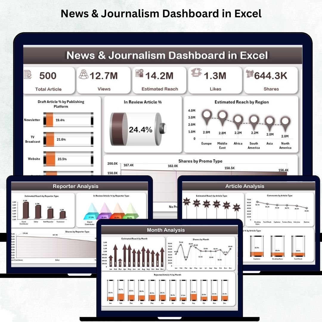
The news and media industry moves at lightning speed. Stories update every hour, reporters submit continuous drafts, and audience engagement shifts across platforms. Managing all this manually becomes overwhelming. The News & Journalism Dashboard in Excel gives editorial teams a clear, visual, and fast way to monitor performance, track article stages, evaluate reporter contributions, and study audience reach — all in one powerful template. 📰📊
This dashboard transforms raw editorial data into meaningful insights. Whether you are a newsroom editor, media manager, publisher, journalism student, or digital team lead, this dashboard helps you make smarter decisions every single day. With automated visuals, insightful KPIs, and user-friendly navigation, your entire newsroom becomes more organized, transparent, and data-driven.
🔑 Key Features of News & Journalism Dashboard in Excel
This dashboard is built to simplify reporting, reduce confusion, and bring clarity to your media operations.
📍 Easy Page Navigator
A simple left-side navigator lets you switch between all five analysis pages instantly. No scrolling, no searching — insights appear immediately.
📊 KPI Cards for Quick Stats
At the top of each dashboard page, you’ll see important KPIs such as:
-
Total Articles
-
Draft Article %
-
In Review Article %
-
Estimated Total Reach
-
Share Distribution
These KPIs help editors and managers understand the newsroom status at a glance.
🎛️ Smart Right-Side Slicers
Filter everything by:
-
Platform
-
Category
-
Article Type
-
Reporter Type
-
Month
You get focused insights in seconds.
📈 Meaningful Visual Charts
Every page displays four clean charts so you can analyze performance across categories, regions, reporters, article types, and months easily.
📂 Data Sheet for Input Only
Update all your raw information in the Data Sheet. The dashboard updates automatically without touching any visual.
📦 What’s Inside the News & Journalism Dashboard in Excel
The dashboard includes five powerful analysis pages, each giving a different angle of newsroom performance.
1️⃣ Overview Page – Your Newsroom Performance at a Glance
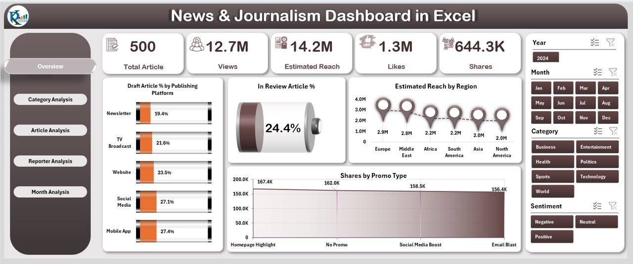
The Overview Page is the command center of your dashboard.
You get:
-
Right-side slicers for filtering
-
Five KPI cards
-
Four important charts:
-
Draft Article % by Platform
-
In Review Article %
-
Estimated Reach by Region
-
Share by Promo Type
-
This page helps editors quickly evaluate productivity, article status, and reach.
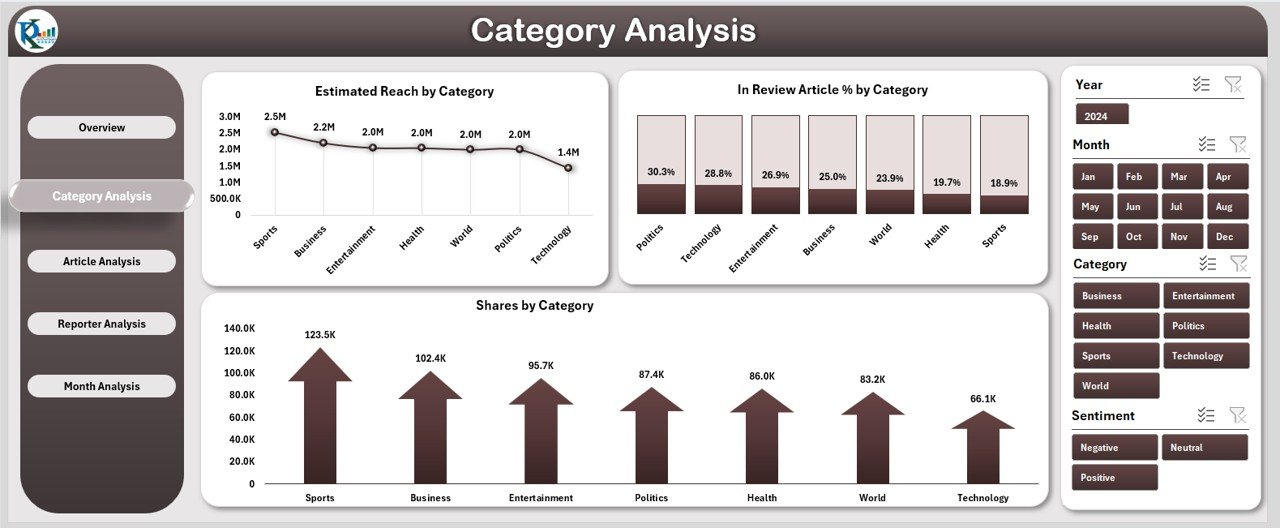
2️⃣ Category Analysis Page – Evaluate Topic-Level Performance
This page shows how different news categories perform.
Includes:
-
Category slicer
-
Estimated Reach by Category
-
In Review Article % by Category
-
Share by Category
Perfect for deciding which categories need more coverage or improvement.
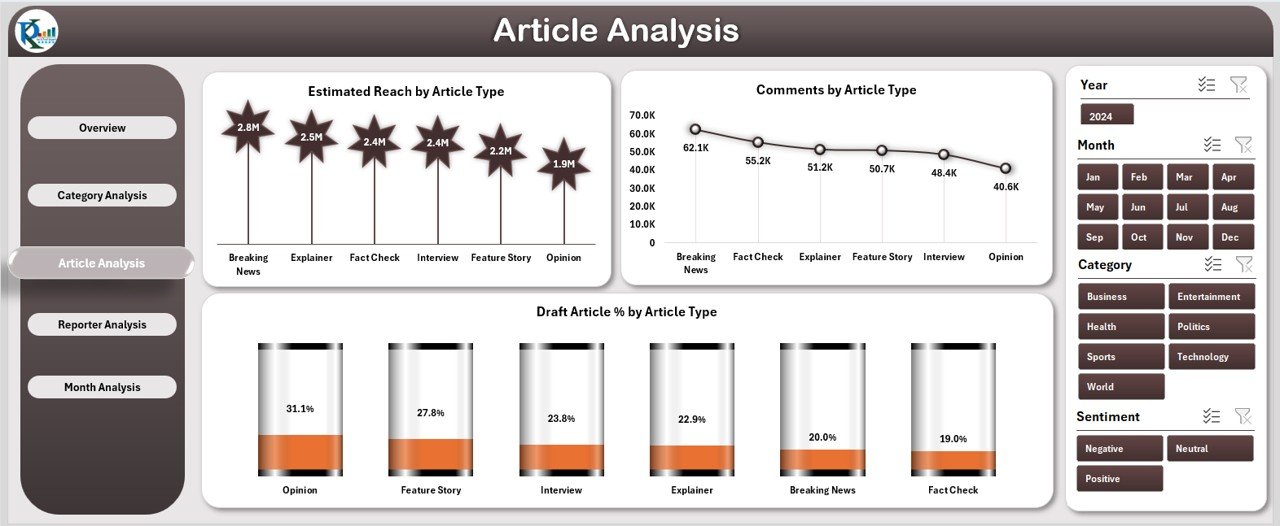
3️⃣ Article Analysis Page – Compare Article Types
Different story formats create different types of audience impact.
Charts include:
-
Estimated Reach by Article Type
-
Comments by Article Type
-
Draft Article % by Article Type
Great for planning content strategies and understanding which formats resonate most with readers.
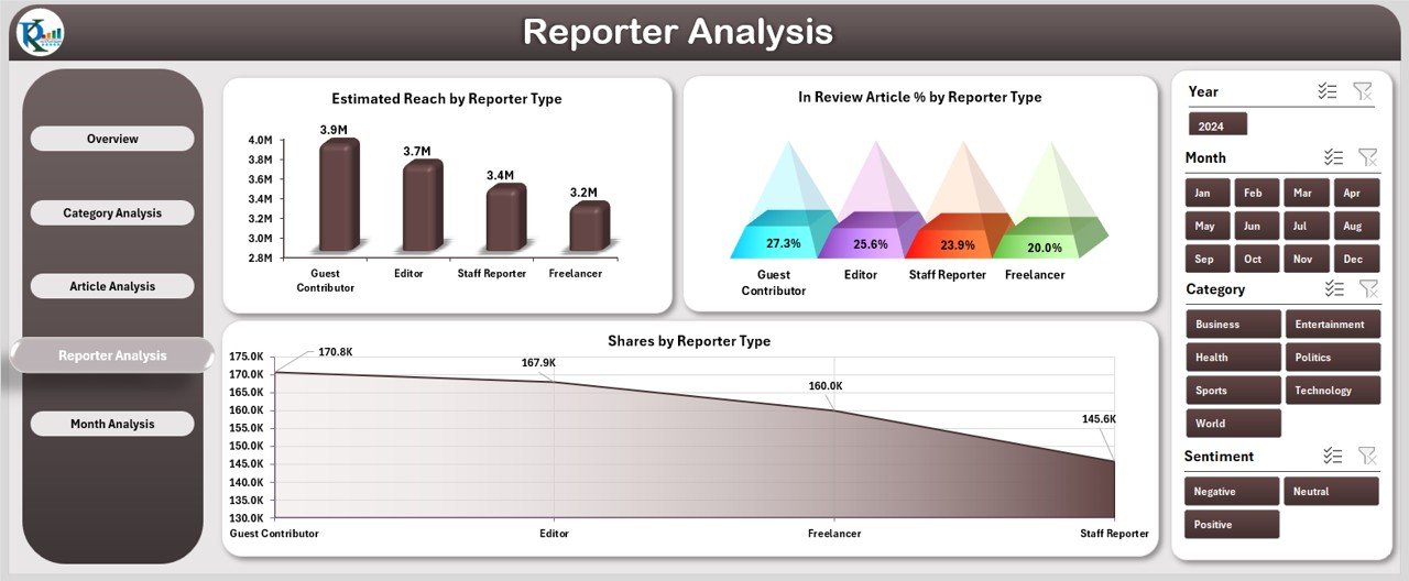
4️⃣ Reporter Analysis Page – Track Reporter Contribution
Reporters are the backbone of every newsroom.
This page includes:
-
Estimated Reach by Reporter Type
-
In Review Article % by Reporter Type
-
Share by Reporter Type
Editorial leaders can use this to assign stories, plan coaching, and celebrate high performers.
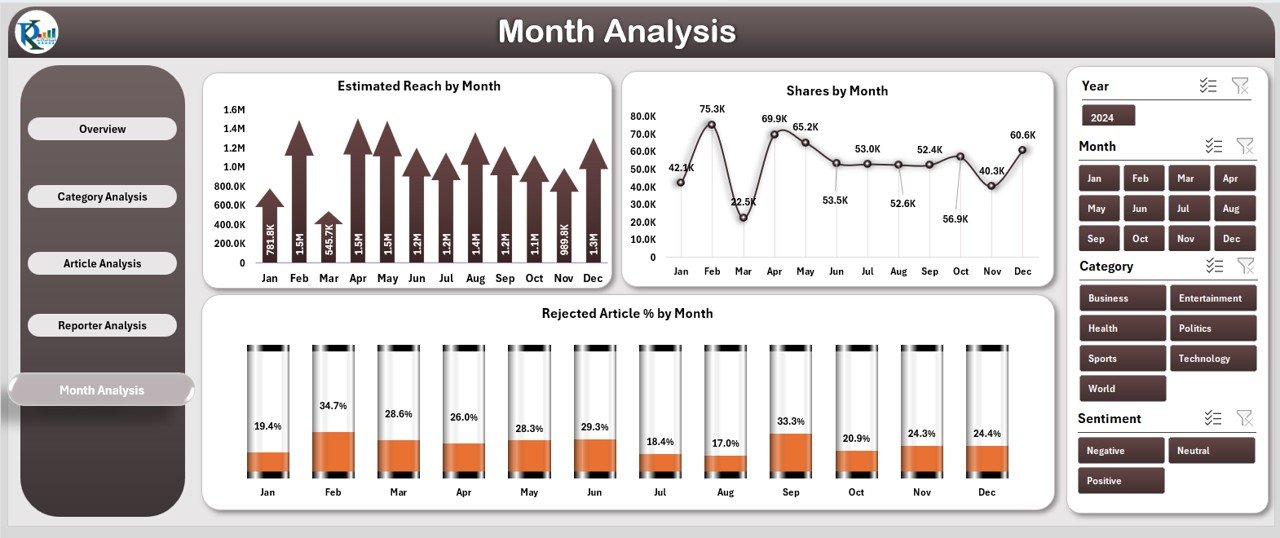
5️⃣ Month Analysis Page – Understand Monthly Trends
This page helps you analyze newsroom performance month-by-month.
Charts include:
-
Estimated Reach by Month
-
Share by Month
-
Rejected Article % by Month
Perfect for planning editorial calendars, reducing delays, and improving publishing cycles.
### Click here to read the Detailed blog post
Visit our YouTube channel to learn step-by-step video tutorials
👉 Youtube.com/@PKAnExcelExpert


Reviews
There are no reviews yet.