Ride-Hailing & Mobility Apps KPI Dashboard in Excel The ride-hailing and mobility industry runs on speed, reliability, and razor-thin margins. Every trip, driver, and rating counts. The Ride-Hailing & Mobility Apps KPI Dashboard in Excel 💡 turns this constant flow of operational data into clear, actionable insights — helping mobility startups and established fleets alike track efficiency, profitability, and service quality in real time.
Ride-Hailing & Mobility Apps KPI Dashboard in Excel This ready-to-use Excel-based dashboard simplifies analytics for fleet operators, logistics managers, and app-based mobility teams. It consolidates all your vital KPIs — rides, drivers, cancellations, costs, and revenue — into one interactive workbook. Built entirely in Microsoft Excel, it requires no coding, runs anywhere, and scales effortlessly with your growing operations.
⚡ Key Features of Ride-Hailing & Mobility Apps KPI Dashboard in Excel
✅ Centralized Performance Tracking: See total rides, active drivers, fuel cost, ratings, and cancellations — all in one place.
✅ Automated Analysis: Instantly calculate MTD and YTD results, Target vs Actual %, and PY comparisons.
✅ Dynamic Dashboard View: Dropdown filters update all charts instantly.
✅ Color-Coded Insights: Green ▲ for improvement, Red ▼ for decline — no guesswork needed.
✅ Drill-Down Trend View: Visualize KPI performance across months for deeper insights.
✅ Excel-Powered Automation: Formulas and conditional formatting handle all calculations automatically.
✅ Customizable KPIs: Add or edit metrics easily — from customer ratings to revenue per ride.
✅ Professional Design: Clean navigation hub and interactive charts make it boardroom ready.
✅ Cost-Effective and Accessible: No extra licenses — just Excel.
This dashboard brings the analytical power of business intelligence to Excel, helping you make smarter, faster, and more profitable decisions.
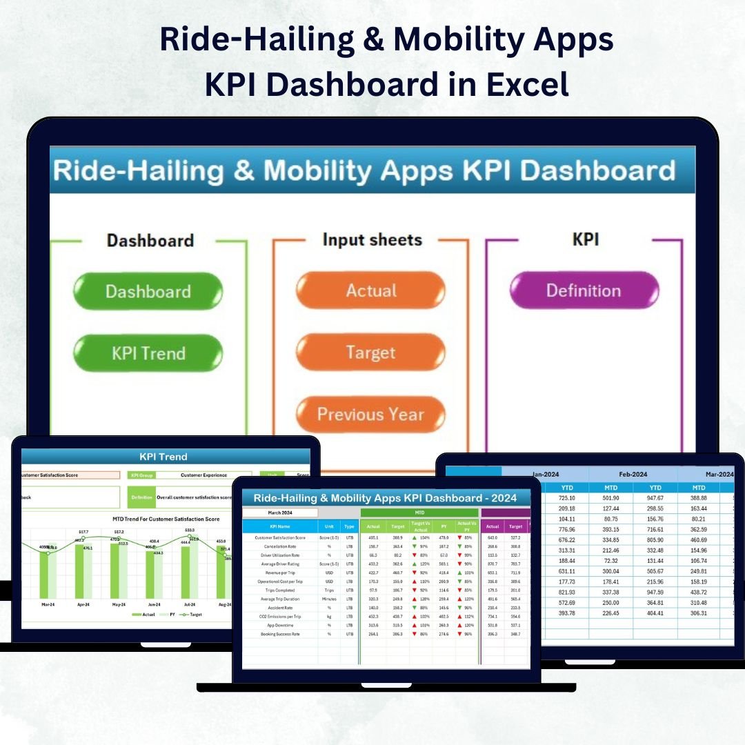
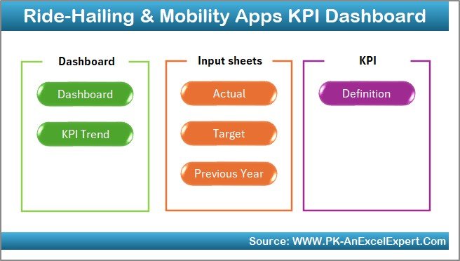
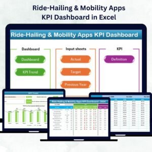
🧩 What’s Inside the Ride-Hailing & Mobility Apps KPI Dashboard
The template contains seven interactive worksheets, each built for clarity and action.
1️⃣ Home Sheet – Navigation Hub
A clean, button-based menu links directly to every major page — Dashboard, KPI Trend, Actual Numbers, Target, Previous Year, and KPI Definition.
It feels less like a spreadsheet and more like a mini application.
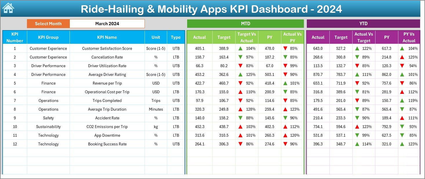
2️⃣ Dashboard Sheet – Your Command Center
-
Month selector in cell D3 updates everything instantly.
-
Shows MTD and YTD Actual, Target, and PY values side by side.
-
Conditional formatting arrows highlight KPI status.
-
Ideal for quick performance reviews and executive summaries.
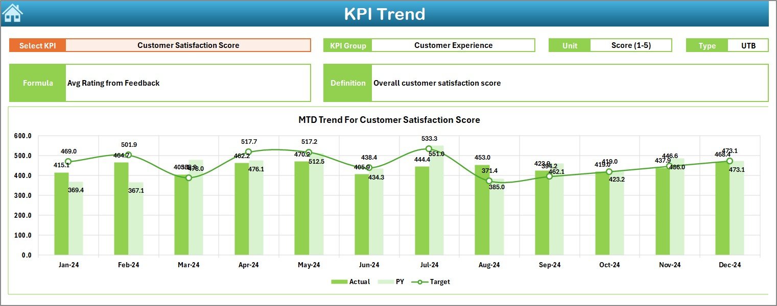
3️⃣ KPI Trend Sheet – Analyze Progress Over Time
-
KPI dropdown (cell C3) lets you focus on one metric at a time.
-
Displays KPI Group, Unit, Type (UTB/LTB), Formula, and Definition.
-
Two charts compare MTD and YTD Actual vs Target vs PY.
Perfect for spotting trends in driver efficiency or ride volume.
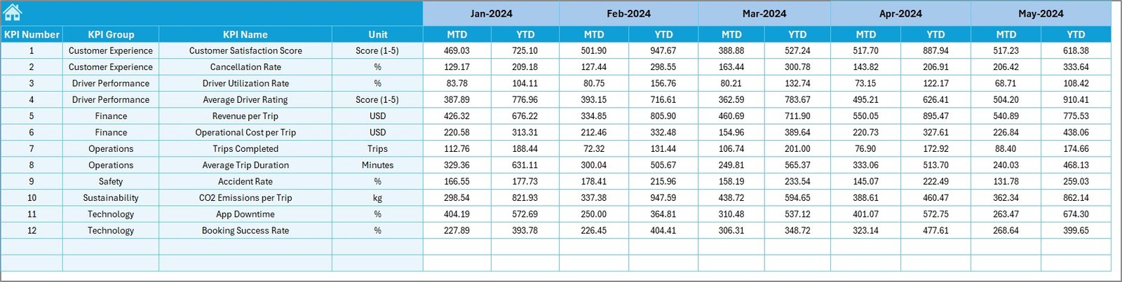
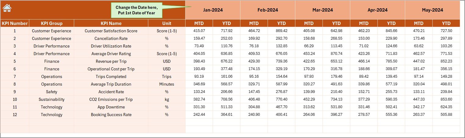
4️⃣ Actual Numbers Input Sheet – Record Real Performance
-
Set start month in cell E1.
-
Enter MTD and YTD figures for each KPI.
-
Dashboard and charts update automatically.
5️⃣ Target Sheet – Set Your Goals
-
Define MTD and YTD targets for each KPI by month.
-
Enables automatic Target vs Actual comparisons.
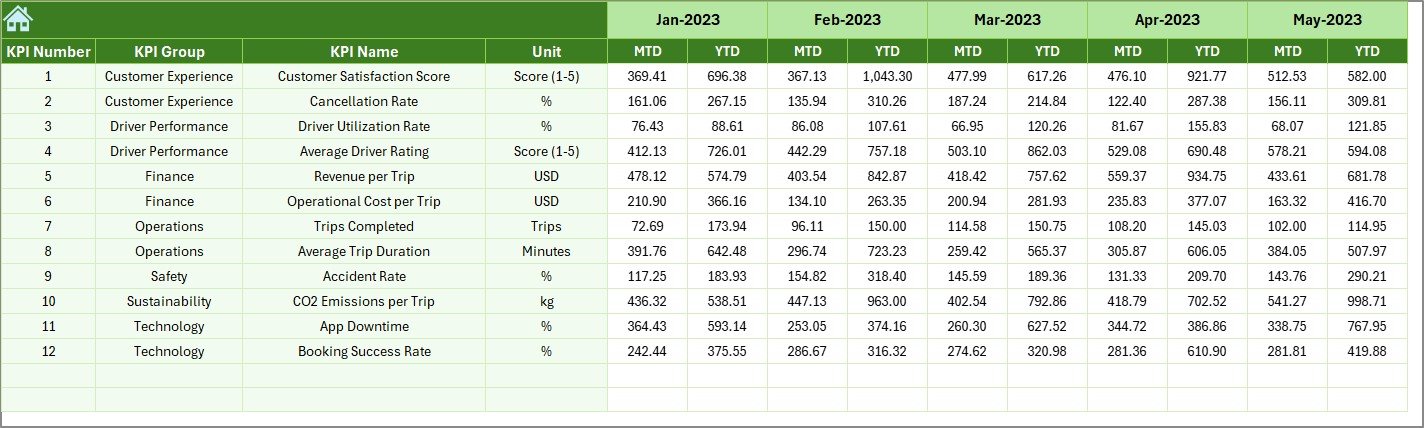
6️⃣ Previous Year Sheet – Track Historical Data
-
Store PY MTD/YTD numbers for growth analysis.
-
Enables YoY performance tracking.
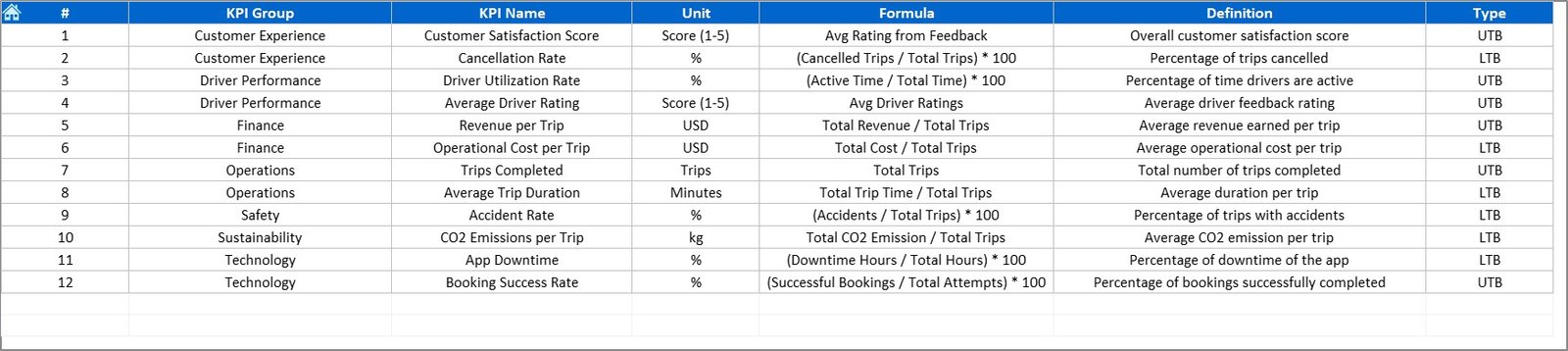
7️⃣ KPI Definition Sheet – Reference Library
-
Lists KPI Name, Group, Unit, Formula, and Definition.
-
Keeps everyone aligned on how each metric is measured.
🧠 How It Works
🚗 Step 1: Enter current month’s Actual data in the “Actual Numbers” sheet.
🎯 Step 2: Input targets and previous year values in their respective tabs.
📈 Step 3: Dashboard and Trend pages update automatically with charts and icons.
📊 Step 4: Use the Home Sheet buttons for quick navigation.
💡 Step 5: Analyze MTD, YTD, and YoY trends to optimize operations.
Within minutes, you’ll have a live performance report that’s ready for team meetings or investor reviews.
👥 Who Can Benefit from This Dashboard
🚖 Operations Managers: Monitor fleet utilization and ride fulfillment rates.
📱 App Developers & Product Teams: Analyze customer ratings and cancellation patterns.
💰 Finance Teams: Track revenue, costs, and profitability by month.
👷♂️ Fleet Owners & Partners: Compare driver performance and efficiency.
📊 Executives & Investors: Get a clear, visual summary of business health.
Whether you manage a local taxi startup or a global mobility network, this dashboard adapts to your scale and goals.
🔗 Click here to read the Detailed Blog Post
🎥 Visit our YouTube channel for step-by-step tutorials
👉 YouTube.com/@PKAnExcelExpert


Reviews
There are no reviews yet.