Freight costs can make or break supply chain profitability — and without real-time visibility, managing them becomes guesswork. The Freight Cost KPI Dashboard in Power BI changes that. It’s a dynamic, data-driven reporting solution designed to help logistics, procurement, and finance teams analyze, track, and optimize freight expenses with clarity and precision.
Built entirely in Microsoft Power BI, this ready-to-use dashboard connects seamlessly to Excel or live data sources and transforms raw shipping data into visual, actionable insights. With just one refresh, you can monitor month-to-date (MTD) and year-to-date (YTD) performance, evaluate carrier efficiency, and spot cost anomalies — all from a single interactive platform.
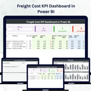
⚙️ Key Features of the Freight Cost KPI Dashboard in Power BI
The dashboard is organized into three powerful analytical pages, each serving a strategic purpose in logistics cost management.
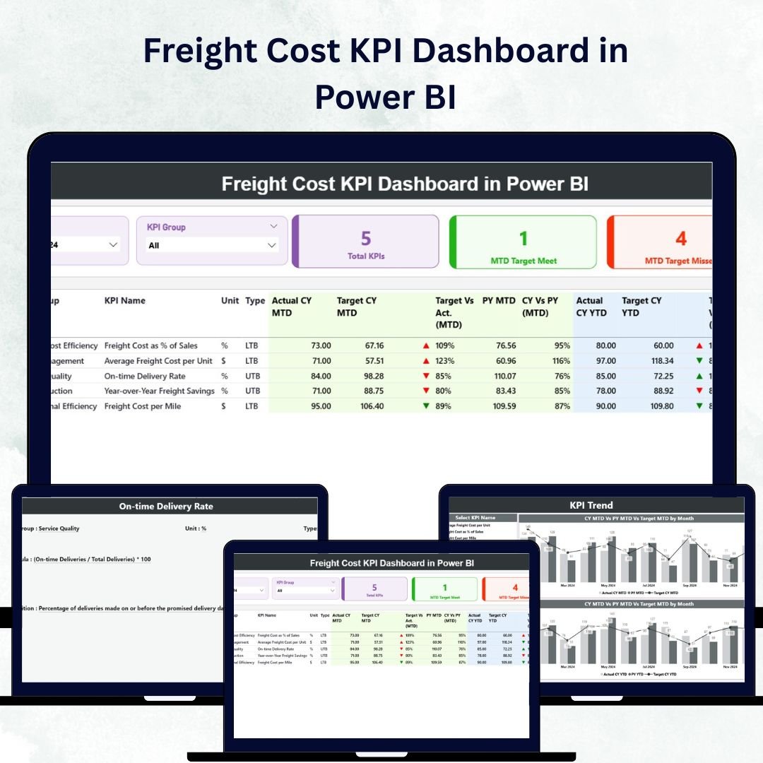
🏠 1️⃣ Summary Page – The Command Center
The Summary Page offers an at-a-glance view of freight cost performance.

Top Highlights:
-
Dynamic Slicers: Filter results by Month and KPI Group to view focused insights.
-
KPI Cards:
-
Total KPIs Count
-
MTD Target Met Count
-
MTD Target Missed Count
-
For example, if your Average Freight Cost per Shipment rises above target, the dashboard instantly flags it with a red ▼ indicator — ensuring quick visibility and action.
KPI Table Includes:
-
KPI Number, KPI Group, KPI Name, Unit, and Type (LTB or UTB)
-
Actual CY MTD, Target CY MTD, and MTD Icon
-
Target vs Actual (MTD %), PY MTD, CY vs PY (MTD %)
-
Actual CY YTD, Target CY YTD, and YTD Icon
-
Target vs Actual (YTD %), PY YTD, and CY vs PY (YTD %)
This page provides a clear and interactive summary of cost efficiency across timeframes.
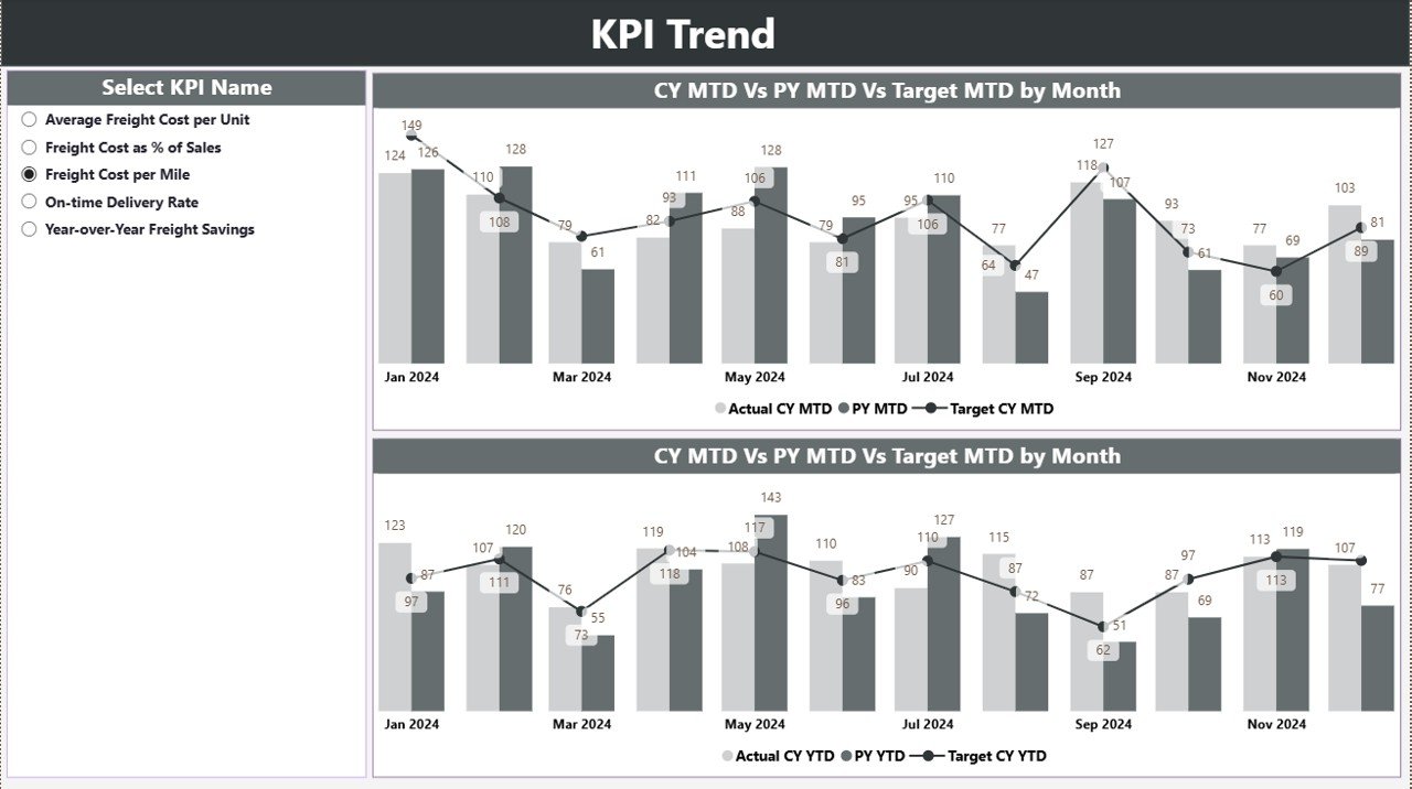
📈 2️⃣ KPI Trend Page – Visual Performance Tracking
This page helps you understand how freight costs evolve over time.
Features Include:
-
Combo Charts: Display Actual vs Target vs Previous Year performance for both MTD and YTD.
-
Slicer Panel: Choose any KPI Name to dynamically update all visuals.
-
Interactive Hover Analysis: Review monthly highs, lows, and trends effortlessly.
Typical insights include:
📊 Seasonal freight cost spikes.
💰 Carrier performance trends.
📆 Year-over-year improvements in efficiency.
This page empowers managers to visualize cost stability and identify the best months for freight optimization.
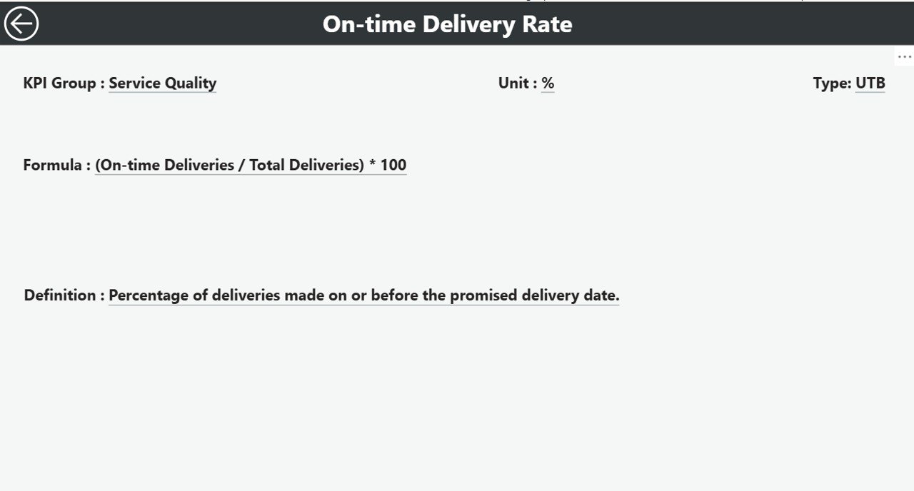
📘 3️⃣ KPI Definition Page – Transparency and Governance
A hidden drill-through page that ensures every KPI is understood across departments.
Displays:
-
KPI Formula
-
KPI Definition
-
Type (LTB/UTB)
Users can right-click any KPI in the Summary Page to “Drill Through” to its definition. A built-in Back button ensures seamless navigation.
This feature ensures consistency and transparency in how freight performance metrics are defined and tracked.
💾 Data Source – Excel Integration
The dashboard integrates directly with a structured Excel data source, including:
📄 Input_Actual Sheet – Captures monthly freight performance data (KPI, Month, MTD, YTD).
📊 Input_Target Sheet – Stores monthly targets for benchmarking.
📘 KPI Definition Sheet – Defines all KPIs with Number, Group, Formula, and Type (LTB or UTB).
This simple, scalable data structure allows Power BI to refresh visuals automatically — ensuring real-time accuracy.
🚀 Why Freight Cost KPIs Matter
Freight expenses often account for 20–30% of logistics budgets. Without visibility, overspending is inevitable. Tracking KPIs like:
-
Total Freight Cost
-
Freight Cost per Shipment
-
Freight Cost as % of Sales
-
Cost per Carrier/Route/Mode
-
On-Time Delivery %
-
Claims & Damage Costs
… helps identify inefficiencies and optimize routes, carriers, and contracts.
🌟 Advantages of the Freight Cost KPI Dashboard in Power BI
✅ Real-Time Insights: Monitor shipping cost trends instantly.
✅ Cost Optimization: Detect cost overruns early and take corrective action.
✅ Informed Decision-Making: Compare performance by carrier, mode, or region.
✅ Historical Context: Year-over-year comparisons reveal long-term progress.
✅ KPI Transparency: Drill-through definitions promote consistent understanding.
✅ Time Savings: Eliminate manual reporting with automated data refresh.
✅ Data-Driven Culture: Empower every stakeholder with visual, factual insights.
💡 Use Cases
📦 Procurement Teams: Evaluate carrier efficiency and negotiate better rates.
💰 Finance Departments: Monitor freight costs against budgets.
🚚 Operations Managers: Track shipment costs by route or delivery mode.
🏢 Executives: Access summary dashboards for strategic insights.
📊 3PL Providers: Share cost transparency reports with clients.
🔧 Best Practices for Optimal Use
✔️ Maintain clean, consistent data in your Excel source.
✔️ Standardize KPI definitions for organization-wide alignment.
✔️ Update data regularly (monthly or weekly).
✔️ Use slicers for deeper filtering (e.g., Carrier, Mode, Region).
✔️ Highlight underperforming KPIs using conditional formatting.
✔️ Automate Power BI data refresh via OneDrive or SharePoint.
✔️ Focus on patterns and trends, not just static figures.
🧭 Who Can Benefit
-
🏭 Logistics & Supply Chain Teams
-
🚛 Transportation & Freight Managers
-
💼 Finance & Procurement Analysts
-
🧮 Business Intelligence Professionals
-
🧑💼 Executive Leadership Teams
🔗 Click here to read the Detailed Blog Post
🎥 Visit our YouTube channel for tutorials
🔗 YouTube.com/@PKAnExcelExpert


Reviews
There are no reviews yet.