Why Energy & Utility Managers Can’t Afford to Work Blind
Managing energy operations without a proper dashboard is like driving at night with no headlights. You have data — output readings, downtime logs, emission reports — but it’s scattered across spreadsheets, emails, and siloed systems. By the time you spot a problem, the damage is already done.
That’s exactly why we built two ready-to-use, plug-and-play dashboards designed for the energy and utility sector. Whether you prefer the cloud-based flexibility of Google Sheets or the advanced analytical power of Power BI, we have you covered.
In this post, we’ll walk you through both products, explore their standout features, and help you decide which one best fits your workflow.
Introducing the 2 Energy & Utility Dashboards
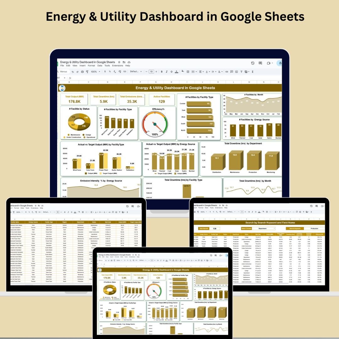
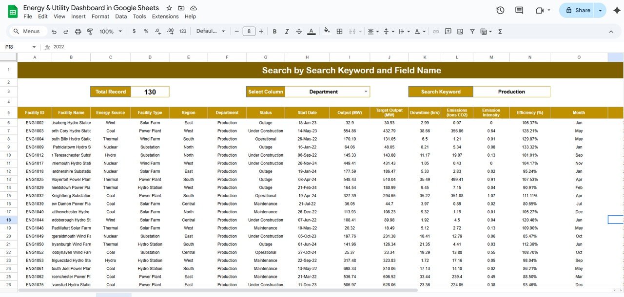
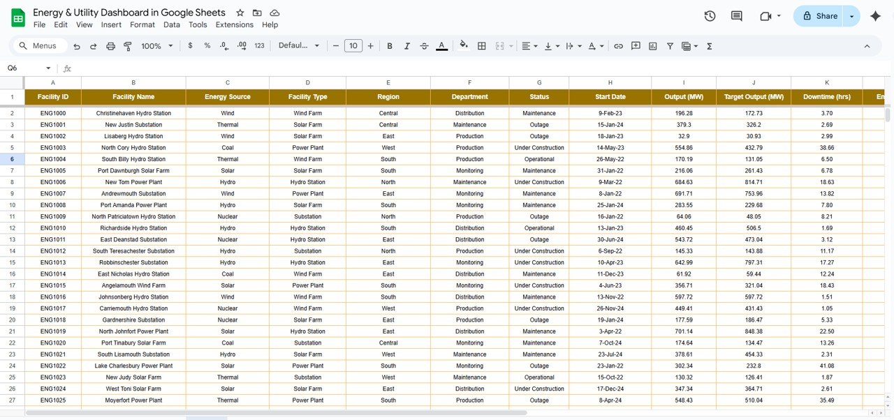
1. Energy & Utility Dashboard in Google Sheets
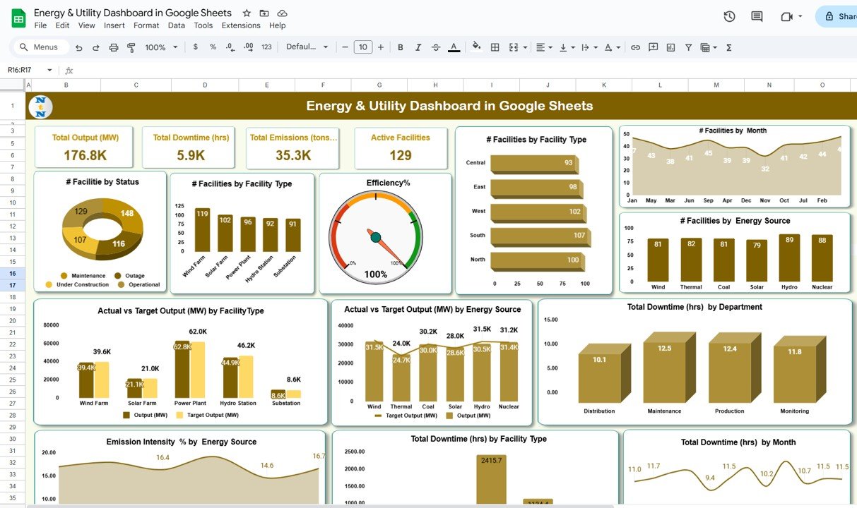
A lightweight yet powerful dashboard built entirely in Google Sheets. It gives you real-time KPIs, dynamic charts, and a smart search system — all accessible from your browser, with zero installation required.
2. Energy & Utility Dashboard in Power BI
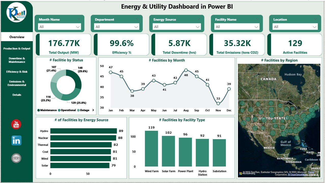
A multi-page, enterprise-grade dashboard built in Power BI. With 6 dedicated report pages, slicer-driven filtering, and deep-dive analytics, this is the ultimate solution for teams that need serious data horsepower.
Both tools help you track energy output (MW), downtime (hrs), emissions (tons CO₂), active facilities, and efficiency (%) — in real time, with zero coding needed.
5 Powerful Reasons to Use These Dashboards
✅ Reason 1: Instant KPI Visibility — No More Guesswork
Both dashboards greet you with a clean KPI overview showing the metrics that matter most:
- Total Output (MW)
- Total Downtime (hrs)
- Total Emissions (tons CO₂)
- Efficiency (%)
- Active Facilities Count
The Google Sheets version auto-updates every time you enter data in the Data Sheet tab. The Power BI version dynamically recalculates visuals the moment you load or refresh your Excel data source. Either way, your team always has a live pulse on performance.
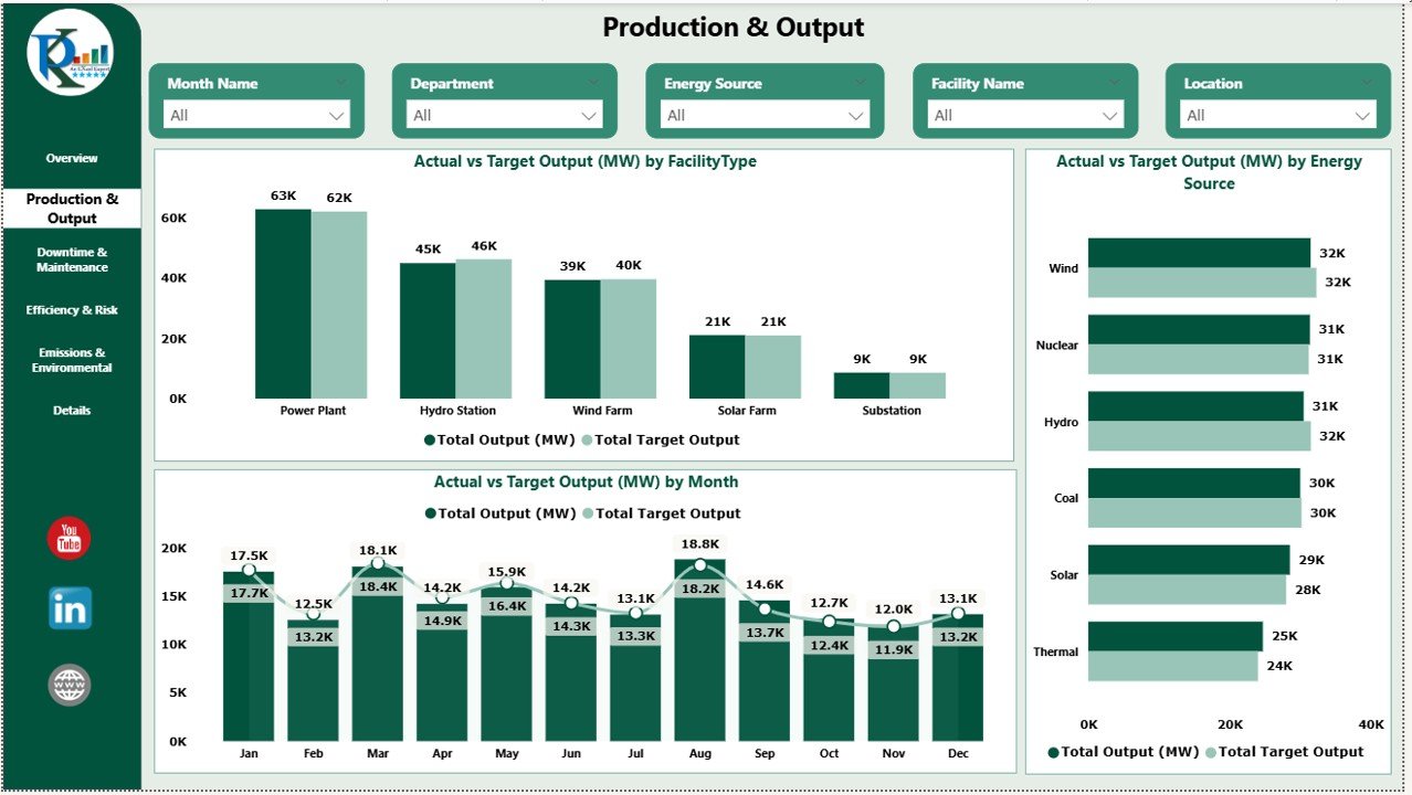
✅ Reason 2: Actual vs. Target Output Tracking
One of the most critical functions in energy management is knowing whether your facilities are hitting their production targets. Both dashboards include Actual vs. Target Output comparisons broken down by:
- Facility Type (Solar, Hydro, Thermal, Wind, etc.)
- Energy Source
- Monthly trends
This makes it easy to identify underperforming facilities early — before they drag down your quarterly numbers. The Power BI version takes this further with a dedicated Production & Output Page, while the Google Sheets version presents this beautifully in interactive chart sections.
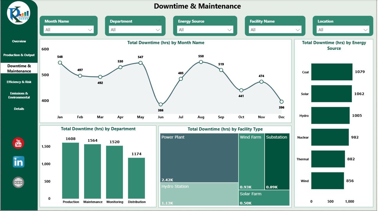
✅ Reason 3: Smart Downtime & Maintenance Tracking
Downtime is expensive. Every unplanned hour offline means lost output, frustrated teams, and potential compliance issues.
Both dashboards include dedicated downtime tracking capabilities:
- Downtime by Month, Department, Energy Source, and Facility Type
- Trend analysis to spot recurring patterns
- Bottleneck identification by region or team
The Power BI dashboard features a full Downtime & Maintenance Page with layered filtering, making it ideal for large utility networks. The Google Sheets version provides clear downtime charts that update automatically as you input new monthly data.
✅ Reason 4: Emissions Monitoring for Sustainability & Compliance
Environmental accountability is no longer optional. Utility companies face increasing pressure to report accurately on their carbon footprint.
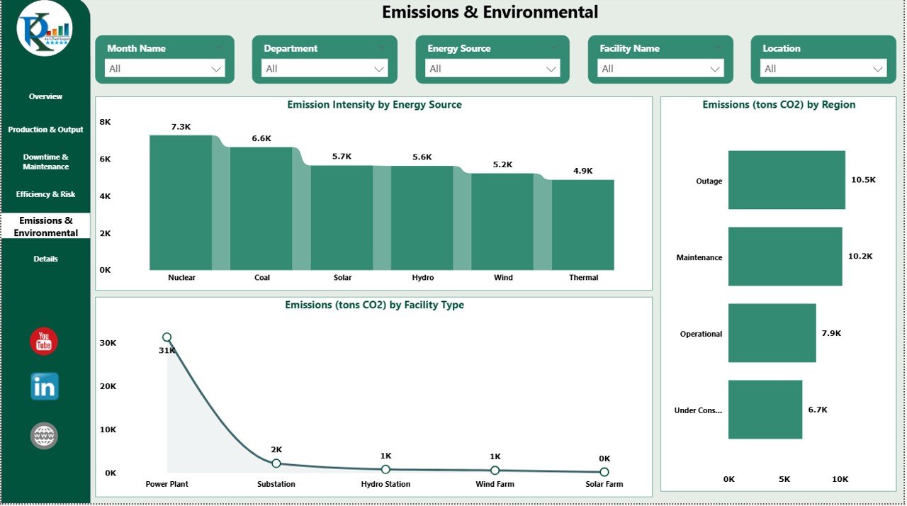
Both dashboards include a dedicated Emissions & Environmental tracking module:
- Emission Intensity % by Energy Source
- CO₂ Emissions (tons) by Region and Facility Type
- Trend visualization to support reduction strategies
Whether you’re preparing a sustainability report or briefing senior leadership, these visuals give you the data-backed narrative you need — instantly. This is one area where the Power BI dashboard truly shines, with a full Emissions Page that lets analysts drill into granular details by region and source.
✅ Reason 5: Collaboration-Ready & Fully Customizable
Both dashboards are built for real teams working in real environments:
Google Sheets Dashboard:
- Cloud-based — accessible from any device, anywhere
- Share with your team via Google Drive
- No software installation required
- Includes a Smart Search Tab to filter records by facility type, region, or energy source instantly
Power BI Dashboard:
- Share via Power BI workspace with your entire organization
- 6 fully interactive report pages
- Page-level slicers for Month, Facility Type, Department, and Energy Source
- Export-ready for formal reporting
Both are fully customizable — add new KPIs, adjust chart types, or modify layouts to match your exact operational needs.
Google Sheets vs. Power BI — Which One Is Right for You?
| Feature | Google Sheets | Power BI |
|---|---|---|
| Cloud-Based Access | ✅ Yes | ✅ Via Power BI Service |
| Number of Report Pages | 3 (Dashboard, Search, Data) | 6 Interactive Pages |
| Advanced Filtering (Slicers) | Basic | Advanced |
| Best For | Small to Mid-Size Teams | Mid to Large Enterprises |
| No Coding Required | ✅ Yes | ✅ Yes |
| Collaboration | Google Drive Sharing | Power BI Workspace |
If your team is already working in Google Workspace and needs a fast, lightweight solution — go with the Google Sheets Dashboard.
If you need multi-page reporting, enterprise-scale filtering, and deeper analytics — the Power BI Dashboard is your best bet.
Who Are These Dashboards Built For?
These tools are ideal for:
- ⚡ Energy Plant Managers overseeing multiple facilities
- 🌞 Renewable Energy Analysts working with solar, wind, and hydro data
- 🔧 Maintenance & Operations Teams tracking downtime and performance
- 🌍 Sustainability Officers monitoring emissions and compliance
- 📊 Business Analysts & Executives making strategic decisions
- 🏢 Facility Managers in power plants, gas utilities, or industrial networks
Whether you manage 3 facilities or 300, both templates scale with your operations.
What’s Inside Each Template?
Energy & Utility Dashboard – Google Sheets
- ✅ Dashboard Tab with real-time KPIs and dynamic charts
- 🔍 Search Tab for instant data filtering
- 📝 Data Sheet Tab for structured monthly data entry
- 🌐 100% cloud-based via Google Sheets
Energy & Utility Dashboard – Power BI
- ✅ Overview Page — KPIs + Facility Status Charts
- ⚙️ Production & Output Page — Actual vs. Target tracking
- 🔧 Downtime & Maintenance Page — Trend + bottleneck analysis
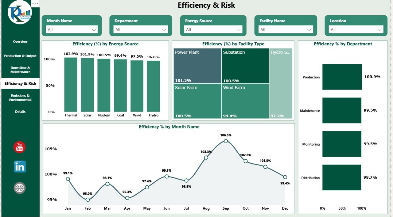
- 📈 Efficiency & Risk Page — Source-level performance gaps
- 🌍 Emissions & Environmental Page — CO₂ intensity by region
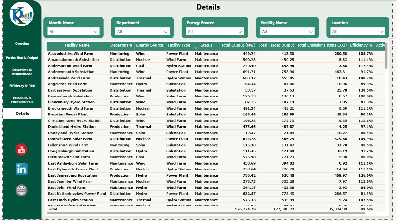
- 📋 Details Page — Raw data table for drill-down analysis
Ready to Take Control of Your Energy Operations?
Stop relying on manually updated spreadsheets and disjointed reports. Both of these dashboards give your team a single source of truth — beautiful, dynamic, and ready to use from day one.
👉 Grab the Energy & Utility Dashboard in Google Sheets — perfect for fast, collaborative, cloud-based tracking.
👉 Or go enterprise-level with the Energy & Utility Dashboard in Power BI — built for deep analytics and multi-team reporting.
Both are on sale now — don’t miss the deal!
📺 Visit our YouTube channel to watch the demo.
Youtube.com/@NextGenTemplates