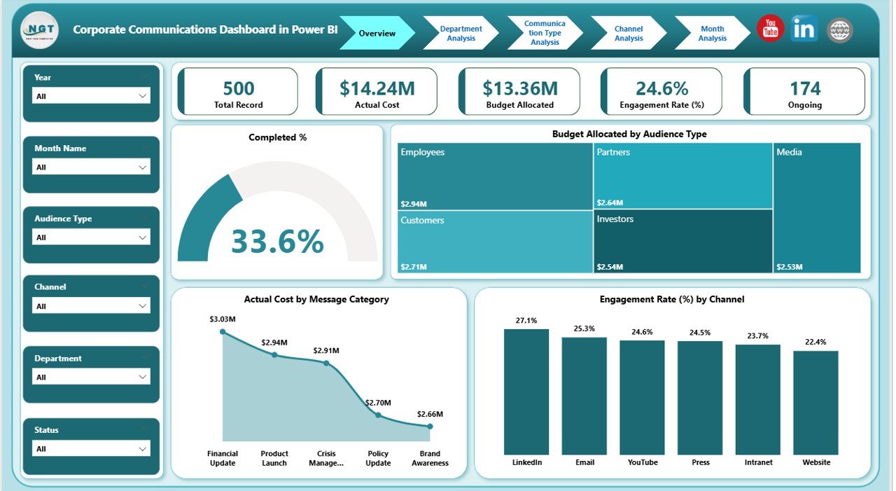
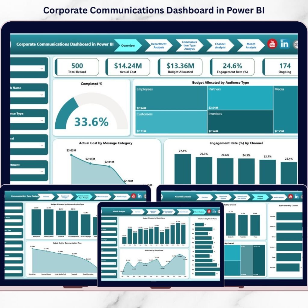
Businesses today are under increasing pressure to reduce operational costs and adopt greener practices. One critical factor that influences both cost and sustainability is energy consumption. What if you could monitor, understand, and optimize your office’s energy usage with precision? That’s precisely what the Office Energy Consumption Dashboard in Power BI from NextGenTemplates.com empowers you to do — intelligently and visually.Office Energy Consumption Dashboard in Power BI
In this blog post, we’ll explore why this dashboard isn’t just a reporting tool — it’s a must-have solution for businesses aiming to cut costs, enhance efficiency, and make informed strategic decisions.Office Energy Consumption Dashboard in Power BI
📊 What Is the Office Energy Consumption Dashboard in Power BI?
The Office Energy Consumption Dashboard in Power BI is a dynamic analytics solution designed to provide real-time insights into your energy usage across your office environment. It visualizes energy metrics using powerful interactive graphics and filters, helping businesses understand patterns, trends, and opportunities to reduce waste.
You can easily import your data — typically from Excel — and begin slicing it by time periods, departments, locations, and energy sources to monitor what matters most.
👉 Get it here: Office Energy Consumption Dashboard in Power BI

🧠 Why Every Office Should Track Energy Consumption
Before diving into what the dashboard offers, here’s why you need a tool like this:
-
💡 Reduce energy costs by identifying waste and inefficiencies
-
📈 Track patterns and trends over time to forecast future needs
-
🌱 Support sustainability initiatives with data-driven insights
-
📊 Visualize complex data easily for quick decision-making
-
📍 Customize views by department, location, or energy type
This dashboard turns complex numbers into actionable intelligence — something every office leader can use.
🧩 Key Features That Power Your Insights
The Office Energy Consumption Dashboard comes loaded with high-impact features built using Microsoft Power BI’s full capabilities. Here’s what you get and how it helps:
🏠 1. Overview Dashboard – Your Command Center
This main page gives you a snapshot of all your energy metrics in one place — letting you answer questions like:
-
What’s the total energy consumed today?
-
How much are we spending?
-
Are energy costs trending up or down?
You can filter the entire dashboard using intuitive slicers and grab insights instantly.
👥 2. Departmental Energy Summary
Understand energy usage by team or unit. This is especially useful for larger organizations where:
-
Some departments use more energy than others
-
Cost-sharing strategies might be needed
-
Energy efficiency goals vary by function
Charts show department-level consumption, cost, and efficiency scores.
📍 3. Office Location Comparisons
Multi-location businesses benefit from seeing how different office sites stack up:
-
Which location uses the most energy?
-
Where are costs the highest?
-
Who performs best in energy efficiency?
This helps prioritize investment in energy-saving upgrades.
🔋 4. Energy Source Breakdown
See exactly where your energy is coming from — electricity, gas, solar, or others — and how each contributes to total consumption and cost. This enables smarter vendor negotiations or source optimization.
📅 5. Monthly Trend Analysis
Track how your energy usage shifts over time. Are there peak months? Seasonal patterns? This page helps you:
-
Identify seasonal usage peaks
-
Plan reductions during low demand
-
Set energy targets for the next quarter or year
💡 10 Ways a Power BI Energy Dashboard Can Transform Your Office
Here’s what makes this dashboard a game-changer:
-
Visualize energy data like never before — empowers quick decisions.
-
Track costs over departments and timeframes — highlight inefficiencies.
-
Forecast future energy demands — helps with budgeting and planning.
-
Monitor sustainability improvements — critical for ESG goals.
-
Filter by energy source — tailor analysis specific to your usage.
-
Spot cost trends — prepare for seasonal changes in energy use.
-
Customize views easily — drill-down into what matters most.
-
Share insights with stakeholders — report with impactful visuals.
-
Encourage energy awareness among staff — data sparks action.
-
Leverage Power BI’s analytics strength — no more static reporting.
⚙️ How It Works: Behind the Scenes
Using this dashboard is straightforward:
-
Prepare your energy usage data in Excel (or relevant sources).
-
Import data into Power BI using the dashboard template.
-
Interact with visuals and filters to analyze trends.
-
Export reports or share dashboards with your team for aligned action.
With Power BI’s drag-and-drop interface, even non-technical users can slice data quickly.
🏆 Benefits You’ll See Fast
Here’s what users often achieve:
💸 Cost Efficiency Gains
By spotting high-usage areas instantly:
-
Adjust HVAC systems
-
Optimize lighting schedules
-
Plan maintenance before waste occurs
📊 Better Decision-Making
When data is easy to visualize, your team makes smarter calls — no guesswork.
🌍 Sustainability Impact
Track carbon footprint and reduce overall energy waste. Many organizations now use dashboards like this to report sustainability KPIs.
🧠 User Tips to Get the Most Value
-
🔄 Update energy data regularly
-
🎯 Set measurable energy goals
-
📅 Track consumption trends weekly or monthly
-
📊 Use filters to dive deep into specific metrics
-
🧑💻 Train staff on interpretation and energy goals
🛒 Conclusion: Power BI + Smart Energy Analytics = Smarter Offices
The Office Energy Consumption Dashboard in Power BI is more than a reporting tool — it’s a strategic asset. It enables businesses to track energy usage, analyze patterns, and make impactful decisions that bring both financial and environmental gains.
Visit our YouTube channel to learn step-by-step video tutorials
