In every modern workplace, office supply management plays a critical role in operational efficiency, budgeting, and employee productivity. Without a smart system in place, tracking requests, stock levels, usage, and cost becomes overwhelming — especially for growing teams.
Thankfully, ready-to-use dashboards like the Power BI Office Supplies Dashboard and the Google Sheets Office Supplies Dashboard from NextGenTemplates.com empower businesses to take control of this process without building tools from scratch.
In this blog post, we’ll explore 10 powerful ways these dashboards help streamline office supply management — whether you prefer Power BI analytics or Google Sheets simplicity. By the end, you’ll know exactly which template fits your workflow best — and why investing in one is a game-changer for your organization.
📊 1. See Your Office Supplies at a Glance
Dashboards turn raw data into visual summaries.
-
With interactive charts and visual KPIs, you can instantly view:
-
Total supplies used
-
Department usage trends
-
Most requested items
-
Stock levels and reorder points
-
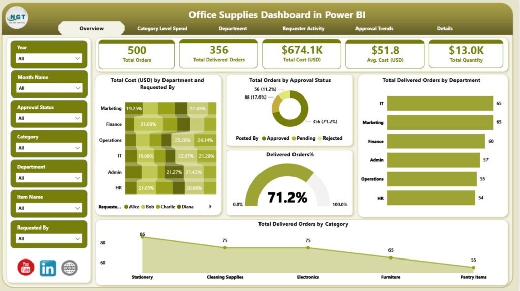
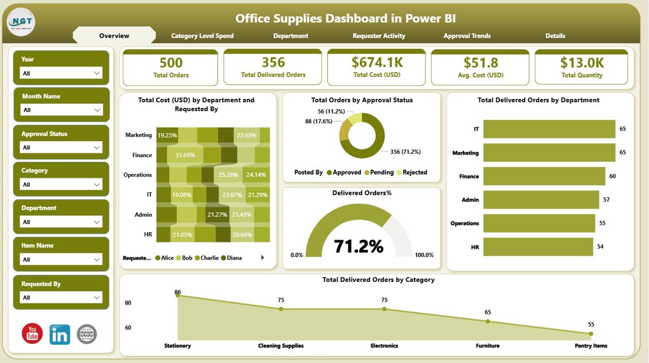
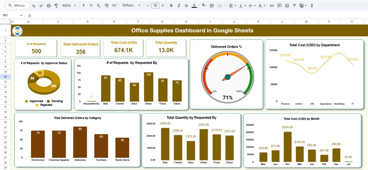
The Office Supplies Dashboard in Power BI offers deep analytics powered by Power BI, ideal for data-driven teams. Meanwhile, the Office Supplies Dashboard in Google Sheets brings the same overview in an accessible, spreadsheet format.
📈 2. Track Requests & Approvals Effortlessly
Manual tracking leads to delays and missed approvals.
Both dashboards let you:
-
Log supply requests
-
Monitor approval status
-
Identify bottlenecks in your ordering process
This ensures no request gets lost — and managers get complete oversight at all times.
💰 3. Understand Costs Better
Budgets matter — especially with tight office spending.
Dashboards help you:
-
Monitor total spend on office supplies
-
Compare month-to-month trends
-
Flag cost hotspots quickly
This kind of insight helps organizations cut waste and make smarter purchasing decisions.
👥 4. Compare Departments & Teams
Want to know which team uses the most supplies?
With these dashboards, you can segment data by department to see:
-
Who consumes what
-
Usage patterns over time
-
Which departments may need tighter controls
Being able to benchmark usage between teams provides actionable insights into resource allocation.
📅 5. Manage Inventory in Real Time
Stop worrying about running out of essentials.
The dashboards help you:
-
See real-time stock levels
-
Set alerts for low inventory
-
Plan orders before shortages happen
This is especially powerful with the Power BI version, where automation and integrations enhance visibility.
🧠 6. Spot Patterns & Predict Needs
Rather than react to shortages, anticipate them.
-
Analyze usage trends
-
Forecast future inventory needs
-
Adjust ordering schedules
The visual analytics in both dashboards make it easy to spot patterns you might have missed in spreadsheets alone.
📍 7. Use the Tools You Already Know
One of the biggest advantages of these templates is familiarity:
📊 Power BI Dashboard
-
Best for businesses with data analysts
-
Interactive visuals and filters
-
Suitable for enterprise environments
➡️ Perfect for teams that need deep insights and advanced reporting with minimal setup — get it here: Office Supplies Dashboard in Power BI
📋 Google Sheets Dashboard
-
Easy to set up
-
No software installations required
-
Great for small teams or startups
➡️ Ideal for teams that want quick setup and easy sharing — access it here: Office Supplies Dashboard in Google Sheets
Both solutions are ready to use and fully downloadable — no custom development needed.
🤝 8. Streamline Collaboration
Teams across functions — from procurement to operations — can work in sync.
-
Comments and notes in Google Sheets
-
Shared dashboards in Power BI reports
-
Centralized data access keeps everyone aligned
This drives faster decision-making and fewer back-and-forths.
🔍 9. Improve Accountability
Dashboards don’t just show numbers — they help teams own results.
By making data transparent:
-
Team leaders take responsibility for usage
-
Managers enforce policies based on evidence
-
Employees understand the impact of wasteful behavior
This transparency boosts accountability and cuts unnecessary expenses.
📥 10. Save Time with Ready-Made Solutions
Instead of spending weeks building reports:
-
Download a ready dashboard
-
Plug in your data
-
Start analyzing instantly
That’s the power of professionally built templates from NextGenTemplates.com — they take complex reporting and make it accessible, usable, and actionable from day one.
🛠 Power BI vs. Google Sheets — Which Should You Choose?
Both dashboards serve the same core purpose — smarter office supply management — but differ in approach.
| Feature | Power BI Dashboard | Google Sheets Dashboard |
|---|---|---|
| Setup Complexity | Medium | Easy |
| Analytical Depth | High | Medium |
| Collaboration | Moderate | High |
| Best For | Analysts & Data Teams | Small Teams & Startups |
| Real-Time Tracking | Yes | Yes |
| Visual Customization | Excellent | Good |
👉 If your team thrives on visuals, filters, and business intelligence features, choose the Power BI dashboard.
👉 If simplicity, ease of use, and quick deployment matter most, the Google Sheets version wins.
Both empower better decisions — choose based on your workflow and tools.
🚀 Final Thoughts
Office supply management doesn’t have to be chaotic. With the right dashboards, you can achieve:
✔ Better visibility into inventory and spending
✔ Faster decision-making
✔ Accountability across teams
✔ Predictive insights for smarter purchasing
Whether you’re a large enterprise or a lean startup, the Power BI and Google Sheets Office Supplies Dashboards from NextGenTemplates.com deliver the clarity and control your business deserves.
Visit our YouTube channel to learn step-by-step video tutorials