

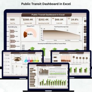
Public transit systems are the backbone of modern cities—they support mobility, reduce congestion, and connect millions of passengers daily. But as operations grow, teams handle more vehicles, more routes, more ticket types, and more performance challenges. Manual reporting becomes slow and confusing. That’s why the Public Transit Dashboard in Excel is the perfect solution for transit authorities, city planners, and operations managers who want fast, reliable, and interactive insights. 🚍📊
This ready-to-use dashboard transforms raw passenger, vehicle, cost, and revenue data into clean charts, KPI cards, and dynamic slicers. With automated updates and easy navigation, teams understand performance instantly—without scrolling through multiple spreadsheets. Whether you manage buses, metros, trams, ferries, or shuttle services, this dashboard gives a 360° view of your transit ecosystem.
✨ Key Features of Public Transit Dashboard in Excel
This dashboard includes powerful features that help transit teams monitor performance with clarity and confidence.
📊 Instant KPI Visibility
View essential KPIs such as:
-
Total Profit (USD)
-
Delayed Trip %
-
Total Trip Count
-
Operating Cost (USD)
-
Revenue (USD)
These metrics help leaders make fast decisions based on real data.
🚦 City, Mode & Ticket Insights
Analyze performance from multiple angles—by city, vehicle type, transport mode, or ticket category.
🎛️ Smart Slicers
Filter the entire dashboard with one click. Compare months, cities, transport modes, or passenger types instantly.
📈 Clean Charts for Better Decisions
Track profit, cost, delays, passenger activity, and revenue using structured visuals.
⚡ Automatic Updates
Paste your data into the Data Sheet and the dashboard updates itself—no coding, no formulas needed.
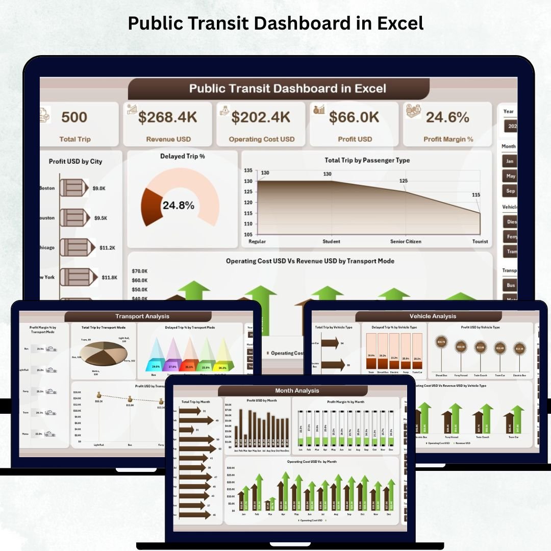
📦 What’s Inside the Public Transit Dashboard in Excel
This dashboard includes five analytical pages, each designed to answer critical operational questions.
1️⃣ Overview Page
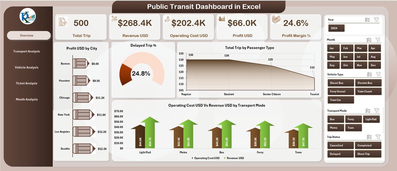
Your main performance hub includes:
-
Slicers for dynamic filtering
-
Five KPI cards (Profit, Trips, Delays, Revenue, Operating Cost)
-
Four powerful charts:
-
Profit by City
-
Delayed Trip %
-
Total Trips by Passenger Type
-
Operating Cost vs. Revenue by Transport Mode
-
This page helps leaders understand the big picture instantly.
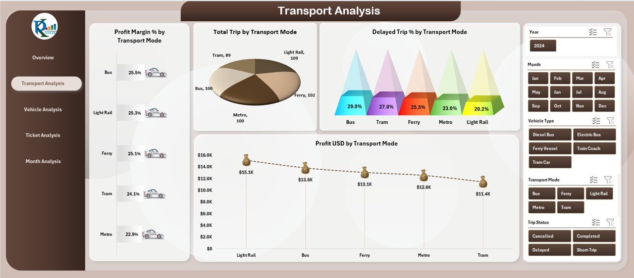
2️⃣ Transport Analysis Page
Compare performance across buses, metros, trams, ferries, or any other mode.
Charts include:
-
Profit by Transport Mode
-
Delayed Trip %
-
Total Trips
-
Cost vs. Revenue
Perfect for identifying top-performing and underperforming modes.
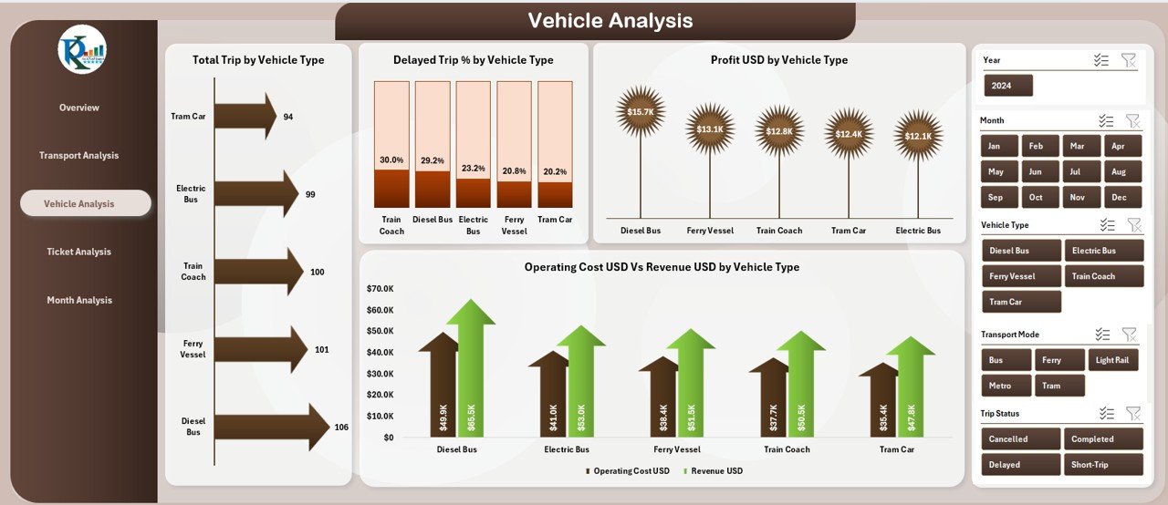
3️⃣ Vehicle Analysis Page
Understand which vehicle types generate more profit, lower delays, and better efficiency.
Charts include:
-
Profit by Vehicle Type
-
Delay %
-
Cost vs. Revenue
-
Total Profit by Vehicle Type
Great for maintenance decisions and fleet optimization.
4️⃣ Ticket Analysis Page
Analyze which ticket types bring the most value.
Charts include:
-
Profit by Ticket Type
-
Profit Margin (%)
-
Total Trips by Ticket Type
-
Cost vs. Revenue
Useful for pricing revisions and marketing campaigns.
5️⃣ Month Analysis Page
View seasonal patterns and monthly performance trends.
Charts include:
-
Profit by Month
-
Profit Margin (%)
-
Total Trips
-
Cost vs. Revenue
Ideal for forecasting, scheduling, and resource planning.
🛠️ How to Use the Public Transit Dashboard in Excel
Using this dashboard is extremely simple:
1️⃣ Update your Data Sheet with city, vehicle, ticket, cost, and trip data.
2️⃣ Refresh the dashboard to auto-update KPIs and charts.
3️⃣ Use slicers for deep analysis.
4️⃣ Explore each page for insights across modes, tickets, vehicles, and months.
5️⃣ Make data-driven operational and financial decisions.
No advanced Excel skills required—everything is automated. ⚡
🎯 Who Can Benefit from This Dashboard?
This dashboard is ideal for:
-
🚍 Transit Agencies
-
🚆 Metro, Tram & Rail Operators
-
🚢 Ferry Services
-
🚌 Bus Fleet Managers
-
🏙️ City Planners
-
💼 Operations Teams
-
📊 Data Analysts
-
🧮 Finance & Budgeting Teams
If you need clear visuals, fast insights, and better planning tools, this dashboard is perfect for you.
### Click here to read the Detailed blog post
Visit our YouTube channel to learn step-by-step video tutorials
👉 Youtube.com/@PKAnExcelExpert


Reviews
There are no reviews yet.