In the paper and pulp manufacturing world, success depends on efficiency, precision, and sustainability. 📄🌿 The Paper and Pulp KPI Dashboard in Excel gives manufacturers the power to monitor production performance, cost efficiency, quality control, and environmental sustainability — all in one dynamic dashboard.
This ready-to-use Excel template is designed for plant managers, production heads, and quality engineers who want to turn raw factory data into actionable insights. With real-time comparisons, automated calculations, and interactive visuals, this dashboard replaces manual reporting with a smarter, faster, and data-driven approach.
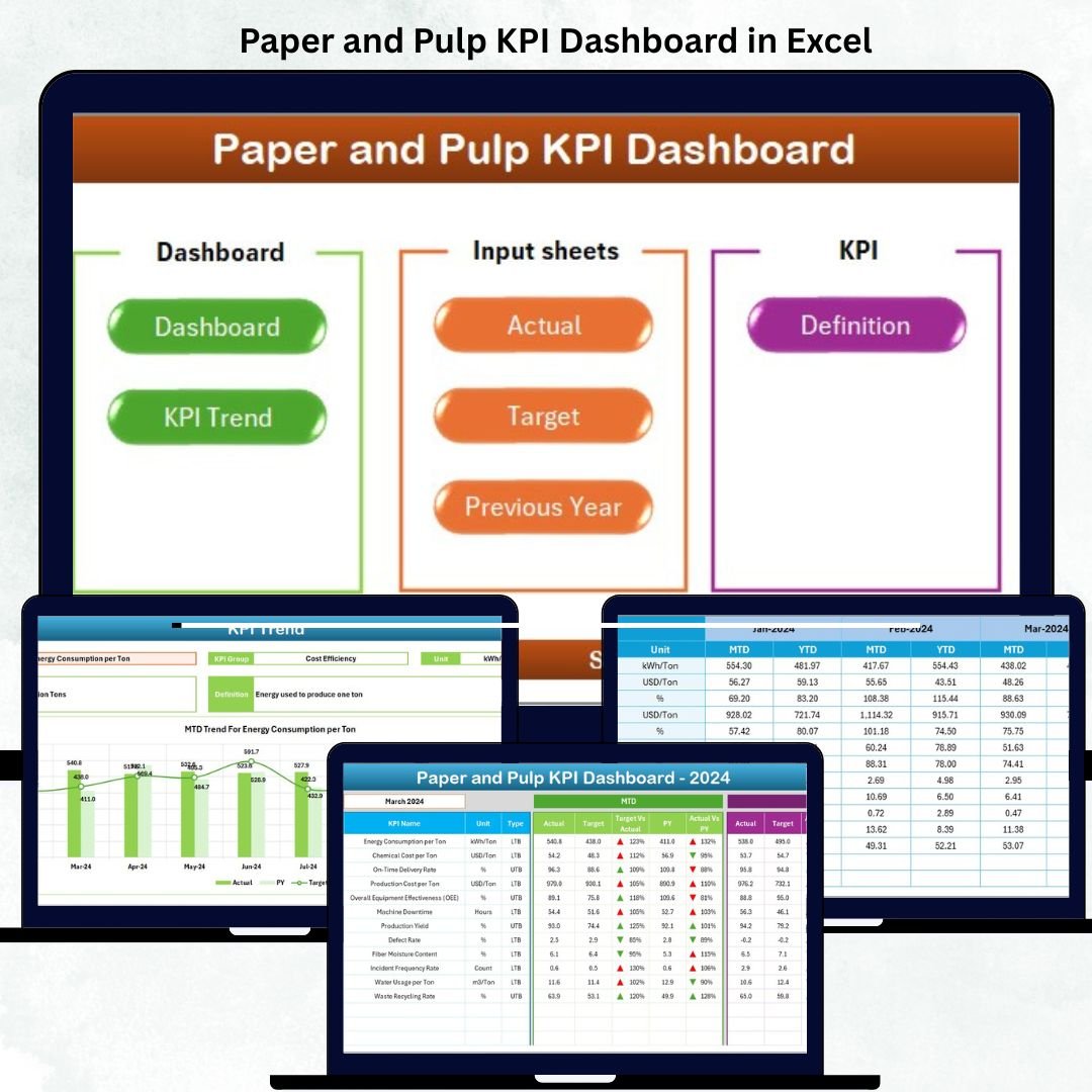
✨ Key Features of Paper and Pulp KPI Dashboard in Excel
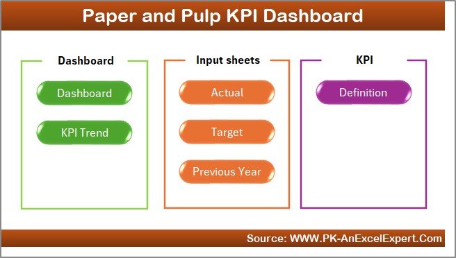
✅ 7 Pre-Built Sheets: Home, Dashboard, KPI Trend, Actual Input, Target, Previous Year Data, and KPI Definition.
✅ Interactive Dashboard: Select any month from a dropdown to update visuals instantly.
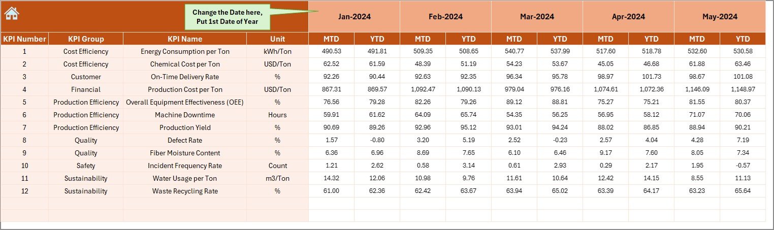
✅ Automatic MTD & YTD Tracking: Monitor Month-to-Date and Year-to-Date performance.
✅ Actual vs Target vs PY Comparison: Evaluate current results against goals and past performance.
✅ Conditional Indicators: Green ▲ for “Above Target” and Red ▼ for “Below Target.”
✅ Comprehensive KPI Trend Analysis: Dual charts show MTD and YTD Actual, Target, and Previous Year values.
✅ Centralized Data Input System: Enter data once — everything else updates automatically.
✅ KPI Definition Library: Each KPI includes name, group, formula, definition, and type (UTB/LTB).
✅ Fully Customizable Template: Add, remove, or edit KPIs, formulas, and charts as needed.
With this Excel-based solution, you can monitor every department’s performance — from production to sustainability — and take timely action to stay ahead of operational challenges. 💡
📂 What’s Inside the Paper and Pulp KPI Dashboard in Excel
📊 1️⃣ Home Sheet – Central Navigation Hub
Your control panel for seamless access. Jump instantly to Dashboard, Trend, Actual Input, Target, or Definition pages through one-click navigation buttons.
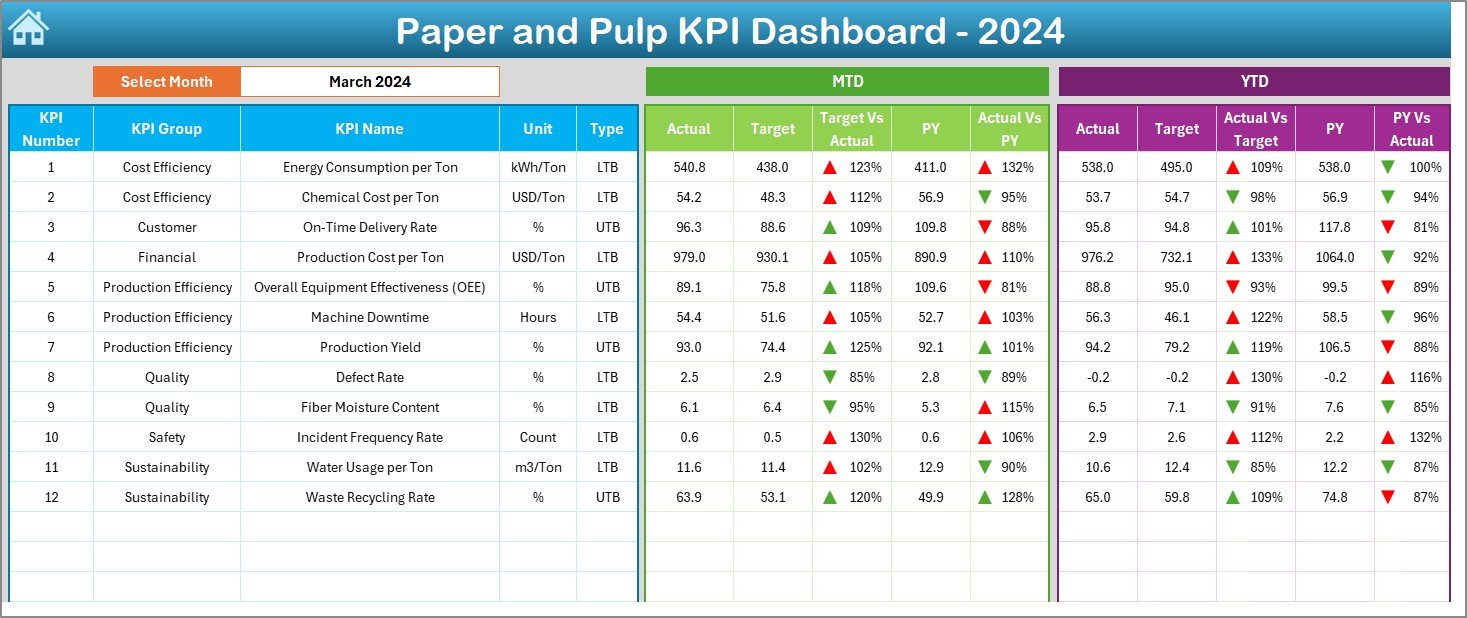
📈 2️⃣ Dashboard Sheet – Performance Command Center
The heart of the system.
-
Choose any month (cell D3) to refresh visuals.
-
Compare MTD & YTD Actual vs Target vs Previous Year values.
-
Built-in color coding instantly highlights areas that need improvement.
Perfect for management review meetings and monthly reporting.
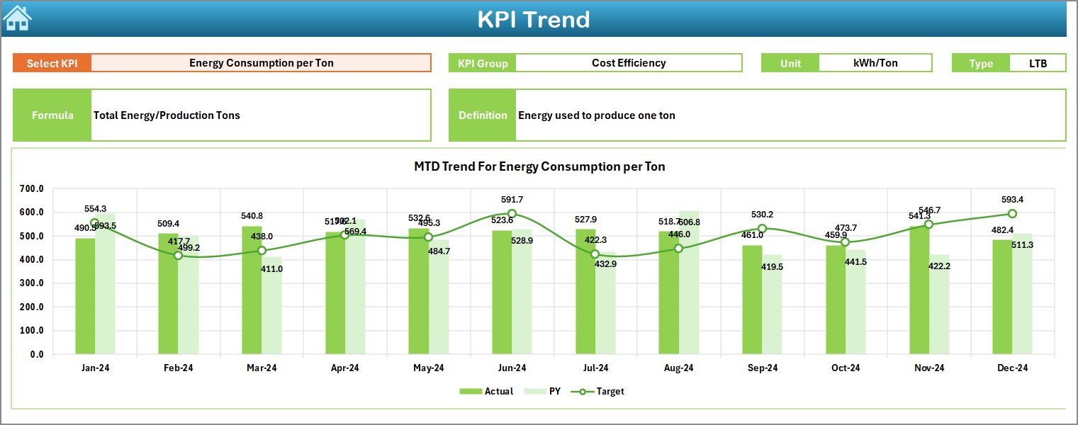
📉 3️⃣ KPI Trend Sheet – Visualize Progress
Track month-over-month performance for any selected KPI (cell C3).
Displays:
-
KPI Group, Unit, Formula, Type (UTB/LTB), and Definition
-
MTD & YTD trend charts for Actual, Target, and PY data
Helps detect patterns like increasing defect rates or fluctuating yields before they become critical issues.
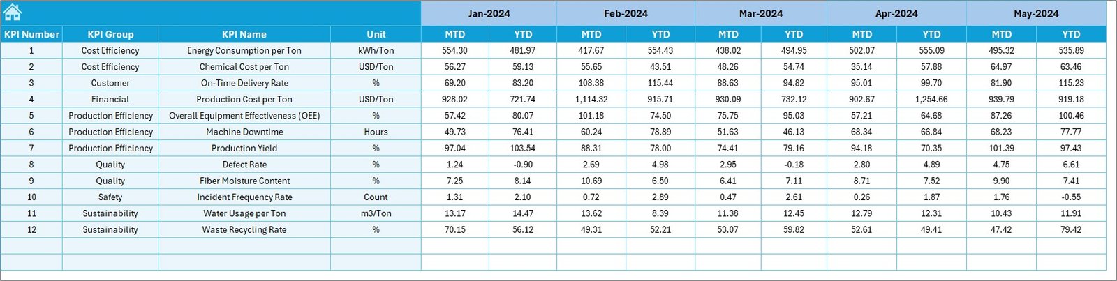
🧾 4️⃣ Actual Numbers Input Sheet – Data Entry Made Easy
-
Input monthly MTD and YTD performance data.
-
Dynamic month setup (cell E1) auto-adjusts the sheet.
-
Paste values directly from ERP systems or logs.
The moment you enter data, visuals across all dashboards refresh automatically.
🎯 5️⃣ Target Sheet – Set Your Benchmarks
-
Record target MTD/YTD values for every KPI.
-
Enables gap analysis and achievement calculations.
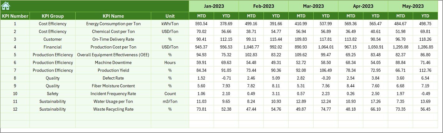
📆 6️⃣ Previous Year Data Sheet – Historical Comparison
-
Stores last year’s performance to enable year-over-year analysis.
-
Identifies long-term improvement patterns or seasonal effects.
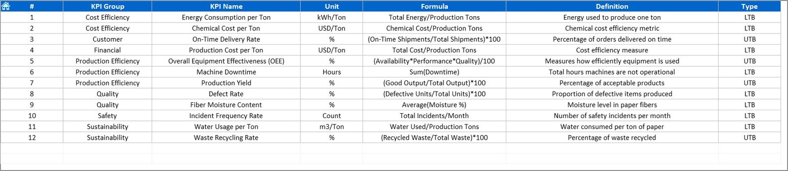
📘 7️⃣ KPI Definition Sheet – Transparency & Consistency
-
Every KPI is defined clearly with Group, Unit, Formula, and Description.
-
Keeps everyone aligned across production, quality, and finance departments.
📈 Common KPIs Tracked in the Paper and Pulp Dashboard
Production:
-
Production Volume (Tons)
-
Downtime (Hours)
-
Production Yield (%)
-
Overall Equipment Effectiveness (OEE %)
Quality:
-
Defect Rate (%)
-
Rework Ratio (%)
-
Moisture Content (%)
-
Customer Complaints Count
Cost:
-
Cost per Ton (USD)
-
Maintenance Cost %
-
Energy Cost per Ton (USD)
-
Material Waste (%)
Sustainability:
-
Water Consumption per Ton (m³)
-
Energy Usage (kWh per Ton)
-
Carbon Emissions (kg CO₂/Ton)
-
Recycling Rate (%)
Safety & Workforce:
-
LTIFR (Lost Time Injury Frequency Rate)
-
Employee Attendance (%)
-
Training Hours per Employee
Each KPI is categorized as UTB (Upper the Better) or LTB (Lower the Better) for easy interpretation.
🧭 How to Use the Paper and Pulp KPI Dashboard in Excel
1️⃣ Input actual, target, and previous year data into their respective sheets.
2️⃣ Select the reporting month from the dropdown in the Dashboard sheet.
3️⃣ Review KPI cards and charts to identify high and low-performing areas.
4️⃣ Use the Trend Sheet to track month-by-month progress.
5️⃣ Apply corrective actions and share performance updates with your team.
Within minutes, your factory data becomes a complete performance story. 📊
👥 Who Can Benefit from This Dashboard
🏭 Plant Managers: Monitor yield, downtime, and energy efficiency.
🧑🏭 Production Supervisors: Track operational targets and bottlenecks.
🧪 Quality Teams: Evaluate defects, rework, and product complaints.
💰 Finance & Cost Analysts: Analyze cost per ton and material waste.
🌱 Sustainability Officers: Measure carbon footprint and water usage.
👔 Executives: Get a full picture of plant productivity and profitability.
Whether you manage a paper mill, pulp plant, or packaging line — this Excel tool empowers every department to work smarter and more efficiently.
🔗 Click here to read the Detailed blog post
🎥 Visit our YouTube channel to learn step-by-step video tutorials

Reviews
There are no reviews yet.