Oncology services demand precision, speed, and continuous performance visibility. Every KPI directly impacts patient outcomes, treatment quality, resource utilization, and operational efficiency. Yet, many oncology departments still struggle with scattered Excel files, delayed reports, and inconsistent KPIs—making timely decisions difficult.
The Oncology Services KPI Dashboard in Power BI solves this challenge by converting complex oncology performance data into clear, interactive, and decision-ready insights. Oncology Services KPI Dashboard in Power BI This ready-to-use dashboard enables hospital leaders, oncology heads, and performance teams to track targets, actuals, gaps, and trends through one unified Power BI interface. With Excel as the data source and Power BI for analytics, the dashboard combines simplicity with enterprise-level intelligence.
This dashboard helps oncology teams move from manual reporting to data-driven, proactive healthcare management.
🚀 Key Features of the Oncology Services KPI Dashboard in Power BI
🎯 Centralized Oncology KPI Monitoring – Track all oncology KPIs in one dashboard
📊 MTD & YTD Performance Tracking – Monitor short-term and cumulative outcomes
✅ Target Met vs Missed Indicators – Instantly identify gaps using visual arrows
📈 Actual vs Target vs Previous Year Comparison – Measure improvement accurately
🎛️ Interactive Month & KPI Group Slicers – Focus analysis instantly
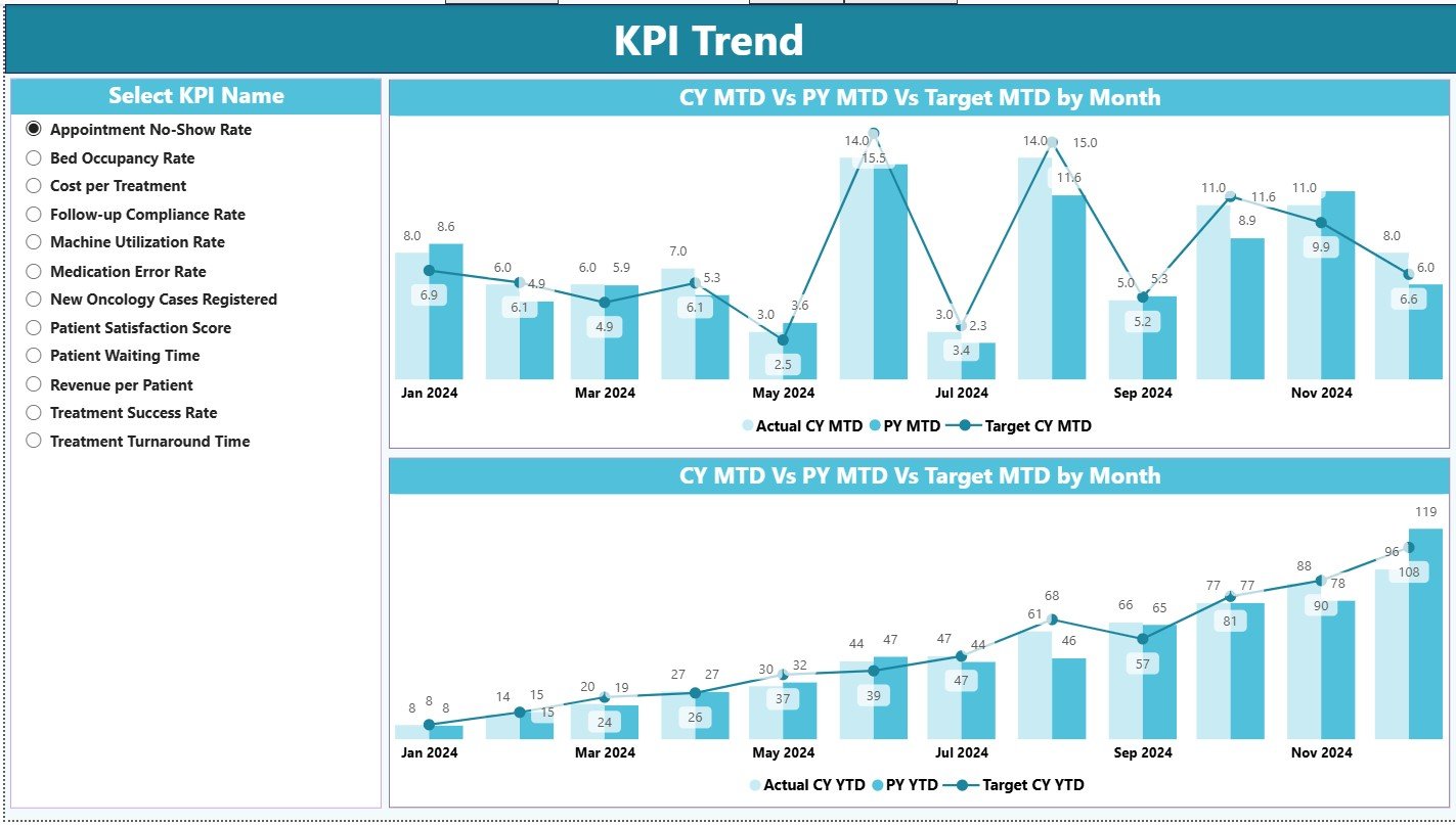
📉 Trend Analysis (MTD & YTD) – Understand performance patterns over time
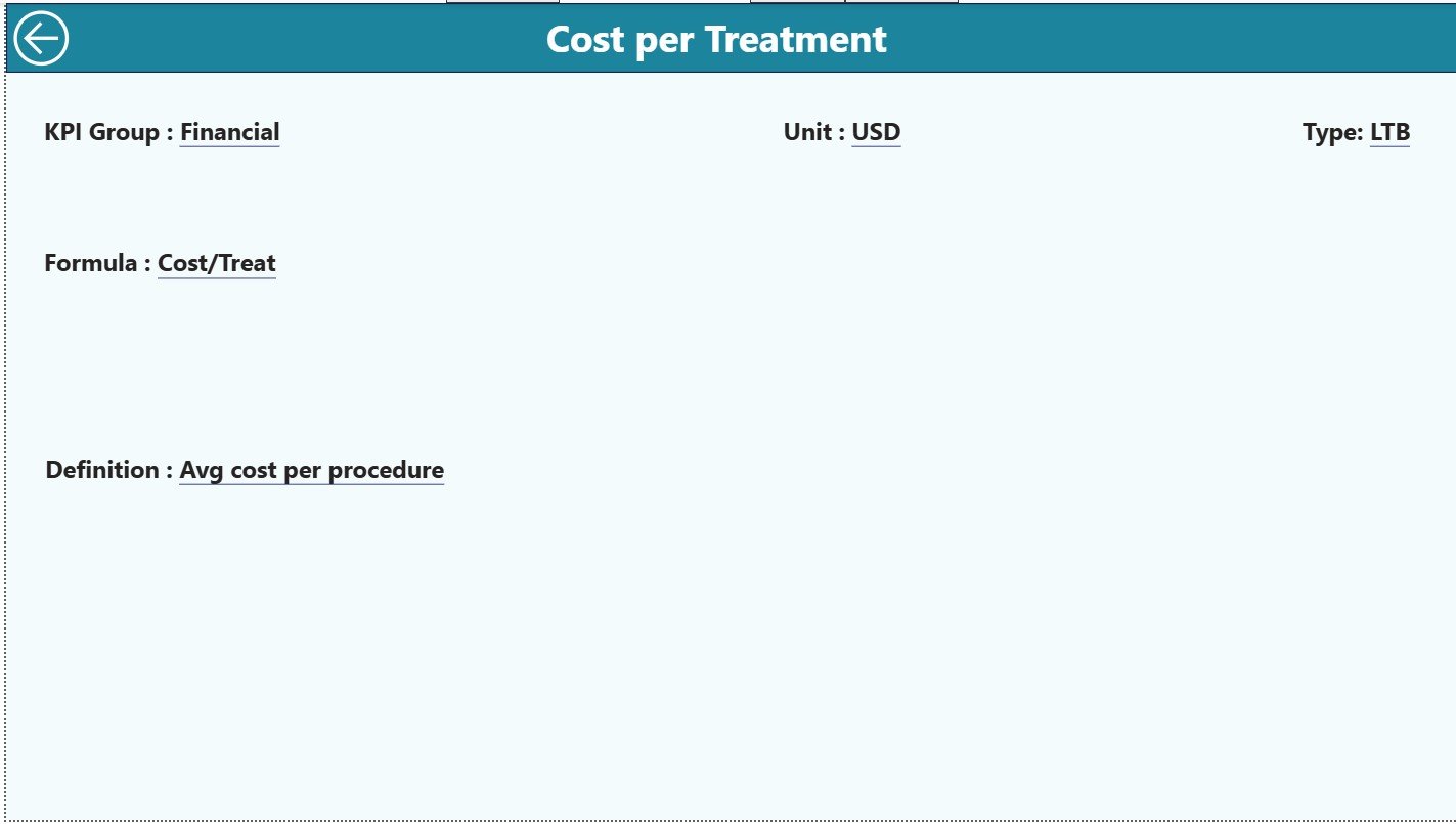
🔍 Drill-Through KPI Definitions – Maintain transparency and clarity
⚡ Excel + Power BI Model – Easy data entry with powerful analytics
📦 What’s Inside the Oncology Services KPI Dashboard
This Power BI dashboard consists of three professionally designed analytical pages, each serving a critical decision-making purpose:
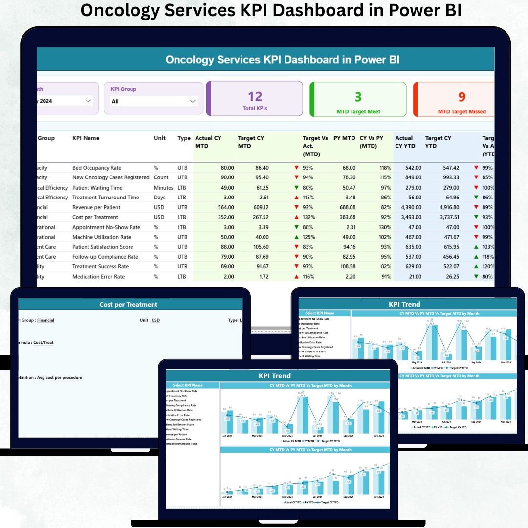
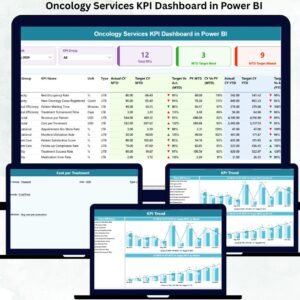
🟢 Summary Page
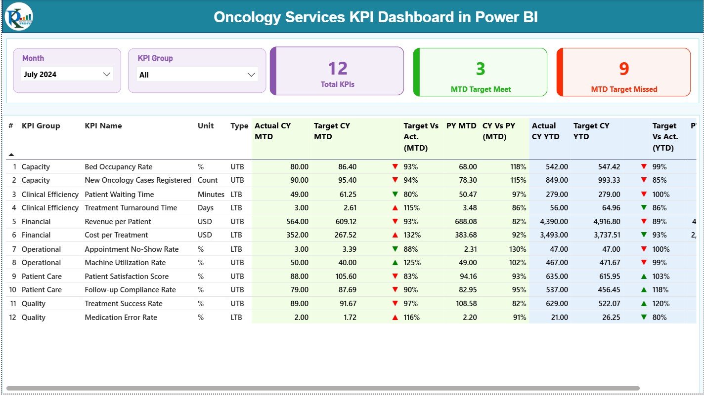
The main control panel for oncology performance. Displays KPI cards for Total KPIs, MTD Target Met, and MTD Target Missed. A detailed KPI table shows MTD and YTD actuals, targets, previous-year values, ratios, and visual icons—allowing leaders to assess performance instantly.
📉 KPI Trend Page
Designed for time-based analysis. Users select a KPI and instantly view MTD and YTD trend combo charts comparing Current Year, Previous Year, and Targets. This page highlights trends, consistency, and improvement opportunities.
📘 KPI Definition Page
A drill-through reference page that explains KPI Formula, Definition, Unit, and Logic. It ensures consistent understanding across clinical, quality, and management teams, with a built-in back button for smooth navigation.
🔗 Excel Backend Structure
The dashboard is powered by three structured Excel sheets:
-
Input_Actual – Actual MTD & YTD oncology values
-
Input_Target – Planned MTD & YTD targets
-
KPI Definition – KPI number, group, unit, formula, definition, and type (LTB/UTB)
🛠️ How to Use the Oncology Services KPI Dashboard
✅ Step 1: Enter actual KPIs in the Input Actual Excel sheet
✅ Step 2: Update targets in the Input Target sheet
✅ Step 3: Maintain KPI logic in the KPI Definition sheet
✅ Step 4: Refresh the Power BI dashboard
✅ Step 5: Analyze KPIs, trends, and target status
No advanced Power BI skills are required. The dashboard is plug-and-play, intuitive, and healthcare-friendly.
👥 Who Can Benefit from This Oncology Dashboard?
🏥 Oncology Department Heads
👩⚕️ Hospital Administrators
📊 Clinical Operations Teams
✅ Quality & Performance Monitoring Teams
📈 Healthcare Analysts
👔 Senior Leadership
Any healthcare organization focused on performance excellence and patient-centric outcomes will benefit immediately.
🔗 Click here to read the Detailed blog post
🎥 Visit our YouTube channel to learn step-by-step video tutorials


Reviews
There are no reviews yet.