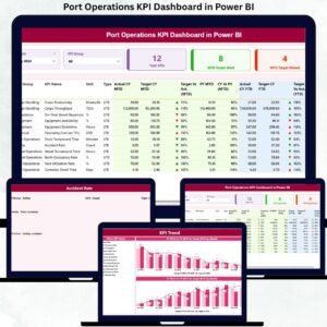
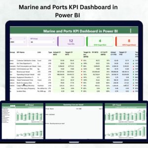
The global maritime industry thrives on precision, timing, and efficiency. Marine and Ports KPI Dashboard in Power BI Every delay or mismanaged container can cost millions. To stay competitive, ports and shipping operators need a clear view of performance data — and that’s exactly what the Marine and Ports KPI Dashboard in Power BI delivers.
This ready-to-use Power BI solution transforms complex operational data into simple, interactive visuals that reveal real-time performance insights across terminals, vessels, and logistics operations. Whether you manage a port authority, terminal operations, or shipping logistics, this dashboard gives you the data clarity needed to improve throughput, efficiency, and profitability.
⚙️ Key Features of the Marine and Ports KPI Dashboard in Power BI
🚢 Comprehensive Operational View – Track vessel turnaround time, berth occupancy, and cargo handling performance.
📈 Real-Time MTD & YTD Analytics – Instantly monitor Month-to-Date and Year-to-Date results.
🎯 Interactive Slicers – Filter data by month or KPI group to focus on critical insights.
💡 Performance Cards – Instantly view Total KPIs, Target Met, and Target Missed counts.
📊 KPI Performance Table – Compare Actual vs Target vs Previous Year with green/red visual indicators.
🔍 Trend Analysis Page – Identify seasonal patterns using combo charts for MTD and YTD trends.
📘 KPI Definition Page – Drill through to view KPI formulae, definitions, and units.
🧩 Excel Integration – Connects seamlessly to Excel data sources for instant refresh.
🧭 No Coding Needed – Built entirely in Power BI Desktop, ready for non-technical users.
🌍 Scalable Design – Adapt for multiple ports, terminals, or regional reporting.
📂 What’s Inside the Dashboard
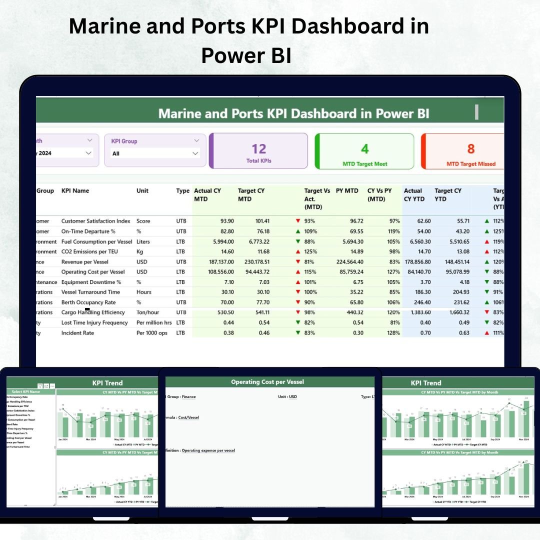
1️⃣ Summary Page – Operational Command Center
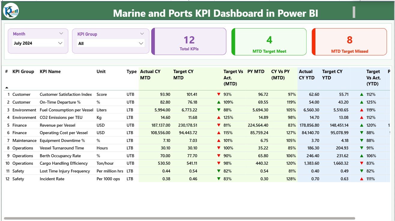
The Summary Page provides an all-in-one snapshot of marine performance.
At the top: slicers for Month and KPI Group for instant filtering.
Below: key cards showing Total KPIs, MTD Target Met, and Target Missed counts.
A detailed KPI table lists Actual MTD/YTD, Target, Previous Year data, and color-coded ▲/▼ icons to show improvement or decline.
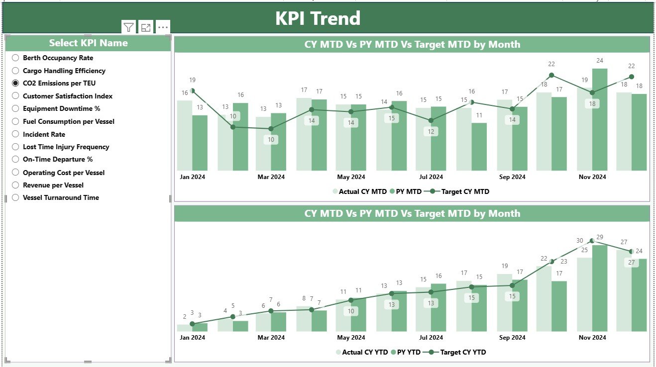
2️⃣ KPI Trend Page – Performance Over Time
Visualize how each KPI evolves monthly and yearly.
-
Choose any KPI from the dropdown slicer.
-
Review two combo charts: MTD and YTD comparisons (Actual, Target, Previous Year).
-
Detect efficiency changes, delays, or operational gains at a glance.
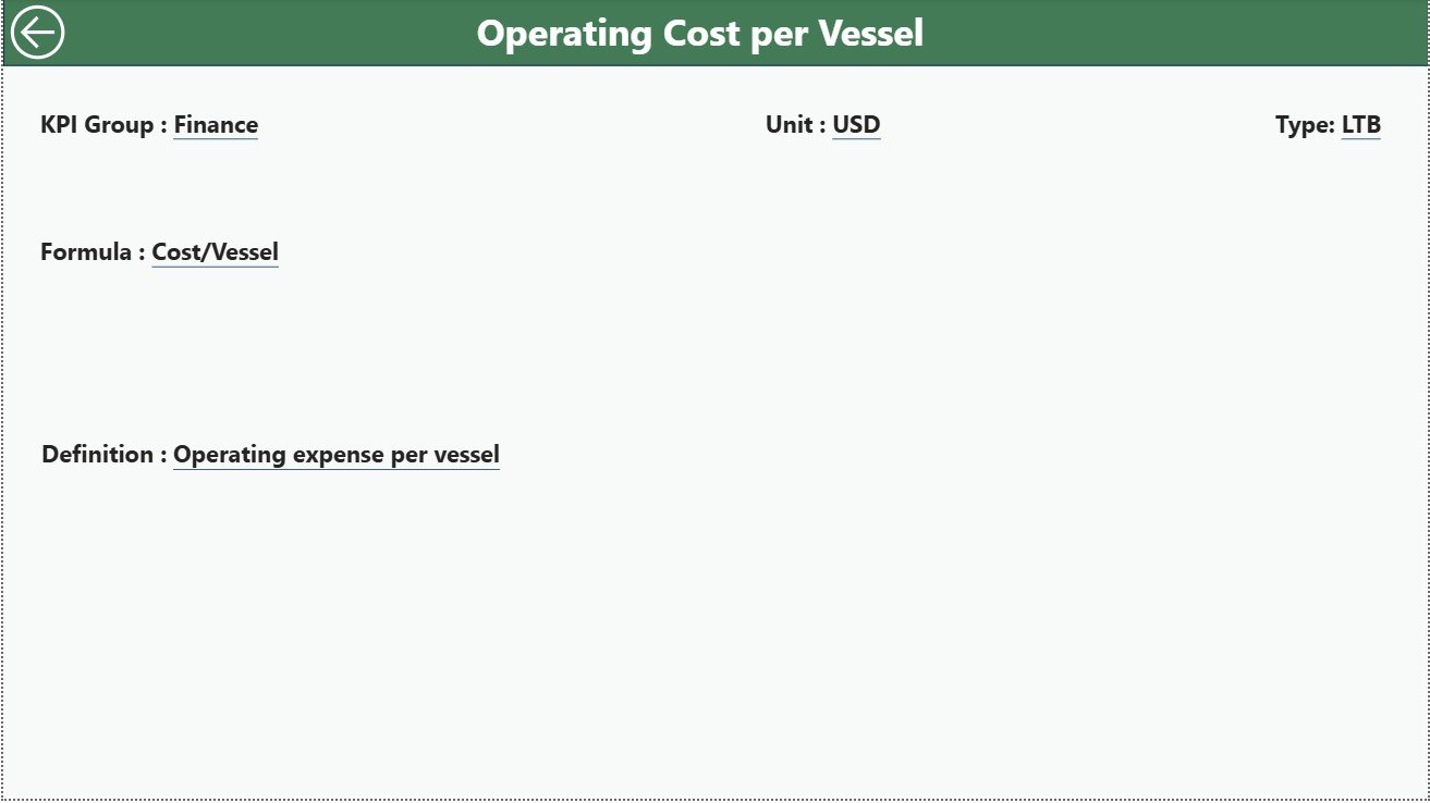
3️⃣ KPI Definition Page – Your KPI Reference Library
Drill through to see every KPI’s formula, unit, definition, and type (UTB or LTB).
A Back button brings you instantly to the main Summary Page.
📊 Excel Data Structure
The dashboard connects to an Excel file with three core sheets:
📄 Input_Actual – Captures Actual monthly values for each KPI.
📄 Input_Target – Stores Target values for comparison.
📄 KPI_Definition – Lists KPI Number, Group, Unit, Formula, and Definition.
Update these sheets monthly and refresh Power BI — the dashboard auto-updates instantly.
⚓ Key KPIs Monitored
-
Ship Turnaround Time (hrs)
-
Berth Occupancy Rate (%)
-
Cargo Handling Efficiency (tons/hr)
-
Equipment Downtime (hrs)
-
Fuel Consumption per Vessel (L/ton-mile)
-
On-Time Departures (%)
-
Safety Compliance Rate (%)
-
Maintenance Cost (USD)
-
Container Throughput (TEU)
-
Revenue per Vessel (USD)
These KPIs help monitor both operational and financial health of ports and marine services.
🚀 Advantages of Using the Marine and Ports KPI Dashboard
✅ Real-Time Visibility – View live performance data without manual reports.
✅ Operational Efficiency – Identify delays, inefficiencies, and cost leakages instantly.
✅ Data-Driven Decisions – Visual comparisons reveal improvement areas.
✅ Accountability & Transparency – Track KPI ownership across departments.
✅ Customizable Scalability – Add new metrics or connect additional ports anytime.
✅ Historical Insight – Compare year-over-year performance for continuous growth.
🧠 Best Practices
📌 Assign clear ownership for each KPI.
📌 Maintain consistent data entry formats in Excel.
📌 Use simple red/green conditional icons for clarity.
📌 Refresh data monthly or automate via Power BI Gateway.
📌 Encourage collaboration by sharing Power BI reports with all teams.
👥 Who Can Benefit from This Dashboard
⚓ Port Authorities – Monitor terminal operations and vessel efficiency.
🚢 Shipping Operators – Optimize fleet performance and fuel costs.
🏗️ Maintenance Teams – Track equipment uptime and repair schedules.
💰 Finance Managers – Analyze revenue, maintenance cost, and resource use.
📦 Logistics Analysts – Assess cargo flows and container productivity.


Reviews
There are no reviews yet.