
Imagine logging in every morning and instantly knowing exactly where your revenue stands, which products are hitting targets, which regions are underperforming, and where profit is leaking — all without opening a single spreadsheet tab or running one manual formula.
That level of clarity is no longer a luxury reserved for enterprises with dedicated data teams. With the right dashboard template, any business can have it in minutes.
That’s exactly what the Revenue Analysis Dashboard in Power BI and the Revenue Analysis Dashboard in Google Sheets from NextGenTemplates.com are built to deliver — instant, visual, and actionable revenue intelligence.
In this post, we’ll walk through everything these two powerful dashboards offer, compare their strengths, and help you decide which one (or both!) is the right fit for your business.
Why Revenue Analysis Is the Backbone of Every Smart Business Decision
Revenue is not just a number on a report. It drives pricing strategy, headcount decisions, marketing budgets, and expansion plans. Yet most businesses still rely on scattered spreadsheets, manual calculations, and static monthly reports.
The result? Leaders are always looking backwards. By the time a problem is visible in a traditional report, it has already cost money.
A real-time, interactive revenue dashboard changes that equation completely. You spot variance the moment it happens. You see exactly which channel, region, or product caused a dip — and you act before it becomes a crisis.
Revenue Analysis Dashboard in Power BI — A Closer Look
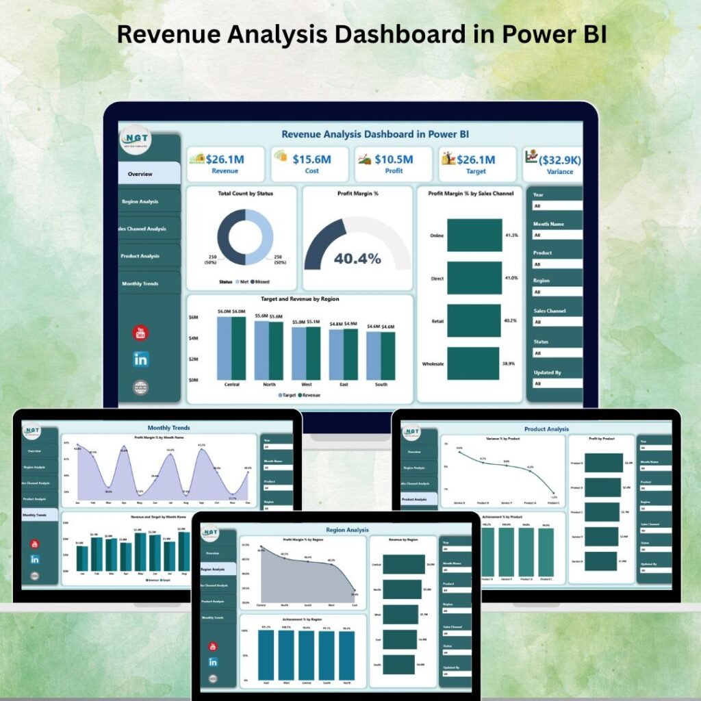
The Power BI Revenue Analysis Dashboard is a professionally designed, ready-to-use .pbix file built for decision-makers who need depth, interactivity, and visual storytelling at the executive level.
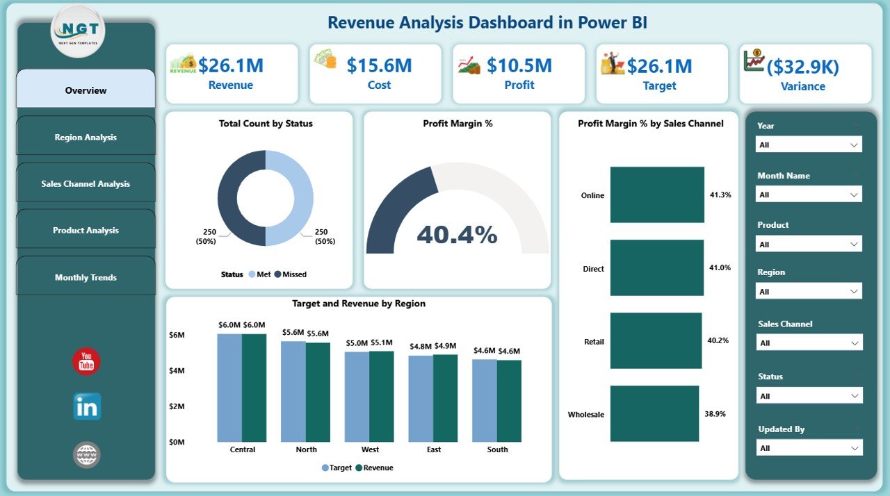
1️⃣ Overview Page – Your Revenue Command Center
The Overview page is the main hub of the dashboard. It features 7 interactive slicers — allowing you to filter data by date, product, region, channel, and more — alongside 5 KPI cards that display critical metrics at a glance:
- Total Revenue
- Profit Margin %
- Target Achievement %
- Number of Orders
- Average Order Value
Four visual charts, including Target vs Revenue by Region and Profit Margin % by Sales Channel, make pattern recognition instant and decision-making seamless.
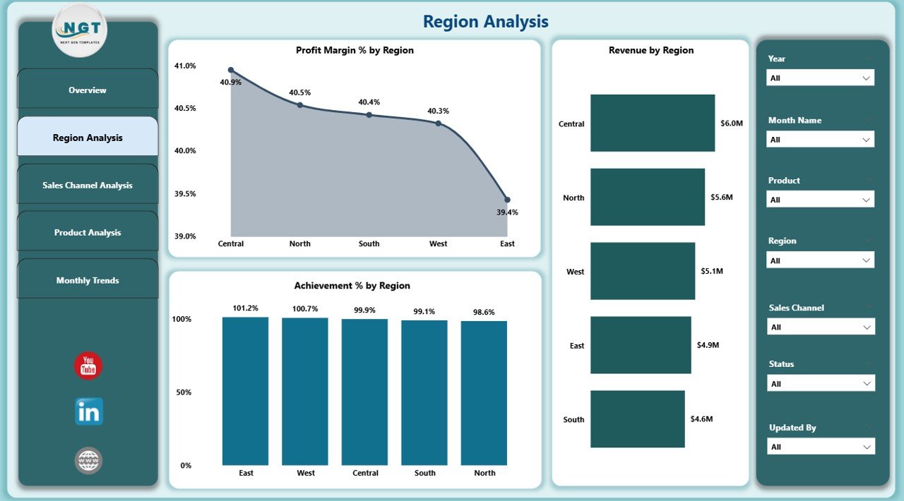
2️⃣ Region Analysis – Know Where You’re Winning (and Losing)
The Region Analysis page highlights performance differences across geographic areas. Metrics like Profit Margin %, Revenue, and Achievement % by Region allow sales and strategy teams to redirect resources towards high-impact areas immediately.
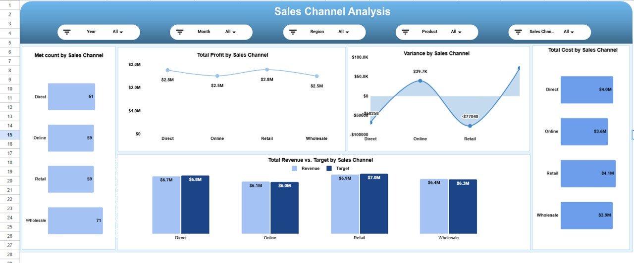
3️⃣ Sales Channel Analysis – Maximize ROI Across Every Channel
Whether you sell online, through retail, or via wholesale partners, this section breaks down which channel is truly profitable. You can compare costs, targets, and achievement rates side by side — giving you everything needed to refine your go-to-market strategy.
4️⃣ Product Analysis – Find Your Stars and Fix Your Weak Spots
At the product level, the dashboard tracks Variance %, Profit, and Achievement % for every item in your catalog. You’ll know exactly which products are driving growth and which ones need pricing or promotion adjustments.
5️⃣ Monthly Trends – Forecast With Confidence
The Monthly Trends page visualizes revenue movement over time using Profit Margin % by Month and Revenue vs Target by Month charts. This section helps teams prepare for seasonal demand, plan for slow periods, and identify peak revenue windows.
Revenue Analysis Dashboard in Google Sheets — Built for Collaboration
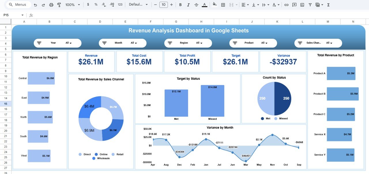
Not every team uses Power BI — and that’s perfectly fine. The Revenue Analysis Dashboard in Google Sheets delivers the same level of structured revenue intelligence in a 100% cloud-based, zero-installation environment that any team can access and collaborate on instantly.
Executive Summary Sheet – 5 Core KPI Cards
The Overview tab puts critical business metrics right at the top:
- Revenue – Total revenue generated
- Total Cost – Combined operational and sales costs
- Total Profit – Revenue minus cost
- Target – Planned revenue goal
- Variance – Gap between actual revenue and target
Supporting charts include Total Revenue by Product, Revenue by Sales Channel, Revenue by Region, Variance by Month, and Target vs Actual by Status.
Region, Channel & Product Analysis
Just like the Power BI version, the Google Sheets dashboard dives deep into geography, sales channels, and product-level performance. Each section includes variance tracking, profit analysis, target comparisons, and cost breakdowns — giving every layer of your organization the data they need.

🔍 Smart Search Functionality
One standout feature of the Google Sheets dashboard is its built-in search panel. You can filter records instantly by Product, Region, Sales Channel, Status, or Month — saving hours of manual lookup during reviews, audits, or sales calls.
Monthly Trends & Forecasting
The monthly section reveals seasonality, growth patterns, and revenue volatility through five dedicated charts — making it a powerful planning tool for quarterly and annual forecasting cycles.
Power BI vs Google Sheets — Which Dashboard Is Right for You?
| Feature | Power BI Dashboard | Google Sheets Dashboard |
|---|---|---|
| Platform | Microsoft Power BI Desktop | Google Sheets (Cloud-Based) |
| Analysis Pages / Tabs | 5 Pages | Multiple Analytical Tabs |
| KPI Cards | 5 KPI Cards | 5 KPI Cards |
| Interactive Filters | 7 Interactive Slicers | Smart Search Panel |
| Real-Time Collaboration | Via Power BI Service | Native Google Sheets Sharing |
| Data Connection | Excel, SQL, Cloud Apps, APIs | Google Sheets Data Input |
| File Format | .pbix (Power BI) | Google Sheets Template |
| Price | $17.99 |
$14.99 |
| Best For | Enterprise & BI Teams | SMBs & Collaborative Teams |
Our recommendation: If your team is already using Microsoft 365 or needs deep data connectivity, go with the Power BI Dashboard. If you want zero setup, cloud access, and real-time team collaboration at a lower price point, the Google Sheets Dashboard is the perfect pick. Many organizations actually use both.
Who Can Benefit From These Revenue Dashboards?
These tools are built for professionals who make decisions that affect the bottom line:
- Business Owners & CEOs — Monitor financial health without waiting days for reports.
- Sales Managers — Track performance against targets in real time and coach teams accordingly.
- Marketing Teams — Measure the revenue impact of campaigns across different channels.
- Product Managers — Evaluate product profitability and spot trends before they escalate.
- Finance & Accounting Teams — Optimize budgets by identifying high and low-performing segments quickly.
- Strategy & Planning Teams — Use monthly trends and variance analysis for sharper forecasting.
How to Get Started in 5 Simple Steps
Both dashboards are designed to be plug-and-play. Here’s how easy it is:
- Purchase & Download — Get instant access after checkout from NextGenTemplates.com.
- Open the File — Launch the .pbix file in Power BI Desktop or make a copy of the Google Sheets template.
- Connect Your Data — Replace the demo dataset with your own revenue, cost, and target figures.
- Apply Filters — Use slicers or the search panel to focus on specific time periods, products, or regions.
- Share & Collaborate — Publish to Power BI Service or share the Google Sheet with your team for live updates.
Ready to transform your revenue data into smarter decisions?
👉 Get the Power BI Revenue Dashboard — $17.99
|
👉 Get the Google Sheets Revenue Dashboard — $14.99
Final Thoughts
Revenue data is only as valuable as your ability to understand and act on it. Scattered reports and manual calculations slow you down and cost you opportunities.
With the Revenue Analysis Dashboard in Power BI or the Revenue Analysis Dashboard in Google Sheets, you get a professionally designed, fully interactive analytics solution that puts you in control — from day one.
Visit our YouTube channel to learn step-by-step video tutorials