In today’s fast-paced business world, professional training and coaching are no longer optional — they are essential for organizational success. The Professional Training & Coaching Dashboard in Power BI helps you turn complex training data into powerful insights that drive performance, engagement, and ROI.
Built entirely in Microsoft Power BI, this ready-to-use, interactive dashboard brings all your training and coaching metrics into one place — from satisfaction scores and costs to trainer performance and completion rates. It’s the ultimate analytical tool for HR leaders, L&D managers, business coaches, and executives who want to track learning outcomes effectively and make smarter decisions.
⚙️ Key Features of the Professional Training & Coaching Dashboard in Power BI
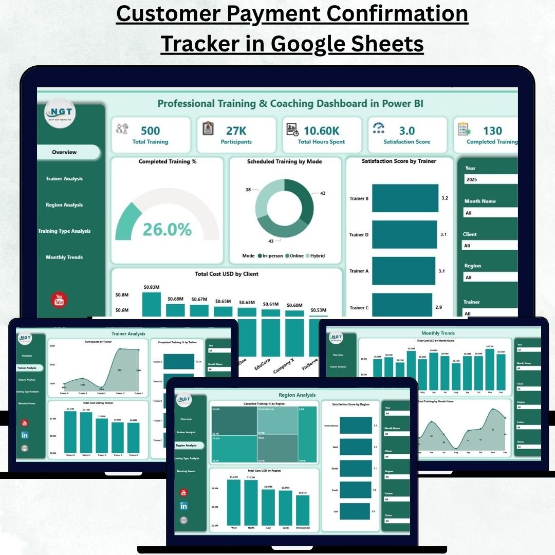
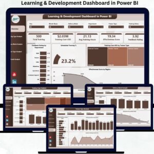
🏠 1️⃣ Overview Page – A 360° Snapshot of Training Performance
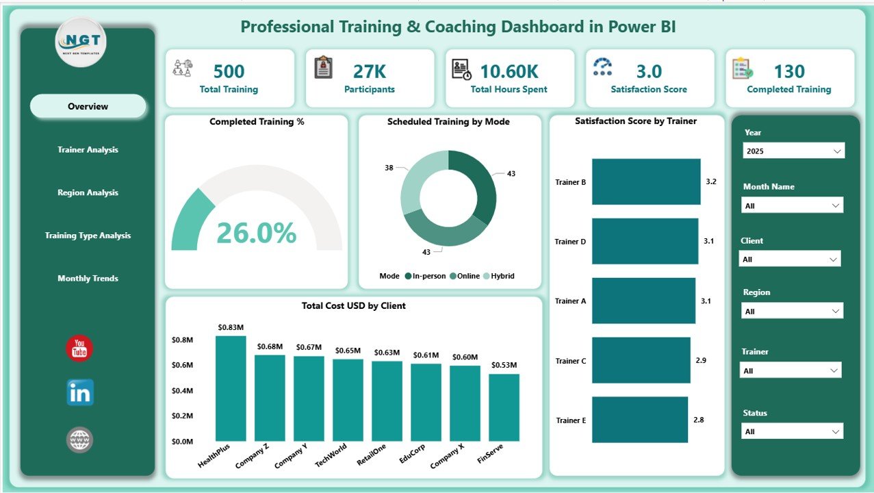
The Overview Page provides an instant summary of all critical training metrics and KPIs.
Includes:
-
🎯 5 Key Cards: Total Trainings Conducted, Completed %, Satisfaction Score, Total Cost (USD), and Number of Participants.
-
📊 Charts such as:
-
Completed Training (%)
-
Scheduled Training by Mode (Online vs Offline)
-
Satisfaction Score by Trainer
-
Total Cost (USD) by Client
-
-
🎚️ Right-side slicers for filtering by month, trainer, client, or mode.
💡 Use this page to instantly gauge training health, cost efficiency, and participant engagement.
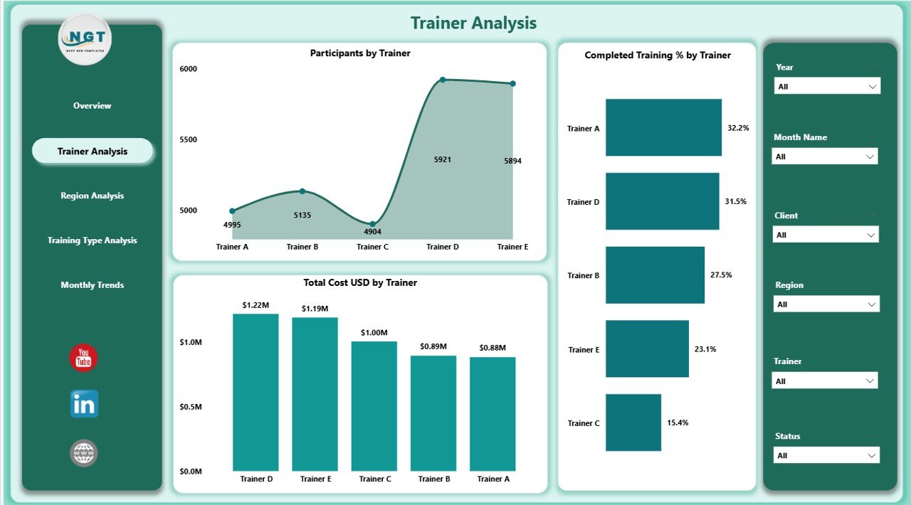
👨🏫 2️⃣ Trainer Analysis Page – Evaluate Trainer Effectiveness
This page highlights trainer performance through dynamic visuals and KPIs.
Visuals include:
-
Participants by Trainer
-
Completed Training % by Trainer
-
Total Cost (USD) by Trainer
📈 Identify top-performing trainers, track satisfaction levels, and ensure your coaching quality remains consistently high.
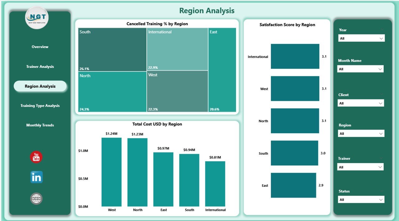
🌍 3️⃣ Region Analysis Page – Compare Results Across Locations
Understand how training programs perform region-wise with visuals such as:
-
Cancelled Training % by Region
-
Satisfaction Score by Region
-
Total Cost (USD) by Region
This helps pinpoint regional performance variations, optimize delivery modes, and balance budgets across locations.
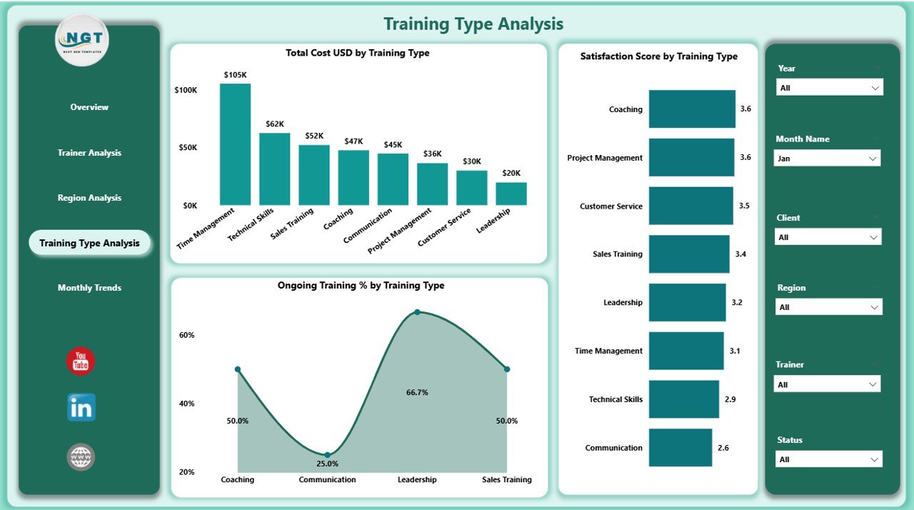
🧩 4️⃣ Training Type Analysis Page – Identify High-Impact Training
Not all trainings deliver the same results. This page compares outcomes across categories.
Charts Include:
-
Ongoing Training % by Type
-
Satisfaction Score by Type
-
Total Cost (USD) by Type
🎓 Whether it’s leadership coaching, soft skills workshops, or technical certifications — find out which programs deliver the best ROI.
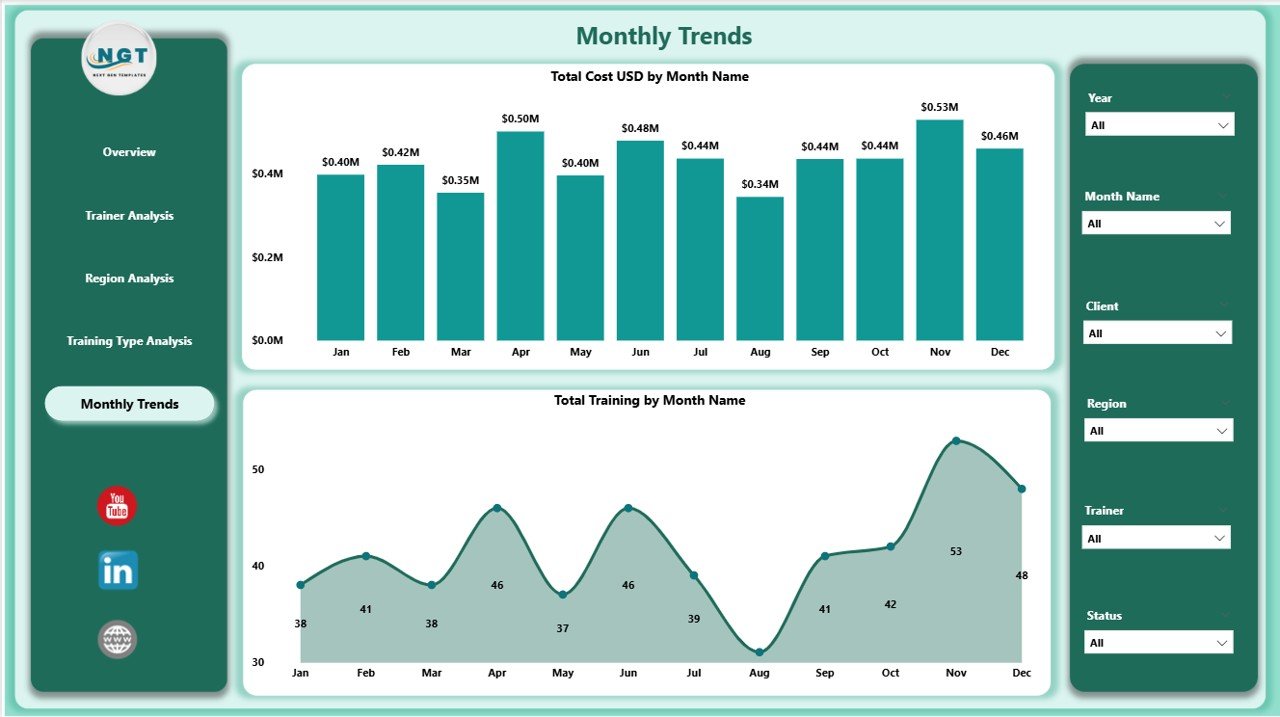
📅 5️⃣ Monthly Trends Page – Monitor Performance Over Time
Track how your training initiatives evolve month after month.
Includes:
-
Total Cost (USD) by Month
-
Total Trainings by Month
Spot trends, forecast future budgets, and measure long-term impact through clean, interactive visuals.
🚀 Advantages of Using This Power BI Dashboard
✅ Centralized Analytics: All your training and coaching KPIs in one live dashboard.
✅ Actionable Insights: Track completion, satisfaction, and costs in real time.
✅ Trainer Accountability: Identify top trainers and areas needing improvement.
✅ Budget Optimization: Compare cost-effectiveness across regions and clients.
✅ Time Efficiency: Say goodbye to manual Excel reports — everything updates automatically.
✅ Scalable Design: Works perfectly for both small training firms and large corporations.
🧭 Who Can Benefit from This Dashboard?
-
🧑💼 HR & L&D Managers – Evaluate training ROI and satisfaction trends.
-
👨🏫 Corporate Trainers & Coaches – Track effectiveness and participant feedback.
-
💼 Executives & Directors – Assess overall learning investments and outcomes.
-
🌐 Training Institutes & Consulting Firms – Deliver data-driven insights to clients.
💡 How to Use the Dashboard Effectively
1️⃣ Import clean, structured data from Excel or your LMS system.
2️⃣ Refresh visuals with one click to update all pages.
3️⃣ Use slicers to filter by region, client, or training type.
4️⃣ Drill through visuals to analyze specific trainers or programs.
5️⃣ Export insights to PDF or share live reports via Power BI Service.
📊 Within minutes, you’ll have a clear, interactive view of your training performance.
🧠 Best Practices for Maximum Impact
-
Keep visuals simple and color-coded for clarity.
-
Schedule automatic data refresh in Power BI Service.
-
Validate source data for accuracy before every update.
-
Use consistent KPIs across all departments.
-
Encourage trainers and managers to use insights for continuous improvement.
✨ With these best practices, your organization can build a data-driven learning culture that continuously evolves.
🔗 Click here to read the Detailed Blog Post
📺 Visit our YouTube Channel for Step-by-Step Tutorials
👉 YouTube.com/@PKAnExcelExpert


Reviews
There are no reviews yet.