In today’s data-driven business world, Quality Assurance (QA) isn’t just about catching defects—it’s about monitoring performance metrics, identifying trends, and driving continuous improvement across teams and products. That’s why professionals around the world are turning to powerful dashboards that simplify QA reporting and help teams stay focused on what matters most.
In this blog post, we’ll compare two top-tier QA dashboards from NextGenTemplates.com designed for different platforms:
✅ The Google Sheets Quality Assurance Dashboard – ideal for quick, cloud-based monitoring
✅ The Power BI Quality Assurance Dashboard – perfect for advanced analytics and interactive reporting
Whether you’re a QA manager, operations lead, or analytics professional, you’ll discover which option fits your workflow—and how these dashboards can help you improve quality outcomes fast.
🚀 Why Quality Assurance Dashboards Matter
Before diving into features, it’s worth understanding why QA dashboards are essential for modern teams:
-
📊 Visualize Quality KPIs – See inspection results, defect rates, and rework metrics at a glance.
-
📈 Track Trends Over Time – Identify recurring problems before they escalate.
-
🧠 Support Data-Driven Decisions – Stop guessing and start acting on real numbers.
-
⏱️ Save Hours of Manual Reporting – No more spreadsheets full of manual charts.
Dashboards make complex QA data simple, actionable, and easy to communicate across teams—and these templates are built to do just that.
📌 Platform Overview: Google Sheets vs Power BI
Both dashboards serve the same goal—enhancing QA performance—but they excel in different environments:
| Feature | Google Sheets Dashboard | Power BI Dashboard |
|---|---|---|
| Ease of Use | Cloud-based, simple | Advanced BI capabilities |
| Customization | Flexible formulas/views | Deep interactivity & visuals |
| Realtime Filtering | Basic filters | 7 slicers + drill-downs |
| Best For | Small teams, quick insights | Analytics teams, enterprise reporting |
Let’s explore each in detail.
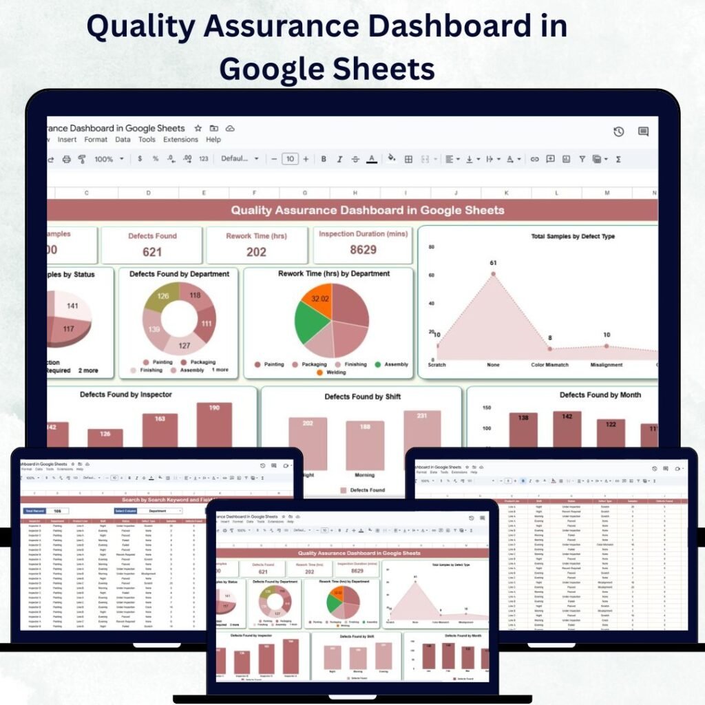
📊 1. Google Sheets Quality Assurance Dashboard
Google Sheets is a ubiquitous tool—easy to access, collaborative, and cloud-ready. The Quality Assurance Dashboard in Google Sheets is a pre-built solution that helps teams track inspection outcomes and QA performance without complex setup.
👉 You can check it out here: Quality Assurance Dashboard in Google Sheets
⭐ Key Benefits
-
🚀 Instant Deployment – Opens in Google Sheets; no special software needed.
-
☁️ Cloud Collaboration – Multiple team members can review and update results in real time.
-
📋 User-Friendly Interface – No steep learning curve for non-technical users.
-
📈 Core QA Metrics – Monitor defect counts, inspection results, and rework times all in one sheet.
💡 Ideal For
This version is perfect for:
-
Small QA teams
-
Startups and remote teams
-
Quick implementation with minimal setup
If your data primarily lives in spreadsheets or you want something that’s collaborative and accessible, Google Sheets is a winner.

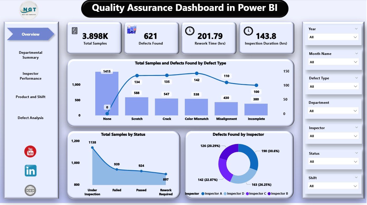
📊 2. Power BI Quality Assurance Dashboard
For larger teams, advanced analytics, or enterprise environments, the Quality Assurance Dashboard in Power BI takes QA reporting to the next level. Built in Power BI, this template delivers interactivity, robust visuals, and deep analytics.
👉 See it here: Quality Assurance Dashboard in Power BI
🔥 Core Features
-
📌 Overview Page – One-glance summary of samples, defects, and KPI cards.
-
📊 Departmental Insights – Spot teams with the most rework or defects.
-
👤 Inspector Performance – Compare individual inspector output.
-
🛠️ Product & Shift Breakdown – Drill into shifts and product lines.
-
📅 Trend Analysis – Watch how issues evolve over time.
-
🔄 Custom Filters & Slicers – Filter by department, product, shift, and more.
📌 Advanced Capabilities
Power BI is built for analytics teams who want:
-
Interactive dashboards with clickable filters
-
Integrated visuals and KPIs
-
Exportable dashboards for stakeholder reporting
If you need data-driven insights at scale, Power BI is the better choice.
🧠 How These Dashboards Help Teams Excel
Both dashboards empower teams in similar ways, but tailored to different workflows:
📍 Enhanced Visibility
Quality data scattered across spreadsheets becomes a centralized hub of insights.
📍 Faster Decision-Making
Instead of manually generating reports, both templates let you:
-
Visualize KPIs instantly
-
Spot anomalies fast
-
Compare performance across teams and timeframes
📍 Better Collaboration
With Google Sheets, teams can co-edit data, while Power BI dashboards allow role-based access and insights sharing across larger groups.
🤔 Which One Should You Choose?
Here’s a quick rule of thumb:
✔️ Choose Google Sheets if you want:
-
Fast setup
-
Cloud-based collaboration
-
Simplicity over advanced analytics
✔️ Choose Power BI if you want:
-
Powerful visuals and interactivity
-
Enterprise reporting
-
Deep filtering and trend analysis
Both dashboards are downloadable, customizable, and designed to save you hours of manual reporting—letting you focus on quality improvement, not data wrangling.
📌 Final Thoughts
Quality Assurance doesn’t have to be overwhelming. With dashboards crafted for both Google Sheets and Power BI, you can monitor performance, spot trends, and make informed decisions with confidence.
Whether you prefer the collaborative simplicity of Sheets or the analytical depth of Power BI, these dashboards give you the tools to:
Visit our YouTube channel to learn step-by-step video tutorials